Overview:
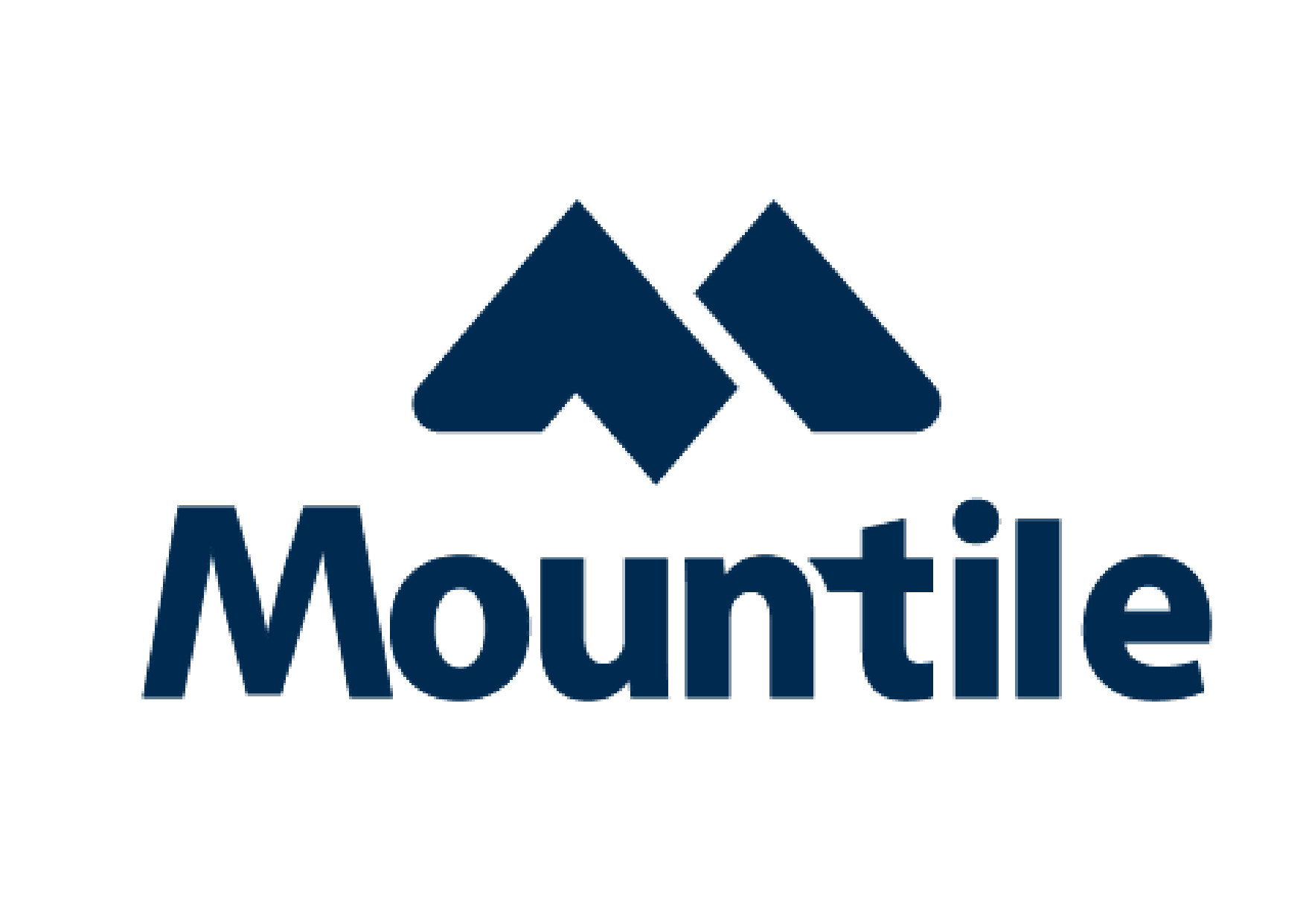
The name of the company is Mountile (a name I generated myself). It is a combination of two different words “Mountain and Tile” adopted as one word. The company is into the production of tiles. The company uses mountain-born substances such as granite and quartz as their primary input. Mountains are known to be huge and taller than the surrounding land, have peaky shapes, plus their robust nature. From these few qualities of mountains, I decided to come out with the above name as it seems fitting in this context.
Project:
I wanted to create a mark for the above company to depict something that is huge in appearance, quality, superior, modern and unique in style and remarkable. Upon the types of logos, I decided to go with the letter mark logo type.
Process:
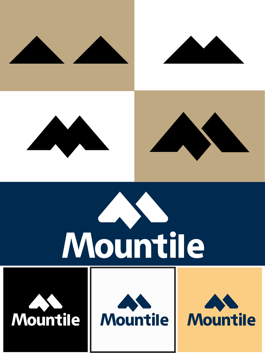
I started by sketching several preliminary designs and come out with one I thought would work best.
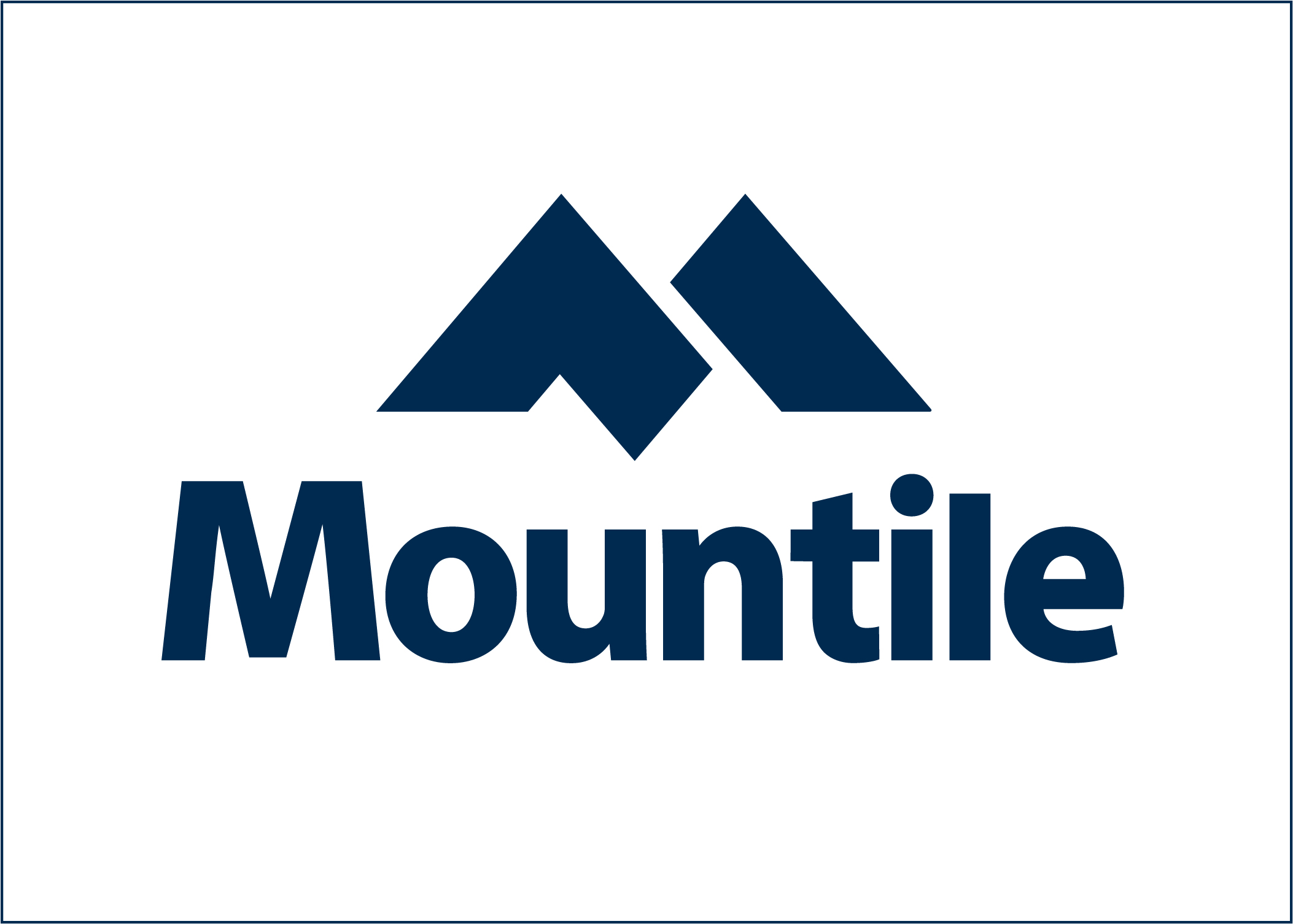
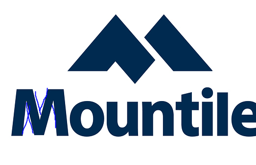
I imagined standing afar and looking at two separates mountains with one being in front of the other. So I used the shape of a triangle to represent this idea. After that I brought them together to form the mark “M”.
If it were me, I’d change leave the type alone and use a normal “t” and just let the “M” icon be the hero.
Have you tried any other fonts, maybe something bolder? The current one is ok, but the M actually looks a bit skinny in comparisson to the rest of the text.
For me the first thing I thought about when I saw it was the Marriot Hotel. But thats neither here or there.
As a concept idea (from my personal opinion) I wouldnt round the corners that much. Little bit of roundness to keep it friendly but having more of a point would be more representative of a “tile” being place together in my opinion.
I would also work on your kerning for the typography.
The M is way too close to the O and
the T is too far from the N (even with the extented crossbar)
the space between the t - i - l - e are all optically off
It’s simple, clean and devoid of distracting details. Despite that, I can’t count the number of times I’ve seen an M made into a mountain. I don’t recall seeing one just like yours, but I would hesitate to sell it to a client considering the distinct possibility that a nearly identical mark is already is use somewhere else.
I dislike both the M and the t in the following type. Neither letter matches the others.
The M’s design appears to be an attempt to make the letter more mountain-like, but you’re already using a mountainous M for the icon. Doing it a second time in the logotype competes and clashes with the first instance.
I have no clue why you created that extended and awkward crossbar on the t. It seems entirely gratuitous and at odds with the other letters. Like the M, it also draws attention to itself as an out-of-place outlier.
I appreciate your input very much. For my logo to look like those in the link in some extent is unfortunate. The truth is, I did not come across such logos before creating mine. It’s just a coincidence. The faults you have pointed out, I will take them into consideration. Thank you.
I didn’t mean to imply that you copied anything. All I was really saying is that many good, simple solutions have already been done before in various ways, so it’s important to be aware of that.
Sir, I absolutely understood what you meant. I myself was a bit surprised to see logos like that, so like you said, I will be careful next time as to how I express my designs.
I think it looks better, however still think you need to try a different font. The “M” on the current one looks too thin in comparison to the other characters, have marked out the thin areas below:
I think it’s lots better now, but like Pluto, I’m still concerned about that M.
The typeface appears to be Myriad, but not quite — especially the M. Is it Myriad? Have you altered it a little? If so, there’s nothing wrong with that. I alter typefaces all the time when I use them in logos.
However, the M doesn’t look quite right. The inner strokes on a Myriad M are a bit thinner than the strokes on the other letters in the typeface, but this is just to help decrease the bulk on the inside of the M and make the overall color of the typeface more consistent.
Tell me if I’m wrong, but it appears as though you’ve made the outside strokes on the letter slant a bit more, and my initial guess was because you wanted it to look more like a mountain, but I could be totally wrong about that. Whatever the reason, the more slanted outer strokes open up the inside of the letter, which causes those inside diagonal strokes to appear a bit too thin.
If it were me, I’d probably use just a straight, unaltered version of Myriad with a standard M. Then again, for all I know, you’ve found a Myriad-like font where that is the standard M. Even if that’s the case, I’d still consider reducing the slant of those outer strokes a bit. If you like the look of Myriad (or whatever it is), I might suggest using Frutiger instead. It’ll look almost identical to what you have, but (I’m going off memory here) the outside strokes on the M aren’t slanted like they are with Myriad.
So that was a long post about something that I consider to be a minor tweaking issue. I do think your latest version looks good and I do like it.
Yes, the typeface is Myriad. I tried changing its form a bit to look different. Have now used the original form of the Myriad M in this last post for you to check whether it’s okay now. Thanks.