Please review my portfolio and be honest!

Thanks so much everyone for the feedback. I posted another study last night of a luxury clothing brand but its mostly mocks so you don’t waste your time lol… its one of my favorites as its my wife’s clothing line…

Ok - here are my recomendations, short and sharp: :hocho:

  • You have such an outgoing energetic personality and I think this is one of your strengths, however your about us section on your website features a generic stock photo of random people. I get that you want to be percieved as a bigger entity, there’s nothing wrong with that, but I think you still need to put something authentic there about you along with a photo (maybe as the founder?), so that people know you’re a real person.
  • It’s awesome you have a blog - this is fantastic for SEO. However the use of ridiculously generic stock photos and the choice of an italic serif typeface, make it seem totally out of place on your website.
  • The effort you put into your mock-ups is great, however design isn’t just asethetics, it’s problem solving. You need to provide more copy, describing the problems you’re solving and how you did so. If a lot of your work isn’t for real clients, that’s totally fine, tell the story of how you arrived at your solution.

Hope this is helpful mate :beers:

Also - out of interest how did you decide what to name your business?

The only thing I’ll say is it looks like a knock off of Yves Saint Laurent.

I appreciate your opinion. YVG is the intials of the designer, and although it does have its similarites, the monogram has several variatians and a different audience so the branding will have to position it differently.

I always remember this quote:
“Your brand is what people say about you when you are not in the room”

  • Jeff Bezos

It stuck with me. So I looked for a word that would incorporate belief in a company or brand. Couldn’t find one.

Closest was credo, which means what a peeson believes spiritually.

In the pronounciation portion their was a Macron over the E so I kept that as the icon. And redefined it as what a person believes in regarding a “brand”. Hence the tagline; “what will they say about your brand?” Harkening back to the bezos phrase.

The Macron accent is a perfect little symbol (over the E) so I use it to frame or animate certain things. Like the behance posts thumbnails.

Phew long story huh?

Still might not hold up in court.

Just saying. I’m not a lawyer.
But… It’s too similar and in the same space

First of all thank you very much!

Point 1:
About us: I cant afford cameras or studio lights so for now its sort of a place holder (just built this site a couple months ago hence it is in construction.

I can try and get a decent picture of my ugly mug but lets see…

Point 2:
Blog
I found some stock stuff to summarize what the post is about and have lots of color and sometimes funny to match the mix of lightheartedness. Dont really know muxh about blogging this was a logical stab in the dark lol. What would you do in my shoes?

I use Libre Baskerville italic for subtitles. Its pretty as hell and breaks up the helvetica sans style up a bit.
Maybe tone it down?

Point 3:
People are in a rush, I tried to keep the studies short and to the point. I studied what designers I could find that did something similar. But I will try to make the copy more rich…

Cheers! :beers:

1 Like

The client is currently speakig with the lawyer that is working with the patent / copyright office. I am hoping that it sticks, because I honestly drew it up from scratch on paper with no influence from Yves. It was totally original and the letter fall that way in monogramming.

None of that matters.

Well what does matter is that Yves is a perfume company, focused on skin care products, and that industry. Our client focuses on clothing. They have 3 different letters than this brand, their business name is different and they have a thinner italic form whereas the client has a black / extrabold fontface and not italic.

Many differences according to their copyright info I read myself. Plus they are on the other side of the planet to my client.

You need to listen.

It might be too similar.

YSL is a luxury fashion house.

You wanted the critique.

Here it is. It looks like a ripoff of YSL.
Not original and has potential for legal problems for the client.

If you don’t care about that then there’s nothing I can do.

But it shows serious lack of attention in designing.

I am not arguing, I am listening. But I am also not the final decision maker. As you know clients pay the bills and they decide what they want to do. If they clear the copyright then all else is mute points.

I can only present these concepts not decide their fate.
Again I appreciate the feedback. Time will tell what the situation is finally (and the law).

I appreciate the feedback. My original concept was very different but this is the direction it went.

It’s difficult when clients push the wrong direction

Part and parcel of the role is to steer the clients in the right direction and away from potential law suits.

All of this is part of my critique, which is what you asked for from the forum members

As such my critique really is not about the design but did diligence not being followed.

It’s not against the law to have the same or similar marks. But it could be copyright infringement, which has significant impact on the client if it does happen.

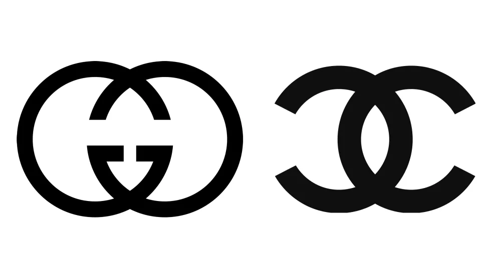
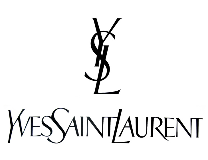
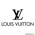
So as part of my critique of the logo it’s not great in terms of what is already in that space.

It’s not differentiated in any way.

There is no such thing in copyright of changing it by 75 percent of 99.999 percent.

It’s still copyright.

And as a designer who is hired by clients it’s part of the role to advise them on this.

I honestly don’t think it’s unique and I’d strongly advise your client by email so it’s in writing that it is too similar and recommend some changes before it’s too late.

If the client says to go ahead then so be it.

But I’d need it in writing. Otherwise I wouldn’t proceed.

It’s like someone comes to me with a reverse tick mark like Nike and the name is Niki for a sports company.

These are real things that should be considered.

As a designer you would not like to see your work copied and used anywhere else. Stealing is stealing.

Why undervalue the industry you represent and work within by accepting that it’s ok to use things that have a clear resemblance to knock offs?

Again you wouldn’t like it if I started a website called Creedo and put Jake Black as CEO and posted pics of your portfolio with tweaks to them.

I know I’m harping on about this.

But I hope you realize how serious this is

And it truly has lowered my appreciation for the work you’ve posted so far

How do I know the other works you have are not ripoffs of other work?

There’s no smoke without fire.

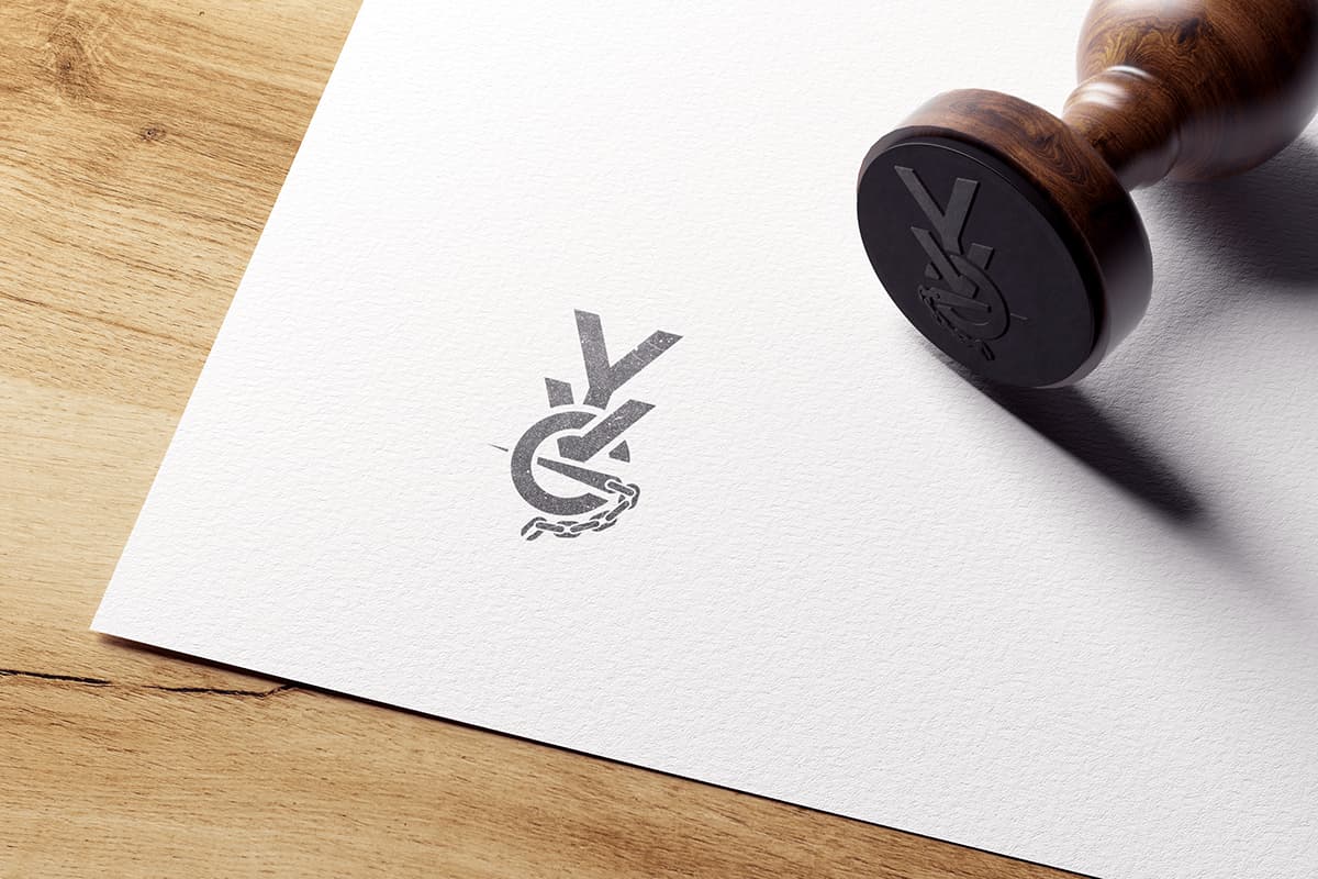
Fire me personally I would not put the YSG ripoff in the portfolio.

Hello Smurf. Although I appreciate your enthusiasm. I do not appreciate being accused of ripping anyone off or copying anyone’s work.

I literally sat and work the Letters Y V G in many different formats and iterations. The only this similar between those 2 logos are the fact that its vertical, a Y in the beginning and 3 letters.

I did NOT take YSL’s logo and say “well I like this logo and make chsnges until it looks different…”
Which it seems your implying.

I don’t know anything about YSL as a brand nor do I care about their work. Its a perfume brand clearly by what they have legally protected.

It does not affect my client. I make most of my logos by hand sketching tirelessly until they are happy, sometimes just straight into illustrator and the pen tool to make my sketches.

The closest you will ever see of my work in similarity to another is in the fact that sometimes clients request stock (paid for and licenced legally) work in their logo. For example a global litigation group asked me to create a logo for them and a stock american flag was set in the background as per their request.

Now in regards to advising my client, I speak clearly and present my feedback, if they are not interested its up to them. I cannot force anyones hand.

Lastly I did ask for feedback, but your opinion of my work losing or raising in admiration doesn’t help pay my bills, your advice may. So that much I appreciate. As well as your time.

The stealing part, not going to even feed into. That’s a pointless converstaion for me. I sleep just fine at night knowing where my work originated. A simple tineye search can prove my work cannot be found anywhere else on earth. Thank you.

This on the other hand is blatant but noone seems to care:

1 Like


Does anyone else on here think these logos look the same and that the YVG mark rips off of the Yves logo?
Mind you the YVG is vertical non italic not like the YSL logo…

(Other than Smurf as he has clearly expressed his professional opinion)

Or maybe this compared to Yves?

download (2)

I don’t see a significant similarity — they’re quite different. And I certainly would not assume or even think you might have copied anything.

One potential problem might be that both companies bill themselves as luxury brands that incorporate their logos on handbags and similar items. In those cases, the vague similarities probably become more relevant.

At the bottom, I’ve linked to a case where Levi’s sued Saint Laurent because they put tiny tags near the back pockets of their denim jeans that were superficially similar to the little tags that Levi’s sews into their jeans.

Nothing stops any company from suing another — even over the most trivial issues. The judge could throw out the case as lacking merit or decide in favor of the defendant. Still, it’s a huge, expensive hassle to be avoided.

In your situation, I think the difference between the two logos is easily sufficient, and I wouldn’t have drawn the connection. Whether one or the other companies would feel differently would be up to them and their attorneys. However, it’s certainly an issue to consider when designing logos.

With all that said: this is still one more of the dozen or so reasons I dislike designing logos. :wink:

I have to say, in Smurf’s defence, that YSL connection is exactly what I thought when I first saw it.

Even if you designed it originally and it wasn’t a rip off – which I am sure it wasn’t – the similarity could cause problems for your client – and not just legally. If potential customers make the same connection, it wont reflect well for your client. Potential customers will be left with a sense of a lack of originality on the part of your client – at best. That’s not the emotional capital you want to start building for any business.

I appeciste that. That is a valid point.

I will bring that up to my client. That’s something I don’t have enough experience with, knowing these even trivial things could cause serious issues down the line.

Petty way of Capitolism I suppose. Pocket tags? Really? :thinking: