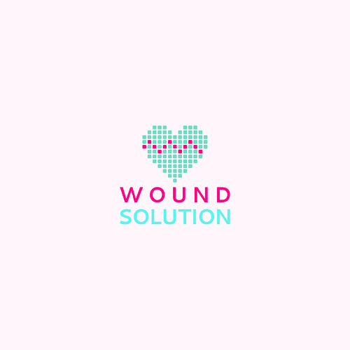
Hi there i make this logo for a health corporation and this is the brief:
The logo is a health related corporation which uses technology. Most is web bases. Font or typography is more important for me. I like formal clean designs. An abstract symbol or symbol with corporate name initials are welcome. Corporation name is: wound solution
That’s not a proper brief.
Wound like a clock?
Or wound like a gash?
I agree with PrintDriver. Wound has two completely different meanings. Which one does this refer to?
If it’s wound, as in being hurt, cut or injured, are you sure a heart is the best symbol? This implies that the organization is involved with heart disease, but there’s nothing in the brief about that. If it’s wound, as in the past tense of wind up, this solution misses the mark entirely. Based on the brief you shared, there’s no way of knowing.
In addition, why is there a light pink background? You can never be assured that the logo will be used on a light pink background. A logo needs to work on both light and dark backgrounds (which often means two versions of the same logo), but placing it on a specific light pink implies that you want it to always be seen on that background, which will likely not be the case.
Why have you used two separate greenish-blues in the logo, when one would have worked better. The color used in the word SOLUTION is also an RGB color than would never print in CMYK.
On a positive note, I do like the simplicity of it.
A few things I would like to see:
- Can you share what this logo would look like in a single color? It is difficult to assess the quality of a design when the colors are this distracting.
- Can you share what the logo would look like in different sizes? I think the dots in the heart would get difficult to see if it had to be scaled down.
- Reconsider your font choice and/or fix the kerning.
- Your color choices are not high enough contrast.
- I’m assuming Would Solution is heart-specific? When I think of wounds, I think of them on the skin. I’m not sure if the icon is attempting to show a heart rate monitor or is a fracture line. Either way, I’m not sure a heart is the best icon to represent wounds.
Quite honestly I don’t like the word wound altogether. Even if the client does read it correctly, wound makes my think of an open, bleeding, gash in the flesh. Not something you want your clients to think about when they picture your company.
I’m not apposed to the heart concept. I think it represents both health and tech pretty well.
