Critiques welcome. If anyone would like to learn the technique for the background I can provide a good link.
1 Like
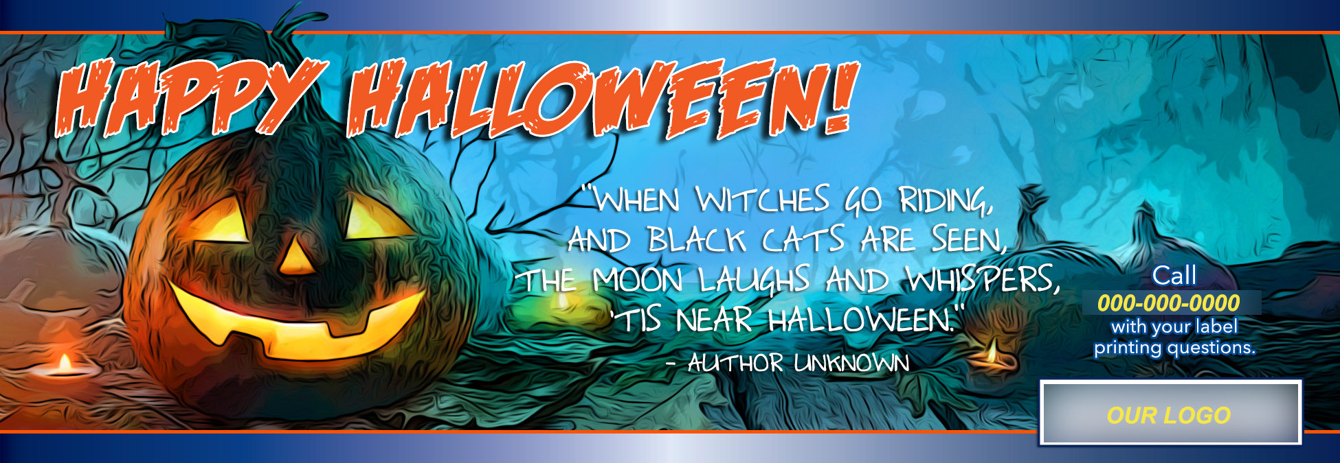
I love the illustration because of the vibrant colors and balanced composition.
1 Like
Thank you. I’ve been spending a lot of time on color tutorials lately.
1 Like
It strikes me as very RGB (which maybe doesn’t matter if this is a web banner ad.)
The color is very nicely done.
Did you illustrate it too?
No, the illustration is shutter stock. I used posterization to make it comic book style. The colors were a lot of techniques that I was trying out for fun. It’s def RGB. We use these for Facebook.
When I first looked at your banner I thought wow nice illustration and then I saw it’s an edited photo. I would never put a filter like that on a photo.. the colors are nice though, you did kind of get the comicbook style I suppose.
Never say never.
The filter works for this.
I like it too, although I would say readability (of the white text) is borderline, especially where the 3rd line crosses color transitions.
1 Like
I don’t agree, it looks cheap.
It’s like putting a ps lens flare on a picture, and that is also not done.
Just a rule if you want your work not to look cheap.
There are no “rules”
but each is entitled to their opinion.
You’d be surprised that there are actually real, legitimate uses for lens flair.
Don’t fall into the trap of buying into the hate just because it is today’s meme.
Someday Comic Sans may be just the font you want to use.
A designer applying preconceived notions with a broad brush may judge it as cheap looking.
The target audience who might look at it analytically for all of 0.353 seconds, may judge it as moody and elaborately detailed.
A label printer posting a Halloween-season ad on Facebook isn’t an upscale investment firm trawling for whales.
There’s no shortage of “cheap looking” graphic design obviously cooked by plugin jockeys. I wouldn’t have instantly classified this as such.
Thank you to those who stood up, but I got this.
Fae: I think this might be an opportunity for you to learn the difference between critique and criticism.
Critique points out specific design issues to help the designer learn ad improve.
Ex: “The flame from the canal on the left side is making the text a little difficult to read.”
Criticism is open ended and only self-serving. These sorts of comments have no value at all.
Ex: “It looks cheap.”
Also, having worked on the other end of the scale for a long time, I can tell you lens flares and all sorts of “no-no’s” are used by people who understand how and when they are needed. If you can’t use them, ok, but that is your issue to work out, not mine and has nothing to do with the piece above.
Btw, it’s Halloween. It’s social media, not print. The target market is parents of 6-12 yo’s. Bright colors and a comic book style sort of seem like good ideas. I guess I could go back and make a gilded bronze on a burgundy background, but I might miss the target…
Well to be fair, you did expressly ask for poop.
I was thinking exactly that as I wrote it. Fae is actually the only one who follows my instructions lol.
I didn’t want to be too rude, but the tone of his/her post is common on the internet. So I took a couple very mild swipes back but really, why bother?
It’s an edited illustration actually.
About the design:
The office loves it. They are not artists. I am not looking for “oh cool” from other artists, but critique - because I want to get better every single day. This is not a portfolio piece. I am looking for that one nugget of information that opens the door to new experimentation and learning.
About Lens Flares:
I can make a diamond from scratch that looks more “real” in print than an actual touched up photo looks. Lens flares are integral to the jewelry business and are only “not to be used” as a standard lens flare filter setting or if the lens flare becomes it’s own design element.
I used to color correct diamonds and gold. If you look at the top 20 jewelry stores in the US (except Helzberg) there is about 1 in 5 chance they have one or more of my pieces in their promotional material. My company made a killing selling our library of color corrected “standards”.
In Austin I have a billboard that is 48 feet long with 10ft tall diamond solitaires (engagement rings) that look really friggin’ good. Guess what? Tons of lens flares in there…
Agreed. I see at least 4 focal points that shouldn’t be there. But these ads are quick and dirty.
Finally, one must realize advertising in posts on Facebook is forbidden. So the “push” has to be toned down a lot and the message is one of customer relation. We are not selling our printing. We are selling the holiday, which is for kids.
I think I’m the one pooping today with all this verbal poopiness. So bored. Slooooooowwwwwww day.
^ This
The busy background detail behind the text interferes with its legibility. You might want to try bolding the type and somehow toning down the detail in the area behind it.