Hello - you don’t know me but you put your portfolio in view of everyone.
A bit about my critique style - I focus on the negatives, the positives are not helpful for you. My biggest lesson in design was to ‘focus on what’s bad not what’s great’ - there’s often greatness in front of you but there’s also something wrong. And I only focus on what’s wrong.
First thing I notice, the print and bleed marks and the colour bars.
They are not needed, even for print, you don’t include bleed marks or colour bars, this a printers perogative, they might require them, but in 25 years I’ve had 0 use for them except in a prepress setting, any designer that sends these they are disregarded.
Next up are questions of how much of this work was conceptual versus client-driven. Seeing projects “born in a classroom” is perfectly fine, especially for a student portfolio, but clarity is key.
For example, the “Old Bag” concept is fun, and “Art of Murder” shows some interesting motion graphics exploration. However, it would be helpful to distinguish these clearly as conceptual exercises. In the professional world, designers often navigate real-world constraints like client briefs, budgets, and feedback, and it’s great to see how those skills are developing too.
That being said, there are definitely strong points. The “Raleway” booklet demonstrates a good understanding of typography, and the “Keep Track” campaign is a compelling project with a strong visual language. Maybe it needs ore context.
Where’s the story behind the design choices?
What was the original brief or objective?
What specific problems did the design aim to solve?
Instead of just showcasing the final product, it’s valuable to demonstrate the viewer through your design thinking and process.
Think back to those pesky math classes, you only get partial credit for showing the right answer, you lose marks for not showing your work method. You get more marks for showing the correct working equation even if the answer is incorrect.
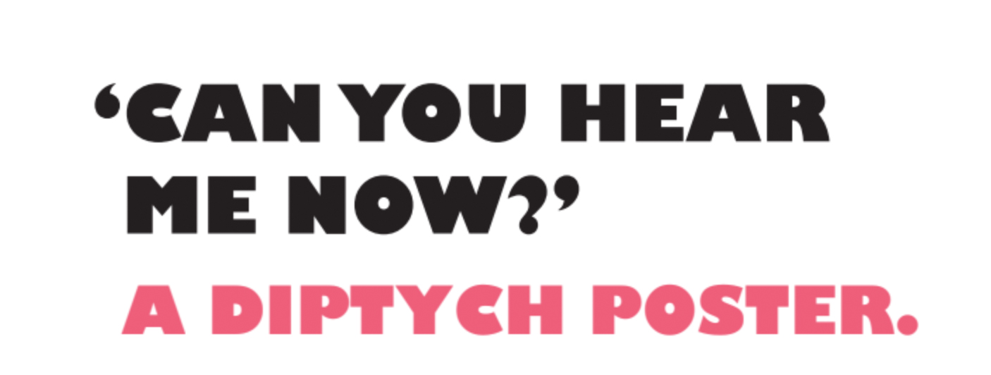
Some of the project descriptions could be strengthened by adding more depth. Take the “Can You Hear Me Now?”, it’s visually engaging, but explaining the design rationale beyond “I liked the song” would provide a richer understanding of your creative decisions.
Regarding the CV, I appreciate you’re highlighting your communication skills, and everyone’s career journey is unique. However, in a design portfolio, the CV is another opportunity to showcase your design abilities. Presenting it with a bit more visual flair could create a stronger and more consistent overall impression.
To take it to the next level, focusing on these areas could be beneficial:
Reframing the narrative: Emphasise the “why” and the design process, alongside the “what.”
Highlighting constraints: Even in student projects, discussing limitations and challenges shows valuable problem-solving skills.
Refining for digital: Ensuring the presentation is optimized for digital viewing is key.
Elevating the CV: Designing the CV to reflect your design aesthetic.
Curating strategically: Being selective and prioritizing quality can make a portfolio even more impactful.
There’s a lot to work with here, and with some focused refinements, this portfolio can be even stronger.
Lastly - good work - you CAN do it.
(p.s. stock images are fine - but you’re saying you’re an illustrator… you need to clarify what is stock photography/images/AI generated and what you specifically illustrated… do not think this went unnoticed)