Hi all,
I’ve recently redesigned my portfolio site and I’m looking for general feedback on my design work. I’m also interested in feedback on the site itself.
Thanks!
Hi all,
I’ve recently redesigned my portfolio site and I’m looking for general feedback on my design work. I’m also interested in feedback on the site itself.
Thanks!
Hello @anon38999867 in general I like the simple and easy to use design, all the buttons work correctly, with respect to the buttons my only recommendation would be that when you click on your logo “Kelsey Spurlock” direct me to the home page.
About your work section personally I think that that you can improve it, I would give more scope between the projects and the nav, and I would change to a title the image that says “This a collection of graphics works by Kelsey Spurlock” and I would place the works below.
Will add more separation between your projects because when I look at them I find that it is a lot and I do not know where to focus, I do not know what I am seeing clearly, it seems similar to a page of stock images.
I hope you find this helpful, saludos!
– The site is pretty straight forward and easy to navigate.
– Pleasing color scheme.
– I don’t like that the two copy blocks (one starting “this is a collection…” and the other starting “Kelsey is a…” show up as portfolio items. No need for either one of these.
– The about me section is too self indulgent to be useful. I think a prospective client would be more interested to read how you solved your client’s problems and about the ROI your clients get from your design work than reading about your wedding and cats.
– I’m not crazy about the portrait. It’s fine to have a portrait on the about page, but the lighting is a little flat and it needs more contrast. Also, it looks like you’re looking down which suggests a condescending position.
– I’d alter the color scheme and type on your resume so it more closely ties in with the website.
– Why did you elect to do a personal site over having a site for your business The Tiny Juggler? I think you need to think about who you are, what your goals are, how you want to present yourself to the marketplace and then refine your message as needed.
– Your portfolio is only as strong as your weakest piece. In this case, I don’t think the little monster illustration is particularly strong. I’d cut that one.
Hope that helps.
Thank you both. I’ll take a look at these areas keeping in mind your feedback.
You’ve placed two spaces after periods. This might be OK in a high school keyboarding class taught by a teacher whose teacher taught her to use two spaces, but it’s not OK in the real world of design and publishing.
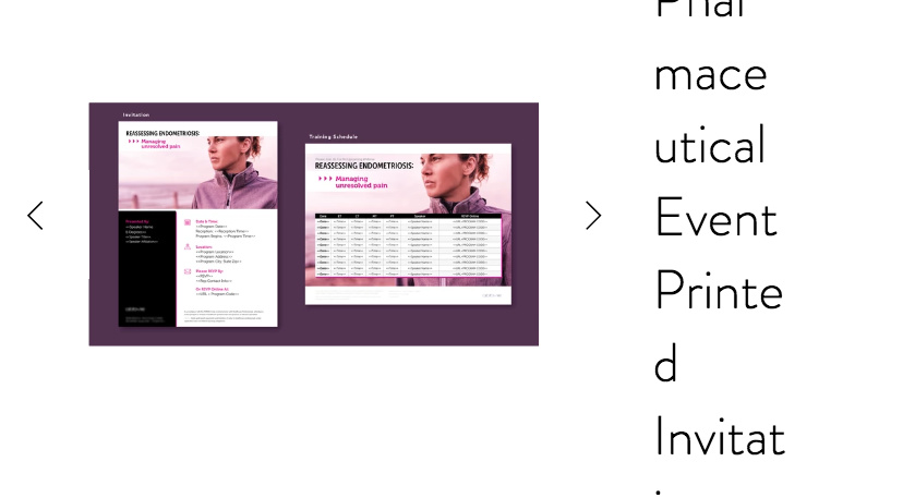
Your work is a bit inconsistent. For example, your endometriosis invitation/schedule is nice, clean, simple, well-organized and has an attractive and appropriate color scheme. However, right beneath it, your real estate ads look more like they were put together by the realtor than a designer. As Steve said, your portfolio will be judged by your weakest work.
The pages that come up when one clicks on the examples are wonky. The layouts look fine when viewed at desktop sizes, and they look fine on a mobile phone. However, on a desktop machine, the layouts reconfigure themselves into something less than idea at anything less than desktop widths. See below.