Portfolio Review (Feedback is appreciated)

(Accidentally deleted post before)
Hello I am new to this form. My name is Noah Weller and I am a recent graduate with a bachelor of design in interactive & graphic design. For almost a year now I have been looking for my first graphic design job and I have been unsuccessful. I recently had an internship but alas it did not end up working out. If you have any tips on gaining more experience and how to do so that would be appreciated. I am stubborn so it took me a while to gain the courage to ask for help but enough is enough. I realize that I need to do this in order to better myself.

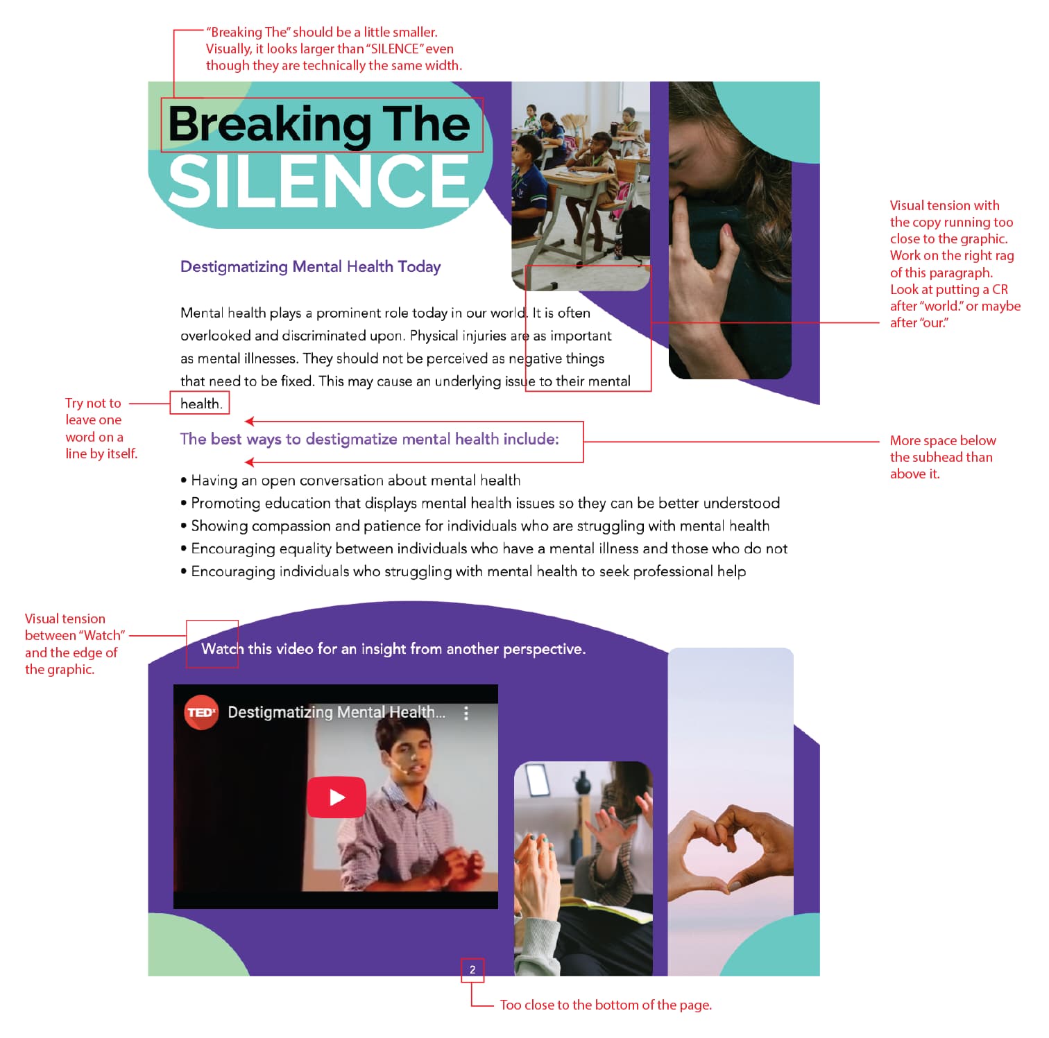
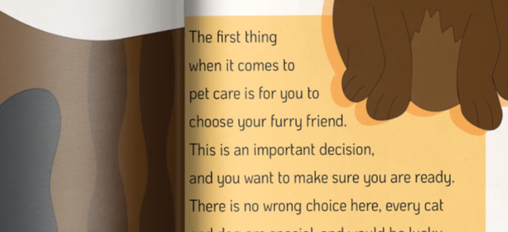
The main reason I created this post though was to gain insight on my portfolio. Whether it is positive or negative. Lay it all out and don’t be afraid to be critical of my work. Please be as truthful as you can. I wanted to do this to get feedback on what other designers think on what I can improve or change. If you have any suggestions or just comments, feel free to reply. Thank you.

You can view my portfolio at https://www.nwellerdesign.com/

1 Like

Noah, welcome to the forum, and good for you for putting yourself out there.

Unfortunately, I see two things in your portfolio. First is your lack of experience, and I recognize the conundrum of how to get experience if you don’t have experience. The second, which is a bit more troubling, is a lack of understanding of good layout and typography. I think you need to spend some time working with a mentor to polish your design skills. I’m not saying that you can’t be a great designer, but it’s going to take some work to get there.

I don’t have time to go through all of your work, but I took just one page from one project to give you an idea of what I’m talking about. I hope this helps.

Hello Steve, I really am trying to put myself out there more even if its uncomfortable.

I really appreciate you taking the time out of your day to reply. I feel like for the experience part its kind of hypocritical that most jobs I see posted online require experience but where exactly are you supposed to get that experience from then? I will for sure be looking into internships and other work I can get. But internships are for the most part only for people still in college, at least from what I’ve seen. It really is such a conundrum, especially because I don’t know what direction I’m supposed to go in.

While a bit nit-picky I get where you are coming from and I always felt a bit behind and am always comparing myself to other designers. I appreciate all your critiques and will definitely take them into account when designing in the future. How exactly would you go about working with a mentor? Where would I be able to find one? Let me know your thoughts. Thank you again for your response and I hope you have a good day or evening.

Here’s the thing, my comments weren’t nit-picky; they were very fundamental in nature. There are a number of seasoned designers on this forum that would have called out the same things.

You are welcome. I hope my comments help you improve.

Best option, in my opinion, is real life. Is there a meetup.com design group in your area? Networking events? Local ad club? Local AIGA chapter? You’ve got to put yourself out there, make connections, and see what sort of relationships you can develop. Ask someone if you can buy them breakfast in exchange for taking a look at your book and giving you some feedback. Most seasoned designers I know are pretty happy to help others.

1 Like

Now that I am looking at it they weren’t nit-picky, I guess I never really noticed the errors. I apologize if that came off as rude. I appreciate your feedback and will take it into account. I’m going to look into networking with others and take your suggestions to heart. I find networking difficult, but I realize more and more that it is kinda essential to do not only in graphic design but in general. Thank you again for the honest words and for giving me good advice. It means a lot!

1 Like

I agree with everything Steve wrote. They aren’t small things. They’re the things that will cause art directors to pass you by in favor of those who don’t make those mistakes.

Here are three more mistakes that are similar to those Steve mentioned. Your work is littered with these kinds of errors — ones that would cause an art director like me to pass you by. I’m not pointing them out to be mean; I’m pointing them out because you need to fix them and stop making the same mistakes.

What’s with the backward-slanted John’s Furnish typography? Was this intentional, or do you have trouble with perspective? I’ve fixed it, but this kind of mistake is a deal killer.

Have you heard the terms bleeds and safties as they relate to printing?

You can’t position typography right up next to the trim. Looking claustrophobic is one reason. The other is that it might get sliced off when the printer trims the paper. You must move everything in at least 1/8 inch (3 mm) to avoid the risk. This inside margin is called the safety. If you want something to extend right up to the trim, you must extend it beyond the trim by 1/8 inch. This outside margin is called the bleed.

Both bleed and safety must be considered on anything that’s printed. Of course, your examples show a trimmed card, so the bleed was trimmed off. However, it does show that you’ve ignored the safety.

I’m not going to explain it better here, but watch every YouTube video you can find on bleeds, trims, and safeties until you fully understand what they are. Once again, this is a deal killer in a portfolio that will instantly get your resume rejected.

Have you heard the term gutter as it relates to printing? The word refers to at least two separate things, but the one I’m referring to is the meeting point of two facing pages. You can’t have typography down in the gutter of a book or magazine because it makes reading difficult and risks breaking the binding.

You have a habit of jamming typography up against trims, edges, and other graphics. Typography needs to breathe. Unless you intentionally aim for a design with claustrophobic tension, it needs a comfortable amount of space around it.

1 Like

One more thing. I really like the cat pillow and patterns. Nice!

I have to say, I quite liked them too – though not much else, I’m afraid – for all the reason you and Steve_O have pointed out and more of the same.

The only thing that struck me as a bit odd with. The cat one, was that it was based on his black and white cat, but the cat model was a Ginger Tom.

To the OP. I am a little bemused by your degree, as you say on your resume that I started in 2024. It’s only 2025 now. How you you fit a 3-4 year degree into one year? I don’t know the course or the university, but there appear to be huge gaps in what you have, or rather haven’t, been taught that I would have xpcted from a full degree. Was it done online, with no lecturer and peer critiques.

If I am honest, your whole portfolio seems as though it is from someone who hasn’t done a degree course. I am not trying to be too damning here, but I think your standard is not what I would expect to see from a graduate portfolio.

As others have said, find a mentor. Even post individual pieces here for critique – beware, they may be brutally honest, but it’s the only way you learn.

Learn from the greats. I assume you’ll have had reading lists given to you?

As it stands, if your portfolio landed in my desk, it would have ended up on the NO pile, I’m afraid. Too many gaps and glaring holes in your knowledge.

Sorry, not what you want to hear, I’m sure, but it’s that brutal honesty I was talking about. All intended to guide you in the right direction, not dishearten.

Good luck.

1 Like