Portfolio Review Request

Hello! I’m new here and wondering if I could get some eyes on my portfolio.
I’ve been looking for a new role for a while now, getting interviews here and there but that’s about it.

I’m primarily interested in branding/packaging/illustration but thinking about trying to freelance and paint murals.
Anyways, here it is:
https://laurakomdeur.myportfolio.com](https://laurakomdeur.myportfolio.com/)
Thanks in advance!

1 Like

Dang! It is so nice to see top-notch, quality work. It gives me hope for the future, considering all the crowdsourcing, Canva, and amateur work flooding the market.

I have no criticisms, which might be a first for me. Why you’re getting interviews but no job offers (so far) probably says more about the places you’ve applied than your work.

I agree, you have nice work. I’m not sure why you aren’t getting more interviews and job offers. Maybe the local economy?

You mentioned the possibility of freelancing. As a designer that has been self-employed for over 30 years, I’d caution you on this approach. I’m not saying don’t do it, but know what you are getting into. With DIY solutions for non-designers (for example, Canva templates), crowdsourcing and contest sites, and a lot of companies placing less value in the assets a seasoned professional brings to the table, freelancing can be a tough way to go. I consider myself fortunate in that I have established clients that use me on a regular basis. You will need to be comfortable with the sales side of things to be successful. Not saying you can’t do it, just making sure you go into it knowing what to expect.

Agreed with Just-B and Steve-O. Overall it is nice work. The following is not a criticism of the overall quality of work which IMO is pretty top notch. But just a few things that I feel can possibly enhance the site. Just my 2 cents.

The landing page is not needed and IMO detracts from the quality. What I mean is the default page with your photo tiled in the background and the text, “Hi, I’m Laura!
Graphic designer, illustrator, muralist, nature & dog lover. Welcome to my portfolio!​​​​​​​”. Kind criticism here, but that landing page was so basic and poorly designed that I was expecting much more amateur work. Basically that page, IMO is unnecessary and detracts from the overall quality.

The Tall Post Cider page. The bottle design was odd. I was expecting the illustrations that were so prominent. The text even says that instead of one generic bottle label that you created individual labels, but all I see is a very generic bottle label. Where are the individual labels? Also, fairly minor, but “skus”, IMO, should be SKUs in the intro copy.

Also, I wish there was a little bit more info on all of your pages (such as the Objective and Scope text that you included for the Tall Post Cider page). Having context helps to better evaluate the project instead of just viewing the designs in a vacuum with no info.

Also, once again just friendly criticism, but the green and packaging for Tanner Bros Ice Cream made me think it was butter or lard rather than ice cream.

With that being said, overall you have very nice illustrations and a very good sense of typography and balance without being cluttered.

I will say that the brochures for Can Am and much of the work under Print Services is okay, but less nice as much of your other work. And I think that is okay. It showcases that your strength is really your illustration work, and more organic products. While the brochure work is ok, it certainly isn’t as strong.

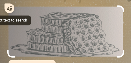
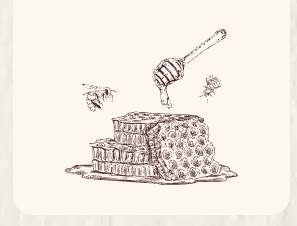
If you are looking for positions with companies that your strengths would work for, IMO, you are solid. But doing things that are more corporate and less personal are probably not where you would shine. Could you do the work? Sure, but I feel that you’d be happier working on projects more along the Cider, Honey, Keeper Kids, Wedding Invites, etc.

But, once again, all in all. Really nice work. Best of luck.

1 Like

thank you for your time!

good to know, thank you as well :slight_smile:

Really appreciate the feedback and am making changes now.
I totally agree about the Tall Post bottle… unfortunately the owner ended up cheaping out on the paper labels and in my opinion they could’ve looked better, hence me not including them. I’ll definitely make it more clear though

Bummer on the Cider Bottles. I’d consider making a mockup of the intended personalized labels as well to show them off.

If I were hiring, you be firmly on the ‘yes’ pile, somewhere near, if not on, the top. Nice work. Where are you applying? Aim high. Some of the London studios I worked in (a good few years ago now) received submissions far below this standard.

I see you are not far from Toronto (I had an aunt who lived in Mississauga). Find the studios you want to work for, find the art director’s name and contact them personally. It’s about getting your work under the right noses, rather than applying for advertised positions. Sometimes positions are created if someone is good enough. In my opinion, you are.

As others have said, it’s refreshing to see credible, serious work these days, as opposed to what has become the de facto offering of regurgitated templates from people who have no idea what they are doing.

Keep at it. You’ll get there.

3 Likes

thank you for the advice! Appreciate it

One thing that really bugs me is when I find the same image used by another company and i just think it’s really the worst.

I tend to go through detailed image searches when looking at portfolios as I got badly burnt in the past by swallowing an amazing portfolio only to find out the person didn’t live up to those standards and worse, they copied items in their portfolio to pass off as their own.

Screenshot 2025-01-13 at 12.50.29

Screenshot 2025-01-13 at 12.50.42

For me, all though your work is quite nice, and I wish you well, but for me, this wouldn’t put you at the bottom of the pile - it’s straight into the bin.

Sorry.

1 Like

Fair enough, honestly. This project is from when I was fresh to the design world and clearly not using best practices while rushing to get jobs out the door, which is no excuse though. Thank you!

Don’t worry, I should have ended with “this is a safe space.” It’s okay to make mistakes that’s how we all learn.

One thing that can really help your portfolio is explaining your role in the project and the scope of your work. Was it a school project? A design job where you were given supplied graphics? Adding context makes a big difference.

There’s nothing wrong with using stock images for products. It’s only an issue if it’s part of a logo. If you’re using a stock image for a product, you can approach the designer on stock sites to request usage rights. I’ve done this before, gotten exclusive rights to stock images and even had them removed from further sale. It wasn’t too expensive, and I passed the cost to the client with a small markup for myself.

Remember, you’re competing against a lot of candidates for the same position, so everything in your portfolio is under scrutiny. Don’t get discouraged, your portfolio shows good work.

That said, one common issue I see in portfolios, not just here but elsewhere, and submitted to me as a job application, is taking work and passing it off as their own. It’s not okay. It breaks trust between you, your clients, your boss, and the company. Trust is everything in this industry, so it’s important to be transparent.

Keep going, you’re on the right track!