I think the following sample is a good of one that would benefit from supporting copy. Because you appear to have illustration skills I’m left wondering if you did the artwork for the beer and bug in this ad.
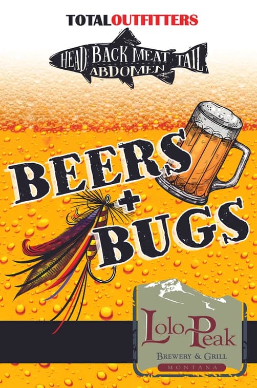
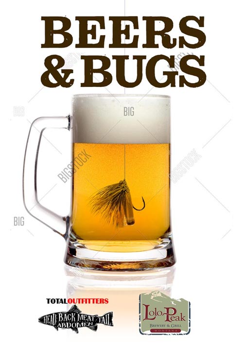
The illustrations are good, though the layout doesn’t make the message as easy to grasp as it could be. I didn’t get that this was some kind of joint event between Total Outfitters and Lolo Peak until I studied it for a minute. A clearer message, and more even representation of both business might be something like the following.
More isn’t always better and superfluous visual information, like the beer in the background of this ad or the abstract art in the background of your website portfolio, hinder rather than aid communication and the purpose of the communication.
And yeah, fly fishing bugs float. It’s just an example.