Alright, I know this is going to hurt, but I’ve got to buck up and do it, if only to temper my expectations better to reality.
I’ve started searching for a new job. I’m hoping to land something where there’s a bigger focus on design quality, instead of quantity/speed like most of what I’m currently doing.
I know I’m at a disadvantage in applying by not having a bachelors or masters degree - as much as I would like to get that extra schooling, it’s just not possible for me with the way things are right now. So most of my pull is going to have to come from experience and my portfolio.
If you’re interested in helping, would you look over my portfolio and let me know if there’s anything you think I should add/remove/improve upon? A marketing professional friend helped me set it up to help make sure I didn’t make any blatant mistakes, but I’d like the opinion of experienced designers on if I’m shooting myself in the foot, either in what I’m displaying or how I’m displaying it - as well as what sort of positions/levels you think might be a good fit for where I’m at. I’ve been shooting at entry level and associate design positions. Though a lot of listings are for senior designers, and I’ve been applying for those, too
I’m putting on my heavy sweater, but I’m still very nervous about the whole thing and trying to hold back on preemptively defending every choice I made, so if you can be gentle, I’d appreciate it a lot.
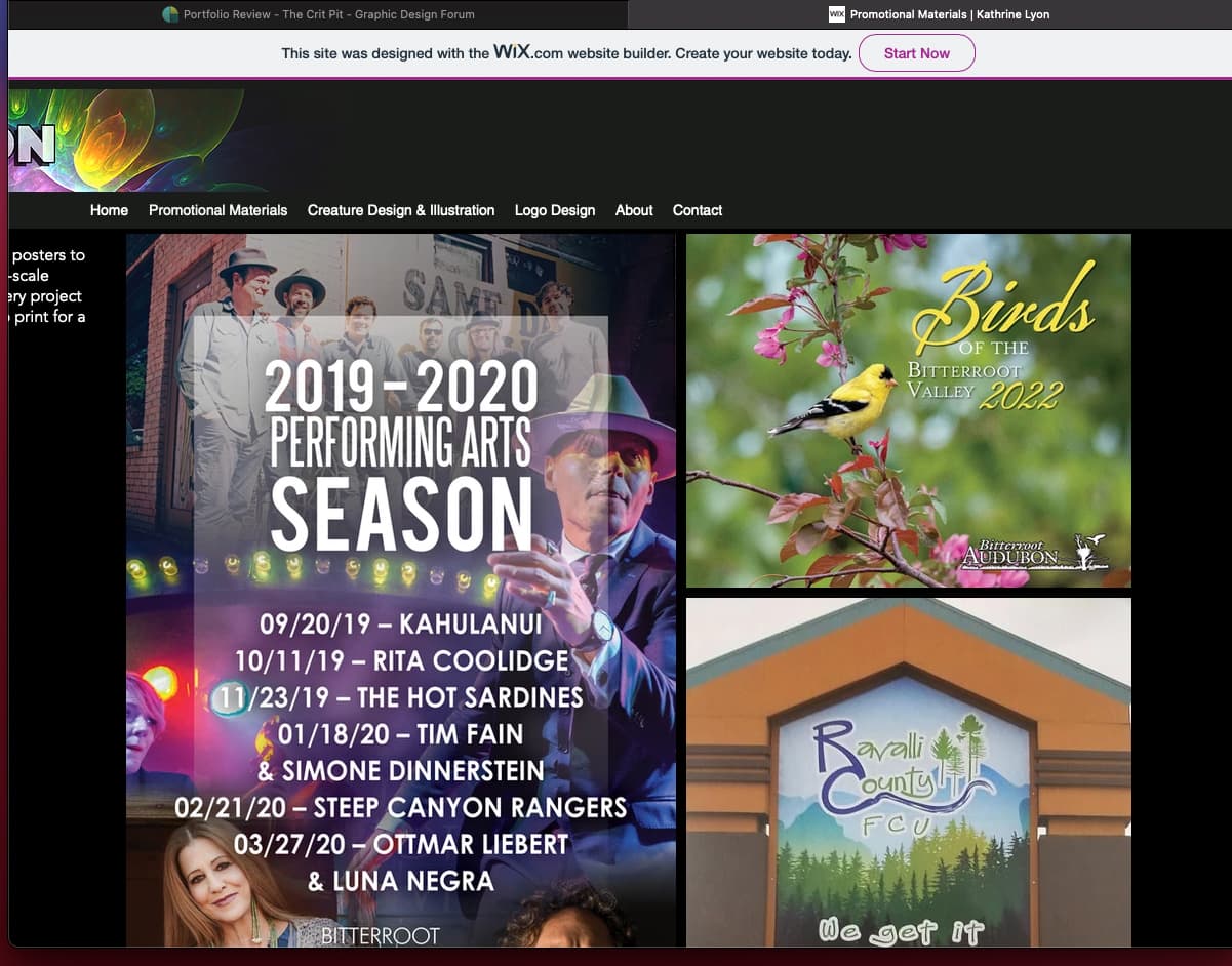
As you can see the name of the site and description are clipped.
Having only a few logo designs I wouldn’t even show that category by itself. I’d recommend adding more samples or placing the ones you have with a general group of samples. You don’t want to highlight a weak area.
The promotional materials category would benefit from explanations for each piece. What you did on the project and the reasons for that solution. This will help potential employers and allow you to show your design thinking.
The About copy definitely needs work. Something about calling yourself a “professional” is odd, as though there’s a question of your being a professional.
You say you’re a design professional but then immediately list experience in customer service, pre-press, and admin. That experience is good to mention, of course, but if you’re looking for a design position ya gotta make that very clear and speak as confidently as you can about being a designer.
You mention specialization and then list a broad group of programs, a broad type of illustration, and concept creation (another broad type of activity).
Also, you might want to be more specific than expressing the wish to join a creative team and create compelling stories. Rather you might say compelling brands, etc.
Anyway, overall it shows you have talent but the presentation doesn’t show it in the best light.
I had a quick look – and this is by no means a comprehensive critique, as it is 11.30 at night and it’s been a long day.
My first thought, before I even looked at anything, was ‘get a domain name’. The wix url is never a great look.
Then when I got to the site, my overall impression was huge logo, massive background pattern hiding the fact there’s not a whole lot of substantial work. No explanations on any of the work to outline the problems you were solving and how you solved them. I did eventually find a brief description by clicking on an image, but far from comprehensive.
If I am honest, your typography leaves a lot to be desired and you will be up against people who do have the degree and who will demonstrate a better understanding of type, hierarchy, layout and the use of white space.
Your logos illustrate that you don’t really understand what logos are. I am immediately turned off when I see a category entitled, ‘logos’. On their own they are fairly meaningless.
I quite like some of the creature illustrations, even though they are a bit derivative. These are your strongest work.
Overall, the site and a most of the work wouldn’t immediately have me sit up and take notice. It doesn’t sing out to me, I’m afraid.
Sorry, not sugar coated in anyway, but sugar coating never helps anyone.
As others have mentioned, there are problems with the Wix site, but that’s par for the course for Wix. I’m not sure what’s doable in Wix, but, if possible, you probably ought to fix those glitches; they’re the first thing an art director would notice.
You seem to have a Catch-22 problem. You mention wanting a job where quality is stressed a bit more than quantity, but your portfolio is dominated by work where quality took a backseat to a get-it-out-the-door retail ad look. Unfortunately, there needs to be more in your portfolio that suggests you’re capable of the kind of work you want to do.
Your creature designs, however, are excellent! I’m not really into fantasy art, but that doesn’t stop me from admiring the talent, skill, care, passion, and time you put into them. The Molten Wartoad and Paradise Zalis are wonderful, as are the simpler ones.
I’m guessing you did these illustrations on your own time rather than at work. If you want to impress an art or creative director, your portfolio needs to demonstrate that your design work potential equals your illustration abilities. You might want to redo several of your designs to reflect the kind of work you want to do for the job you want to have.
A logo doesn’t need to be meaningful to show good design, at least in respect to the purely visual aspect. In any case, words can be used to explain the meaning or brand. If words fail, I suppose a descriptive video or full length documentary could be produced for each sample, just to be sure the meaning is firmly grasped, though some might find such overkill off-putting, and we wouldn’t want that.
Ah, yeah, oof, that’s a big turnoff. We were checking on two pcs but didn’t check a Mac. Definitely looks like I’ll want to try something else, because if that’s how I’m showing up that’s very much not okay, yikes.
I’m going to take a bit to read over and think about how to address the critiques from everyone and look into some other hosting options. Some of the notes are things I thought myself when putting it together.
I’m glad my illustrations are landing well, though! Character design is one of those things I really would like to do some day, but it’s a very limited field.
I have to beg to differ here; it absolutely does. If you want a job producing quality design, you need to demonstrate that you understand that logos are not solely about being visually appealing. Of course aesthetics are part of it, but not, by any means, enough. As a potential employer, I would need to be confident that someone understood what design is about, beyond the recently pervasive trend of making ‘cool’ logos. Usually, this is the differentiator between having the formal education and not, which is why it is often banged on about so much around here.
… and there lies the rub. They are part of a brand identity and not stand-alone decoration. I agree, using words to explain is a good idea. Without context, they are just about pretty, which is why I said that a category on a website, entitled, ‘Logos’ rings alarm bells.
Fortunately, in this case, words don’t fail; ease upon the sarcasm. It’s not helping.
Being expert in a specialist field can be a good way to go, if you have the passion and talent.
I have a niece who loves exactly this. She bust her guts, got herself educated in exactly this area in London and last year (after a few years working in more minor roles) ended up designing characters and doing rigging for the BBC’s, His Dark Materials.
It’s all possible if you are good enough and tenacious enough. Education is key though. It’s always about the sacrifices we are prepared to make in order to achieve what we want. That’s why you need the passion to drive it and see you through the tough parts.
You’re not making sense. No one said anything about “stand alone decoration”. If words can sufficiently convey the meaning of a brand and its association with a visual representation, a.k.a logo, and words can be presented with logos on websites (they can be), then there’s no rub, no need for alarm bells, and no reason to beg to differ with me. It’s also not dignified for a grow man to beg, I will add.
Congratulations on deciding to go for the job you want! I’m also in a job transition right now and I think people forget how daunting and frustrating the search can be.
I agree with other people that Wix is not a great tool for a portfolio website. If you want to stick with free then do a google search to learn what other website hosts are out there but specialize in displaying portfolio items. Like Behance used to be free. I don’t know if it still is.
Then buy a domain name and point it to the host you pick for your website.
I know all of the above can take some time and you’re probably trying to apply for jobs as we speak. A quick fix I would do on your current site is make sure every image when clicked on displays the job name, year completed, and more content if you can. I saw one titled “something something.jpg” that definitely needs to be updated.
You put yourself out there for a review, so good for you for that. My comments here are designed to help you. Please keep that in mind.
As others have said, the site needs to be fixed. There are scaling problems, and it is not responsive. Also, the social media links in the footer appear to point to Wix social media instead of your own.
The personal branding needs to be more focused. You have the K.A. LYON and the illustration in the upper left corner, then you have the KATHRINE LYON and the dragon logo as the hero on the home page. They are competing against each other. This tells a perspective employer that you don’t understand branding.
You say that you’re looking for a job that emphasizes quality over quantity and speed and that you don’t have any formal training. Unfortunately, the lack of training and doing work that emphasizes quantity and speed show in your portfolio.
When selecting pieces for your portfolio, keep in mind that you’re only as good as your weakest piece. With that in mind, you need to work on your portfolio. I’d suggest two things. First, edit it way down. You are far, far better off showing 10 solid samples than 20 samples that includes 10 good pieces of work and 10 so-so pieces of work. Second, there is no reason you have to show the work as it is. Meaning this. If you feel all (or some) of your work is hurting because it was rushed, take the time to re-do it and show it as you’d prefer: that could mean tweaking the work or it could mean a complete redesign.
I think these changes need to be implemented before referring potential employers to your site. As it stands, it would only help you with a lateral move — not an upward move.
Am a little confused by your portfolio - are you applying to be an illustrator or designer? I would recommend picking the one that you’re passionate about and leading with that and omitting the other stuff altogether. There’s a great video about this here:
Similar to @Steve_O, would agree that you’re going to be judged by your worst piece, so would recomend filtering everything down to your top few best pieces.
And as @sprout mentioned, would definitely dedicate more time to describing the problems and how you were able to solve them. Would probably consider dedicating about a page worth of content to this rather than just showing work with no description.
Get rid of the psychedelic patterns - especially the backgrounds.
I think you need to get someone to help you with your website design - if you have a mate that can do this, would totally recomend hitting them up to give you a hand. If not, would do as @IzChik says and get on Behance and delete the current site.
I have not checked the site, but I will here in a bit. But I know people have called out using Wix as a possible sticking point, you may want to consider using Adobe’s portfolio website which is free to Creative Cloud users. I haven’t used it, but I would think it would work well.
I disagree that the argument on this subject is as clear-cut or convincing as Chris Do and others make it out to be.
I agree that one can’t be great at everything and should focus. I also agree that some people make a good living by specializing in a niche.
As Do mentions in the video, if one is looking for a math tutor, a tutor specializing in math has an advantage over someone who tutors students on everything from math to history to football. However, the benefits of specializing too tightly need to be weighed against the smaller client base accompanying specialization. There’s a difficult-to-pin-down sweet spot between the extremes that depends upon a thousand variables.
For example, in my previous management roles, when I looked for someone to fill a graphic designer role, I would look for someone flexible enough to handle the variety of work that this position required, which was more often than not, a little bit of everything. If the job primarily involved print catalogs, I’d look for someone with that specific background, but this person would also need the well-rounded set of skills required to take on other design tasks that came along.
When choosing the right person to hire, I would narrow down the field d to two or three candidates of roughly equal aptitudes and skills. The deciding factor would often be a side skill. For example, when searching for a graphic designer, a designer’s side talent in illustration, video, or photography would often be the bonus that clinched the job.
On the other hand, when I looked for a contractor to do a one-time specific job, a specialist in that particular job would have the advantage. Even there, however, I preferred to hire someone well-rounded and capable of seeing and considering the bigger picture of how his or her piece of the puzzle was a component that needed to integrate seamlessly with everything else.
In my solo practice, new clients usually hire me for specific tasks. Clients might hire me specifically to design a magazine, but their next request might be to design the social media campaign for an unrelated project a couple of months later. However, as those clients transition into longer-term relationships, my ability to competently handle other types of design work inevitably plays a role in solidifying the relationship. My ability to demonstrate to clients that I’m not a one-trick pony leads to longer-term clients rather than a series of one-time gigs where I only do one thing.
I’m tempted to provide a dozen more examples of arguments for and against various degrees of specialization, but I’ll stop here. My main point is that both advantages and disadvantages are best handled by balancing the pros and cons to arrive at that sweet spot that works for the person and situation in question.
Thank you for the feedback - I think you put everything very plainly, and I appreciate that.
I think the only thing you mentioned that I can’t address by myself is the issue with typography - I know it’s one of my weak points, as the limited education I have only grazed it and I can feel that things aren’t right, but don’t know how to fix them.
I’m not in a position at the moment where I can go back to school to get a more formal education - but can you recommend anything for me to reference? Like a book that would have been included in a course, or even just keywords to look up to find guides on my own? I want to get better, but I don’t know where to find the tools I need to do that.
Good typography is critical and weak type will always put you on the ‘NO’ pile, I’m afraid. You absolutely need to get that right. It is good that you understand that you are weak in this area. Half of any solution is knowing there is a problem in the first place.
There are thousands of books and links out there and a little bit of work on your part will easily find the information you need. A quick search around these forums will give you that information – the question has come up a good few times before. Here’s an extract I put in a post by someone asking a similar question, of some of the books from my own shelves:
You have the entire internet in front of you.
For what it is worth, at uni, type was not my strongest suit. It was a few years later that it ‘clicked’ for me, but all the groundwork we had to put in – history, hand-rendering, lettering – paid dividends. The hand rendering was one of the most useful things they had us do. Hated it at the time, but later realised how invaluable it was. Pages and pages of 10/12 Bembo, then on 14, then on 16. Hand drawing display type, etc. It all gives you an appreciation and understanding of how type works, the beauty of individual glyphs, how crucial negative space is, how the glyphs work together to form the whole. etc. Hard slog, but worth it.
These days, it is far easier than it ever was to find the information you need. Of course reading voraciously and learning as much as you can from the very best of the best is crucial, but a formal education also gives you invaluable staff and peer critiques. Without this, it is very difficult to get the kind of feedback you need. Places like this exist and you will always get good, honest critiques (even if you don’t like what you hear), but it is no substitute.
Naturally, I have absolutely no idea about your personal circumstances, but if you don’t get a formal education, unless you are one of those rare geniuses and naturally talented, then you are always going to be coming up against people who have found a way to get themselves educated. The best piece of advice I can ever give you is to get an education. However you manage it. Work you way through it, if needs be.
When I was interviewing, I’d say 99% of people who got through to interview had a degree. I can only think of one who didn’t and they had a real standout portfolio.
The advantage you have, of course, is that you have worked in a fast-paced environment (even if quality wasn’t always paramount), so you will have an understanding of production and print that many people going for the jobs you are going for may not. This goes a long way, but you need to ‘get’ type and there are no quick routes.
Here’s a link to some online videos and courses. I’ve never waded through them, and some cost money. However, typography is one of my lifelong things, so I feel reasonably confident in recommending that you watch them (with a critical eye, of course) to get a few viewpoints from people with something to say about the subject.
Coincidentally, the first one on the list is by the guy I previously mentioned disagreeing a little with — Chris Do at Futur. He’s a smart, articulate person and a top-notch designer (despite my occasional alternate viewpoints). His course costs around $300, but I can’t imagine a better online typography course if you have some cash to spare. There’s a free preview, which I watched and which gave me a good deal of confidence in this being a great course.
As Sprout mentioned, the books and video courses aren’t the same as an in-person, formal education, but you can still pick up on the basics and get a good feel for good typography and how to produce it.
I firmly believe that getting good at using type is a mandatory first step in becoming a great designer. I say this because good typography involves contending with nearly all the principles of design in ways that reduce those principles down to their bare, most obvious essentials.