Portfolio Review

Hey, guys hope y’all are well. I graduated from university this July and I’m currently job hunting to get my break into the industry. However, I would like to know if the position of my portfolio at the moment, is ready to be sent out to employers, or does it still need to be refined. I’ll be looking into internships and junior roles in and around branding, packaging, etc. Honest feedback and opinions please on how I can improve it, I’m all ears.

(I cannot link my website properly for some reason, is it a community guideline)?

Welcome Aboard :slight_smile:

You can’t add a link because you are brand new. It’s an effort to stop the massive spam we get otherwise :wink:

I fixed it so that it’s clickable now :slight_smile:

1 Like

Generally speaking, I would suggest going for cool disturbing and not disturbing disturbing.

Could you elaborate on what you mean, is this for my website as a whole? Or the certain projects? Just looking for specificity, thank you

Chelsea fans would not be happy with that. I’d ditch that project it’s painful.

The concrete is decent.

Read your copy again. Quite a few errors. One sentence trails off with our.

Reduce the text. Let the project do the talking.

I like the concrete and the passa.

First of all, congratulations on your recent degree. That’s a significant achievement.

Jumping right in…

If I were you, I’d get rid of your first page. It comes across as an animated cartoon logo you’re trying to show off as the primary piece in your portfolio.

The same is largely true of your project page. The images suggest that you’re yet another student who’s put together a bunch of logos and designed a cover or two.

Clicking any of these images leads to your best work, where you’ve thought through entire unified campaigns and designed collateral material to tie everything together. For me, this is where your ability shines through, yet you’ve buried evidence of that ability three layers deep behind some logos. In other words, the images that link to what’s behind them don’t do justice to your thought processes behind the branding and campaign work. The exception is the PASSA typography, which is pretty nice and easily stands on its own.

If it were me, I’d try to figure out a way to bring what works with the collateral materials coordination and apply that mindset and imagery to your project page.

Another thing I’ll mention is your writing. You’ve written run-on sentences laced with awkward phrases and punctuation mistakes. Most graphic designers aren’t great writers or copy editors, but these writing errors often suggest how much attention a designer pays to details.

1 Like

Having a closer look on the laptop - the Chelsea side of things is confusing, why on a baseball? Why basketball jerseys? You can’t change the crest, and what you’ve done is not very good, sorry to say. The treatment of the lettering is not great, it looks awkward and unfinished. The logo blended with a plane, and a lot of clubs at the moment are under fire with all this carbon neutral business. Flauting a plane in the logo would be harmful to the club. It would be far better to try and incorporate a carbon neutral message.

But don’t mess with club crests - will only lead to unrest from the fans.

Falmot - don’t need a history lesson to explain what you’ve done. You could say it was a Twinning of the cities or something. Or bringing Jamaica to Falmouth. People already know of the connection with England and Jamaica.
Adding the Queen’s image to it is risky, as by 2025 the Queen will be removed as Head of State. What it has to do with fast food, I don’t know.
Adding tax on the receipt? Tax should be included in the price…

I don’t get a Jamaican vibe from it at all. Which is the worst part. The colours are all wrong.


Driftwood - not sure what this is - it’s very wordy, the grammar is all over the place, misplaced commas - you need to get a copy editor or a proofreader to go over your whole spiel.

You have billboards of a virtual reality experience with a guy out actually doing an activity, cycling… it’s a bit silly. You have the occulus mentioned on the billboards, is it for this virtual reality headset or will with work all headsets?
I’m sure it’s just the branding of the Driftwood you want critique on - but you opened the door to critique on the marketing campaign by including it. You’re driving the campaign with suggestions for the client on how to build their Driftwood package.

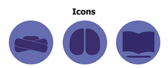
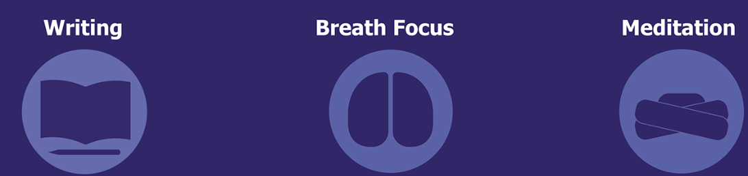
Icons standalone are confusing
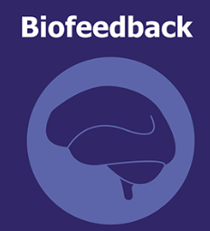
Head turban - Brain/Kidneys/Arse? - Book/Reading?
image

Having to spell out what they are is a problem.

Why brain Icon? Why not whole body???
image

I don’t get the logo - what is it?
It’s not explained at all.
The tagline cannot be read at small sizes.
image

I’d get it if it was surfing, canoeing or watersports, or beach related… but for a virtual reality holiday extravaganza it’s pretty bland.


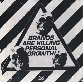
I like the Concrete concept, but you’d be sued and buried in debt for a thousand years, and your children’s children will be paying for this one.

‘Don’t punch above your weight’ - Oleksandr Usyk would disagree, he beat Anthony Joshua and was way below his weight. An odd verse.

And the main issue with Concrete as a brand, is it’s trying to kill brands and shame them?

I like Concrete as a logo.
But you can’t slash other brands or misuse their logos.


Upari
Hmmm ok …
Leave that one alone I guess. It’s very odd. Quirky. And it’s more artistic than it is design.


Maneouver
Consider the inner margins - shows a lack of knowledge for print production
Text too close to the inner margins.
image

Blank back cover - could have been sold for advertising - you could get up to £20k for a back cover advert.

Illustrations are excellent by the way.


Passa I see on Amazon music - well don on this one, it’s excellent. Good work.


I like your style, your illustrations are great.
Logos are of good quality.

Lack of understanding in the print industry.
No Pantone colour specified, only HEX which are limited colour palletes for print and not usually achievable.

A lot of the branding is not hitting the mark, for me anyway. Chelsea, Driftwood, Falmot, all fall short of what would be expected.

1,000,000 percent you’re hireable, and have a long way to go.

I would say this is just short of Excellent work.
I’d have no issues in taking on someone with your abilities to work alongside senior designers and learn the trade.

Well done.

1 Like

The Concrete project is very strange, an apparent attempt at anti-branding branding.

An explicit brand message is “brands are killing personal growth!

Concrete is a brand.

Concrete is killing personal growth?

It is self-contradictory.

I also don’t understand the use of concrete as a symbol. To me a concrete brick says things like solid or foundational, and this is particularly strange because the intent of the project seems to be deconstructive in nature.

I’m curious about what the instructor said about this project.

My recomendation is to filter out the garbabge.

You will be judged by the weakest work you present. You are far better off to present less work that is of a higher quality than include things just to make it look like you have a large body of work.

1 Like

There’s certainly things I could change in which you’ve brought up but there’s so many things that you clearly ignored which comes off as disingenuous.

For example, the reasoning for the baseball and basketball elements of the Chelsea project, it’s clearly explained in the brief and throughout the project on why, Hint - Todd Boehly. The Queens Head for Falmot, though I could agree not a good choice since she won’t be head of state in a few years was chosen as stated in the project was because it represents the delivery aspect to the brand, a pen pal service which encourages interaction between residents and customers (the queens head is a postal stamp in the UK).

There’s a few other things I would mention but I’m not here for this. I’ll take note on a few things you mentioned because there were some genuinely good points like driftwood’s icons, however, overall you lived up to your name in certain areas. Thank you for the feedback.

It makes sense and it’s what I had before, but I’ve recently had a portfolio review by someone in the industry who told it was better for me to show versatility. It’s been getting a bit confusing when making this, how many projects do you recommend I should have within a portfolio?

Self-contradictory? I guess it is, we used concrete because of it’s symbolism and flipped it on it’s head through the brands message, a bit of juxtaposition. Concrete wasn’t trying to invest you into a product, or even shame other brands as someone suggest before, just to make you think before you buy. Are you buying this because you genuinely need it or are doing it to fit in with trends or societal pressure.

Thank you, it was a tough ride especially during the pandemic it was a weird uni experience for sure.

I see what you mean about my cover pages for my homepage along with the project pages. Would a showreel on the homepage be a better way of displaying work as it could entice the viewers delve further?

My writing is one of my biggest issues, I’ve gotten grammarly recently to help me with it.

Thank you again, I really appreciate the feedback.

Good luck in life

1 Like

It might also imply a royal endorsement, which, as I understand it, might come down on the wrong side of British law. I’m not a British citizen, though, so feel free to tell me that I don’t know what I’m talking about. :wink:

As for this and many of the things others mentioned, many are valid criticisms and subjects for analysis and discussion. These sorts of things are often given a pass while in school since developing broader skills is more important — even when it comes at the expense of overlooking inconvenient details.

At an agency, these kinds of deep-dive questions are part of the winnowing process where everything is analyzed from every conceivable direction to make sure it’s all in order — both legally and creatively. A legal cease-and-desist recall order for 50,000 Falmot packages already in stores or a slander lawsuit from Mcdonald’s for using their logo to disparage their brand could be expensive for a client who would likely, in turn, sue their agency.

Similarly, a British agency would need to be very careful about misjudging the average American sports fan’s view of football not being what they consider football. They would also need to consider that the name Chelsea is more closely associated with Bill Clinton’s daughter than a football (soccer over here) club.

All this considered, you posted in the crit pit where a bunch of working professionals responded instead of the university instructors you might be used to. What’s been said is nothing to be alarmed over, however. It’s standard stuff and an ongoing and essential part of the process.

I’m standing by my initial comments, though. You seem to have a knack for unifying bigger-picture campaigns. When you get that agency job, you’ll be working with people who have already been down this road a hundred times. You’ll do fine, and now that you’ve graduated from uni, the real learning will start. Good luck. :grinning:

1 Like

Mashallah

To me, a concrete brick symbolizes things like solidity, structure, and foundation. I don’t see how this relates to the brand, why or how it’s flipped on its head, or how anything is juxtaposed. None of this makes any sense, and it should make sense, shouldn’t it?

If someone were to be influenced by the Concrete brand, couldn’t the nature of that influence be social pressure or some ‘just going along with a trend’ created by Concrete? Big brands like Apple and McDonals essentially seek to influence how people act. The purpose of Concrete is also to influence how people act. Suggesting that Starbucks serves poison, for instance, is a warning not to buy/consume what Starbucks offers. If simply attempting to influence consumers is bad, then Concrete is also bad.

Screen Shot 2022-08-22 at 3.48.36 PM

If what this graphic says is true, why isn’t the Concrete logo etched into a skull also???

Concrete was used to represent the weight some people may feel from society and trends to buy expensive items to fit in, the slab is used because a lot of stores have concrete tiles in front of them such as the Apple store.

Yes, at the end of the day Concrete was still a brand. The brands we used in our designs are popular brands that people use as a sort of status symbol or standard. You are right in that we attempt to influence ‘consumers’ my fault there, I guess Concrete can be considered bad just depending on which side you are on.

Anyways, thank you for your feedback.

McDonald’s is not an expensive brand, in fact, it’s branded cheap, fast, and predictable. It’s also not a show of status to eat there and is actually more like a kind of guilty pleasure.

I can’t see how the concrete brick conveys ‘social weight’.

The issue, as I see it, is that you’re taking aim at the wrong target. There’s nothing inherently good or bad about branding. It can be used to better society or to take advantage of it. Yet Concrete (a brand) targets branding as the bad guy. Makes no sense. Other targets might be capitalism, deceptive advertising, materialism, rationalization, groupthink, etc.

I would aspire to have 3-4 really strong pieces of work that you’re super proud of and get rid of the rest. Prospective employers will look at the worst work you have and think: if he can do that to himself, what will he do to me?