Hi everyone I’m a graphic designer focusing on branding, editorial, and digital design. I’d love your feedback on my portfolio: https://johannashemesh.com/
First of all, welcome to GDF. I hope you stick around.
Second, you have done some very nice work. Congratulations!
Here are a few comments that I think could take your excellent portfolio and make it a little stronger.
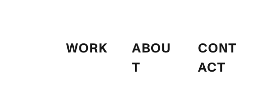
As the browser window reduces in size, the type on the menu breaks up (see screen capture). I think you should have the menu collapse into a hamburger menu.
The Vuelta project looks nice, but it’s hard to take in. You have a lot of animation going on. By contrast, your other book projects (Haggadah and The Field Museum) are much easier to take in and assess.
Why did you not include a narrative on the /RRE page? I think it would be helpful. I noticed one other page without narrative. I think it would benefit you to have narrative on every page since you have it on some of the pages.
On the Cinenené page, I would have the animated logo at the top of the page play once rather than being on a loop.
Bottom line, you do some great work. Some refinement would make it easier to take it in.
I think that’s a great question. More than once, I’ve told people who post their portfolios for review they need to trim it down and get rid of the weaker pieces. In your case, I think everyone here could respond and give a different answer. That said, I’d say you could drop metamorphosis (it’s more about the photography than the design) and yoga retreat (even though you did a fine job setting the type). EDIT: I’m not saying those are weak pieces, I’m just saying which two I think could be cut since you asked.