I would love some feedback on this series of Word Search Book covers (there are 4 books in the series).
I’d also really appreciate it if addition to feedback, you could also rank the images (of the butterfly, hummingbird, ladybird, and cat) from 1 to 4, as I might change the order of the images to use the most eye-catching one for the first book.
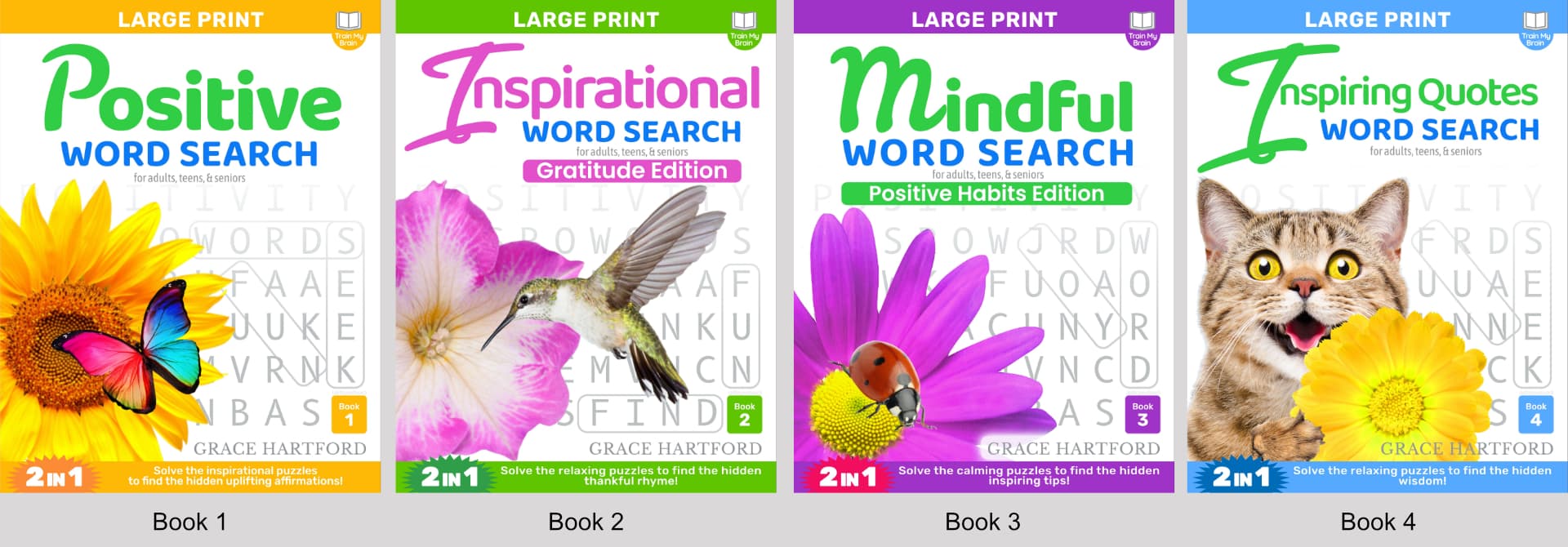
I know there will be other folks a little more critical then me, but off the bat, a few things of note. What do the images have to do with the word search, although they are esthetically nice, none of them say the meaning of each book. Next, what is the target market for these, as some elements seem more childish, then others more adult.
What I’d recommend is instead of the big images that don’t really fit, maybe use the wording in the back images and incorporate the meaning of each book instead of the generic word search image that you have showing. You might also want to work with the fonts and colors, although they might look nice and vibrant on your screen, they won’t print nice and will look very muted. Just my 2 cents.
Thanks, this is super helpful. That target audience is adults, teens and seniors, so I’ll definitely think more about that. Just to double check, it’s the cat image that comes across as childish? Or are some of the other ones childish too? Thanks!
I’ll also consider the colours, although the main goal is to make the design standout online when the reader purchases it, so I am not too concerned if the colours look dull on the print out, but I’ll definitely run some printed tests to make to ensure it looks great.
As you mentioned, the cat does look a little childish, as well as the first big letters on each book. In my opinion, they don’t really work and look out of place compared to the rest of the word, you want the complete word and the fonts to complement each other and it doesn’t.