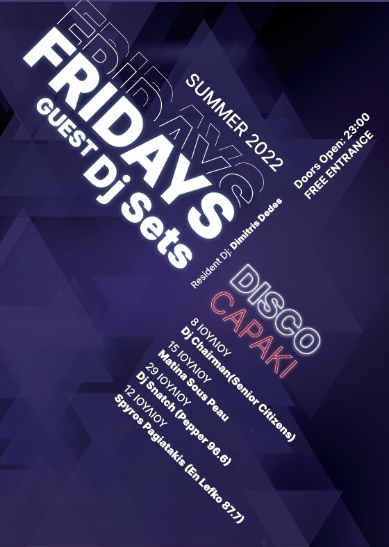
Here is a poster I made for some Dj Set Events for a disco club.
The thing that confuses me is the hierarchy.
The focal point should be the event “Fridays Dj Sets” right?
The club is called “Disco Capaki”. Do you thing that the event title outweighs the club’s name?
Yes. The word FRIDAYS is easily the first thing anyone would read. More than likely, the line immediately beneath it would be read next.
I’m wondering, though, is FRIDAYS supposed to be possessive or plural. If possessive, you’re missing an apostrophe. I’d also adjust the kerning in FRIDAYS — the AYS sequence looks awfully loose compared to the first four letters
Omg! you’re right! the kerning was awful!
Is it better now? I think it’s more balanced.
Dj sets is the first thing, and thats what the poster is about, then Fridays and Disco capaki come second and third.
About Fridays it’s plular, because all of the dj set events are on Fridays. The club owner is not sure about the event name yet, though.
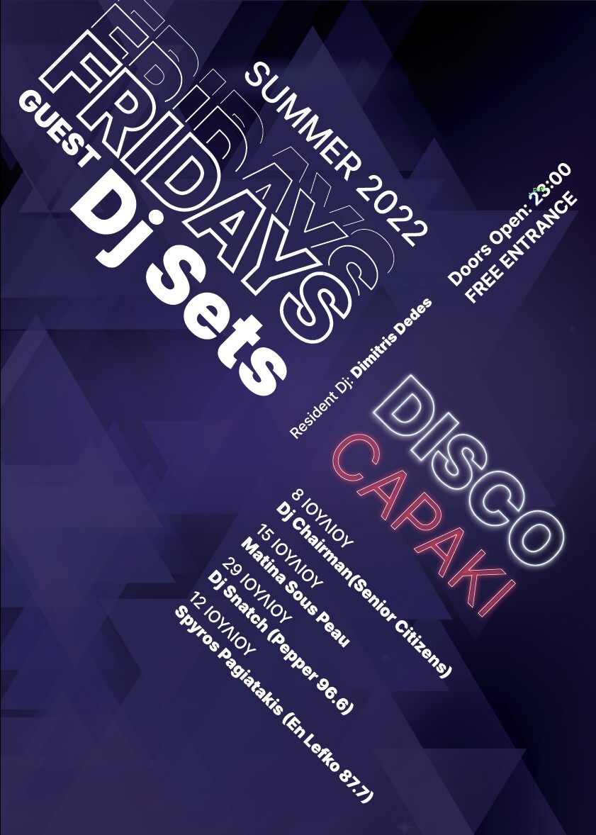
This is my last take.
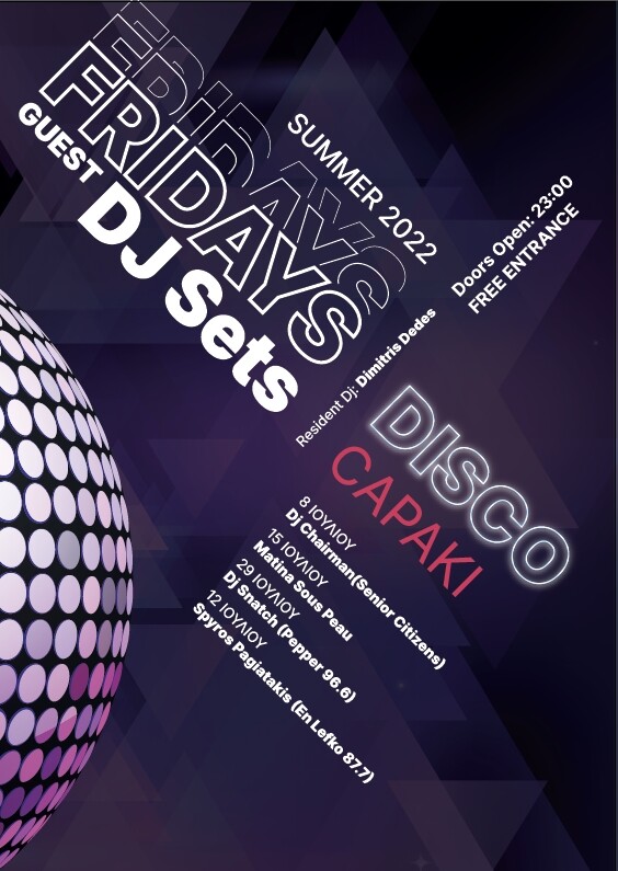
To be honest, I will revise it tomorrow, maybe the disco ball distracts the viewer more than it should be, but now my eyes cannot see it clearly and need rest!
Maybe, but it does seem to complete the composition, and it reinforces the whole disco thing. Another thing it does is repeat the reddish coloration of the word “CAPAKI,” which was something of an outlier color in your first versions that looked like it didn’t quite belong.
Speaking of CAPAKI, why have you reduced its size in relation to the word “DISCO” above it? You might have good reasons that I’m not considering, but I liked the two words together when they were both the same length.
well, the reason behind making CAPAKI smaller is to balance the composition, given that the visual “axle” is “Resident Dj and Doors open”
Thus, on the left side of the axle, "guests "and “dj sets”
are not of the same size, so I wanted to achieve that on the right side of the axle, between “Disco” and “Capaki” words.
Excuse my English, I hope you understand what I am trying to say.
As for the the disco ball, you described exactly my thinking behind placing it.
@Stefanos1984, I’m curious about the months. Why is everything but the months in English? And why don’t you use a Greek font rather than a Latin font that doesn’t contain the correct letters? The substitution of the Greek Λ with a Latin A sort of makes sense, but why have you substituted the Σ with a Y?
I know very little about Greek other than being somewhat familiar with the alphabet, so my ignorance is showing. Then again, that’s why I’m curious and asking about it.
Happy to answer. Well it’s not pseudo Greek!
The client gave me the text (with errors), which I copied and pasted without checking it.
Yesterday all I wanted is to discuss layout, balance and focal point, so I didn’t pay attention that much.
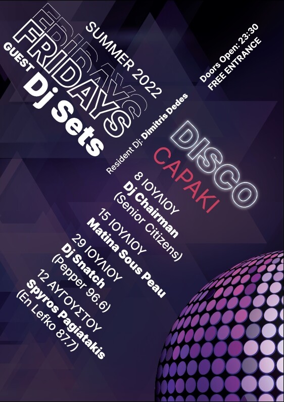
Indeed the last date should be “ΑΥΓΟΥΣΤΟΥ” which means “of August”, and all previous dates are “ΙOYΛΙΟΥ” which means “of July”.
The client wanted the DJ to be with lowercase j.
The final Poster (after tweaking and correcting words) is this:
As for Υ and Σ: Greek grammar is very complicated. ΙΟΥΛΙΟΣ is nominative case, whereas ΙΟΥΛΙΟΥ is possessive case, which means “of July”. So in dates we use possesive cases. I wish I could explained more thoroughly!
I didn’t get what you mean with “Λ” and “Α”, though.
Thanks for explaining that to me @Stefanos1984. I suspected the mysterious last letter might have something to do with the context in which the month was used, so I was curious. Thanks for explaining that it had to do with case. That makes sense now.
I was looking at the word on my iPhone and the Lambda looked like an A, which made me wonder why you were using a Latin letter to simulate Greek. Now that I’m on my desktop computer with a larger display, I can see I was mistaken.
By the way, I like the last version of the poster with the disco ball in the lower right-hand corner. You’ve made significant improvements on every version. Looks really good!
Thank you for your kind words!
You know after a break, I find things that could be improved, almost every time.
The more you look at something, the more you get used to what you see, even if it is not correct.
So a good sleep, a walk, a coffee break, work miracles in “reseting” your eyes.
Now should find a way to make it printable, because, I think that dark purples will be messy…
among other things.
I have almost no experience in printing to be honest…
Can you direct me?
The poster is mainly for social media, but the client plans to print it aswell.
You know enough about it to realize there might be a printing issue.
Those dark, subtle background patterns might darken during printing, which would make them all but disappear. If it were me, I’d lighten them slightly.
The possible printing problem relates to dot gain and total ink coverage. These are two separate phenomena that are too involved to explain here, but a Google search will turn up lots of information. Either of these things can cause printing problems at darker values. The higher the amount of ink laid down in each CMYK layer, the more problematic the dot gain becomes.
The type of paper (coated vs. uncoated) affects the degree of dot gain. More absorbent paper surfaces will have higher levels of dot gain. For example, if your poster prints on newsprint, I’m certain the dark purple background patterns would turn into a purplish black.
In addition to paper stock, the degree to which one should compensate for these issues differs with the type of printing process involved. Offset, for example, is different from digital printing. Even in digital printing, toner is different from ink. With offset printing, the results on a sheetfed press will differ from a web press.
Luckily, the software you’re using (probably Adobe software) compensates for these issues (to a degree) if you set up the color profiles correctly while considering the printing process used and the type of paper on which the file will print. A good printing company will also make adjustments based on their experience with their equipment.
The whole subject involves so many variables that it’s often best to avoid the problem. As I said, I’d lighten the background a little to be on the safe side. I’d also make sure that the total ink coverage in the darkest areas didn’t exceed 280 percent.