Poster critique

Hi guys,
I am doing a poster for an American football team. The text is in another language but it reads top to bottom:
American Football
Team town and name
Team town and name
Date, hour
Sports park Domžale (town)

I am practicing a lot with Helvetica these days and figured I tried it on the poster.
I am preparing a totally different one too, more dynamic and energetic so to speak, but it isn’t ready to show it yet.
Throw your critiques at me and maybe even some pointers what I am doing right (if anything at all) and what I am doing wrong.

1 Like

Looks like your players are wearing the same team uniform. Might want to change that so they look like opposing teams.
US football teams have individual team colors. If two specific teams are playing, they would have different helmet logos too.

Team logos will be added on helmets and one of them will be colored a bit different and then vectorized again. Thanks for your feedback.

Without knowing your audience and their location, I’m going to make just general comments.

I pretty much agree with your visual hierarchy, but you probably only need one Team town and name.

And instead of “practicing” with Helvetica, I suggest you look for fonts appropriate to the particular subject. The font should visually support the message.

So should the color. Is there a specific reason you chose dull orange? Is it one of the team colors? Could you use a more exciting shade?

And the image. You might consider a more exciting one. :slight_smile:

image

2 Likes

I feel the designs you proposed are too static.

2 Likes

A little more information would possibly generate more helpful feedback. Is this a school project, personal project, what’s your background, is this for a pro football team, college team, prep school team, etc.

That said, here are a few general comments:

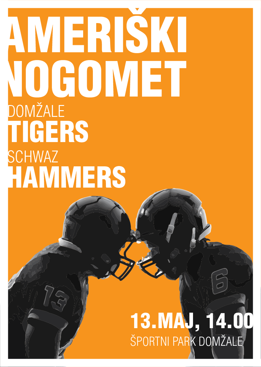
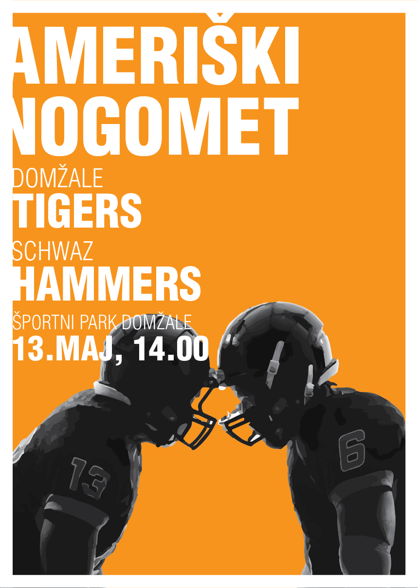
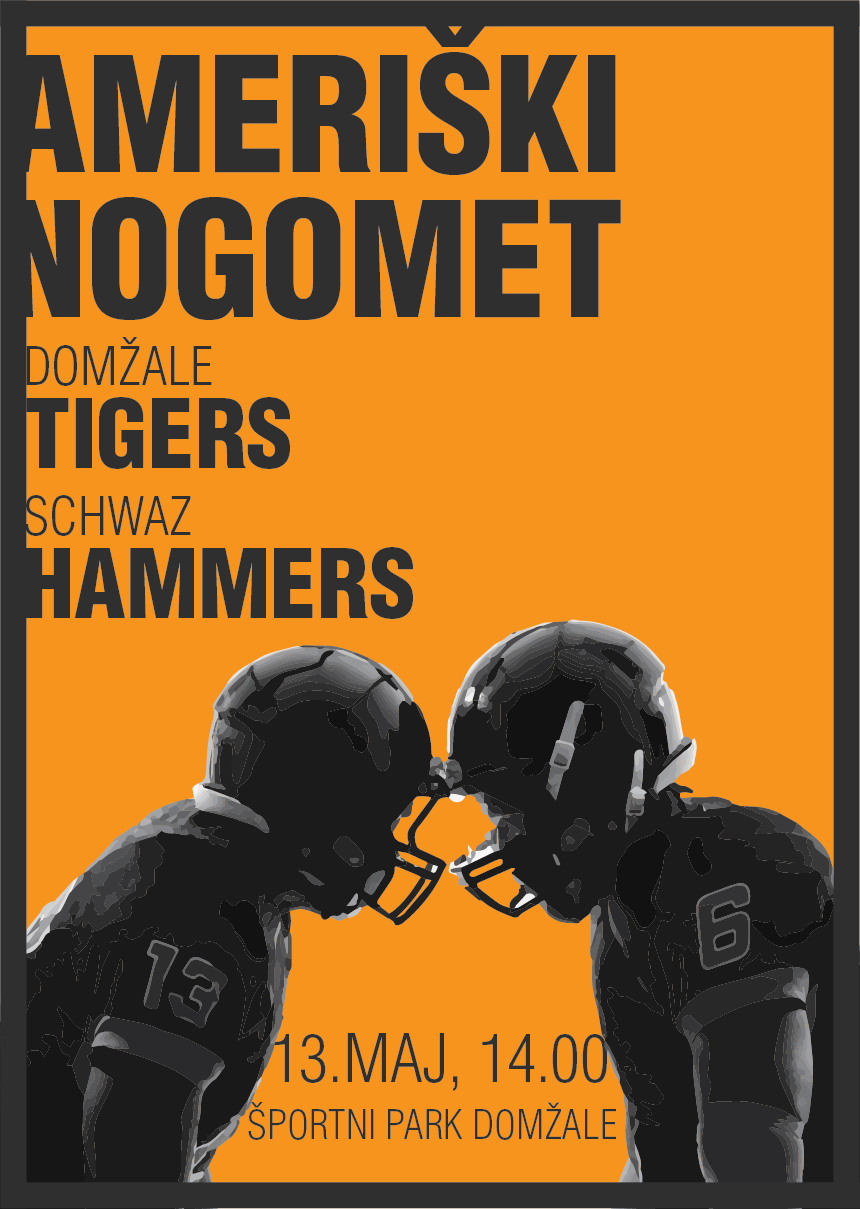
– The image you have does not capture the energy and excitement of football.

– With the black and white photos, and orange/black/white color scheme, this looks like prep school or college football to me, not pro football. This is an observation. Maybe this is for a prep school or college market. If so, spot on. If it’s pro or exhibition, it’s lacking something.

– Overall, I like the visual look and feel. With the orange color and type treatment, it has an up-to-date feel. So I’d say good job on the overall appeal (assuming this is not pro or exhibition).

– Maybe try setting the transparency on the photo to multiply so you’ll get some of the orange showing through.

A few specific comments:

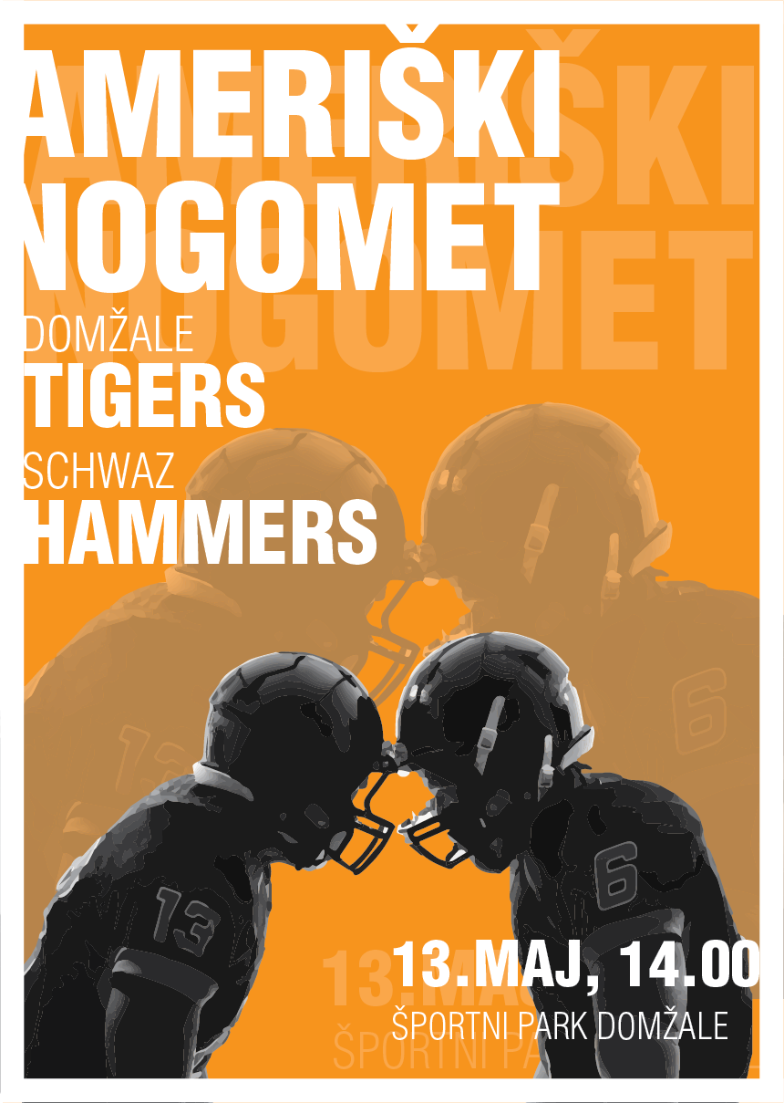
Poster Option 1 – This one is nice.

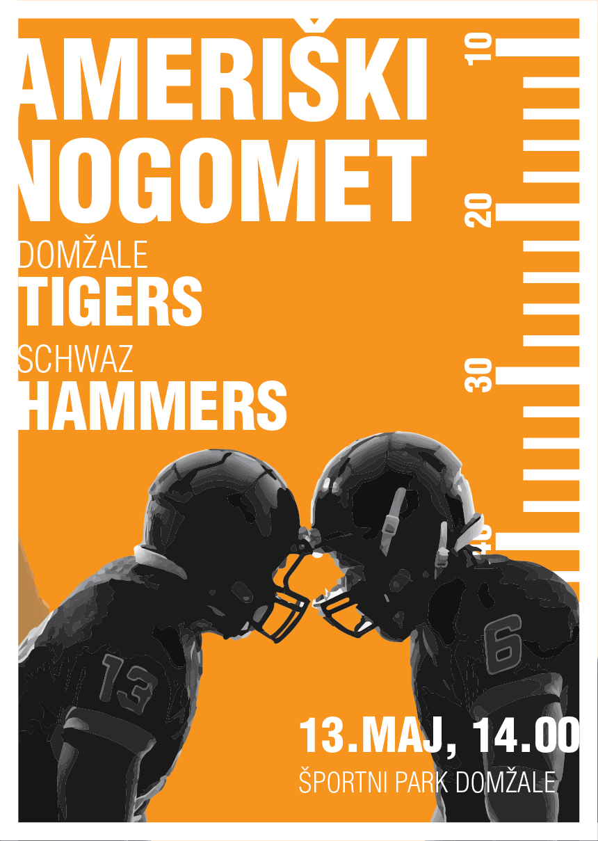
Poster Option 2 – Set the yard markers to about 66% orange so they aren’t so prominent. They compete with the type.

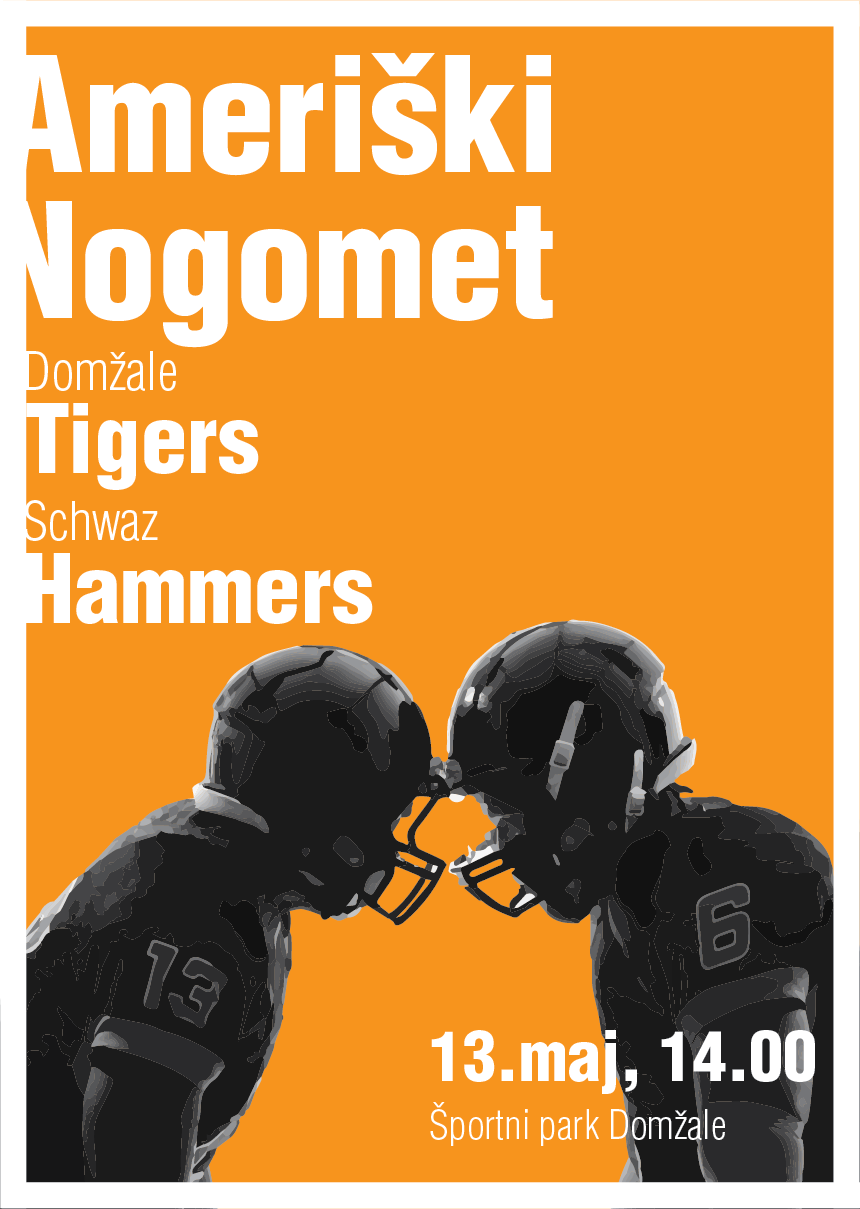
Poster Option 3 – Not the strongest option. It’s too plain. Let this one go.

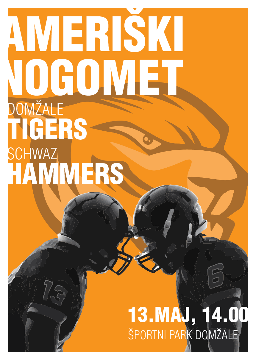
Poster Option 4 – I don’t mind the players ghosted on the first option, but the mascot ghosted on this one is too distracting.

Poster Option 5 – I like the all caps type; but, like 3, a bit blank.

Poster Option 6 – The type over the helmet doesn’t work. It works better over the arm.

Poster Option 7 – The dark gray is nice, but it could use some white type, too. Time, date, and location looks way too fussy between the players.

Overall: 1, 2, and 7 are the strongest, but they need some refinement and pushing.

Hope that helps.

1 Like

Thank you for you reply DocPixel.
I should’ve put more information in the post.
Team is an amateur, local one, they play gridiron football but is more on par with college football.
They play in the second league.
I chose orange because it is the team color. Whole poster is basicaly in team colors, orange being predominant, then white and black. Will try a different shade of orange, maybe a darker one would do the job better.

I agree, it is pretty static. Maybe the other one will turn out better and will capture the essence of football a bit better.

Hi Steve-O.
It’s a project that I will get payed for (about 50 bucks).
It’s for an amateur local football team that plays gridirion football but it’s more on par with college football. They play in the second division.
I agree that the image used is too static, I have some more ideas, wanted to put this one down first to see how it turns out.
You’re right, it isn’t pro football, amateur second division.
I will try out some more things on this one before I start on the new one.
Thank you for your feedback, it has been most helpful.