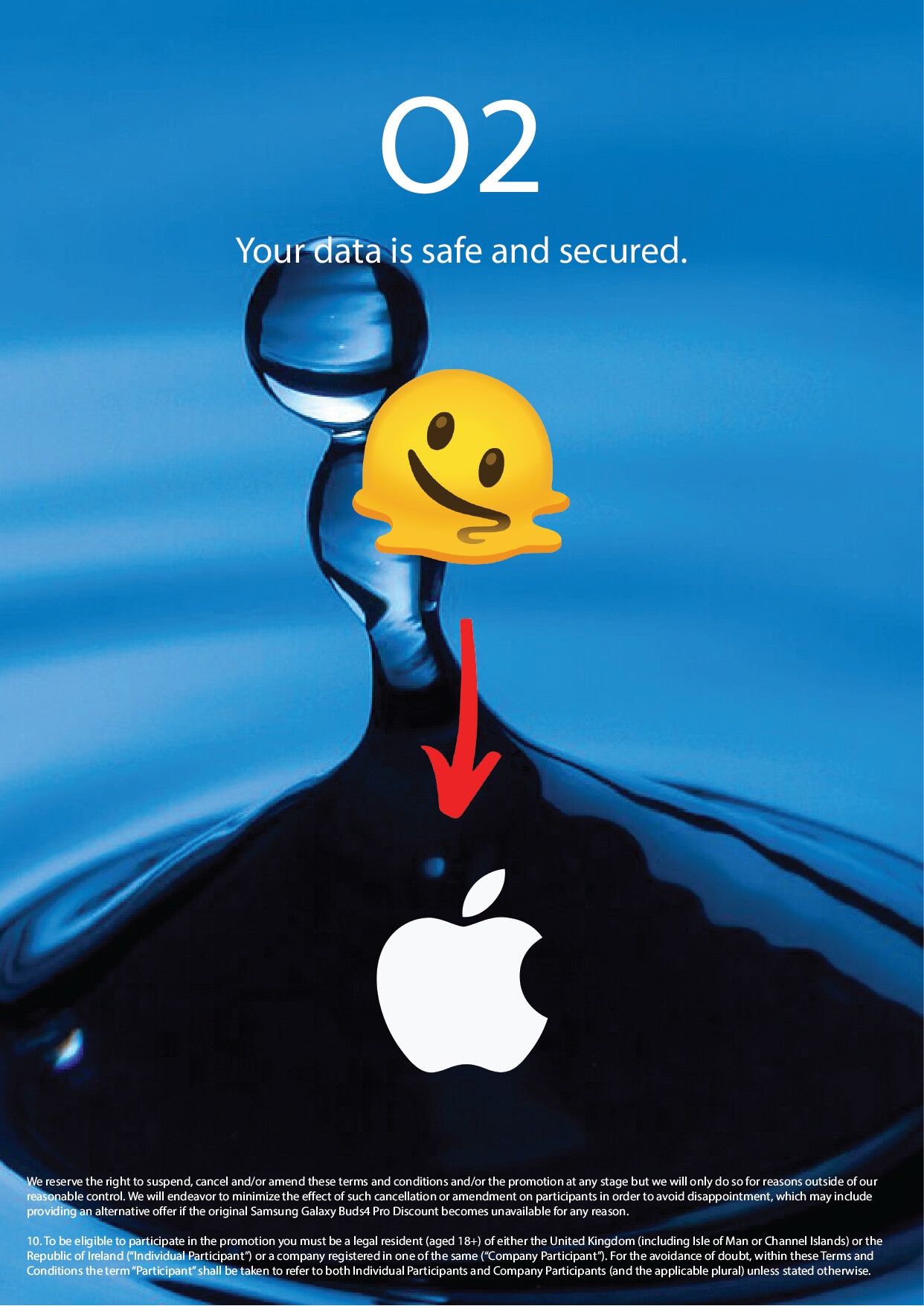
Hi everyone, I’ve been working on this poster for a while and would really appreciate some outside feedback. I’m trying to keep the design visually interesting without making it feel overloaded.
Welcome to the forum, Luca! Great first post, and I like that you’re already thinking about balance — visually interesting but not overloaded. That’s the right instinct. I had a good look at your poster, and here’s what stood out to me:
What’s working: You have a clear reading order — headline (“O2”), tagline, image, logo — which is exactly what a poster needs. The blue palette feels clean and techy, which suits a data/security message, and the water droplet photo is dramatic and eye-catching.
A few things I’d rethink:
-
The image argues with the message. A dripping, melting droplet reads as “leaking” — the opposite of “your data is safe and secured.” For a security message, imagery that feels solid, locked, or shielded would match the words much better. Either swap the image or adjust the tagline so the two support each other.
-
The smiley emoji and the big red arrow are working against you. Emojis instantly lower the trust level on a poster about security — this kind of message needs to feel serious and reliable. And the red arrow pulls the eye without telling the viewer what to look at. I’d remove both and let the hero image breathe.
-
Two famous brands are fighting for attention. The “O2” headline and the Apple logo at the bottom compete — viewers will wonder which company this ad is for. One brand per poster. Also, for practice/portfolio work, a fictional brand keeps things cleaner than mixing real logos.
-
The fine print is swallowing the bottom. That dense block of tiny terms becomes a dark anchor that drags the whole layout down. It’s fine to include terms, but set them smaller, lighter, and with generous margins so they sit quietly.
One quick trick that always helps me: squint at the poster. Whatever you notice first, second, third should be the exact order you want people to read it. Right now the emoji and the arrow win that test, and they’re the least important elements — so that’s a good sign of where to cut.
The bones are genuinely here, and with a tighter message-to-image match this could be a strong piece. Looking forward to seeing the next version!