Hi guys,I have worked on a poster on one of the quotes of the ‘Manifesto of Futurism’ by F.T.Marinetti which was the beginning of the futurism art movement.
Here goes the quote,
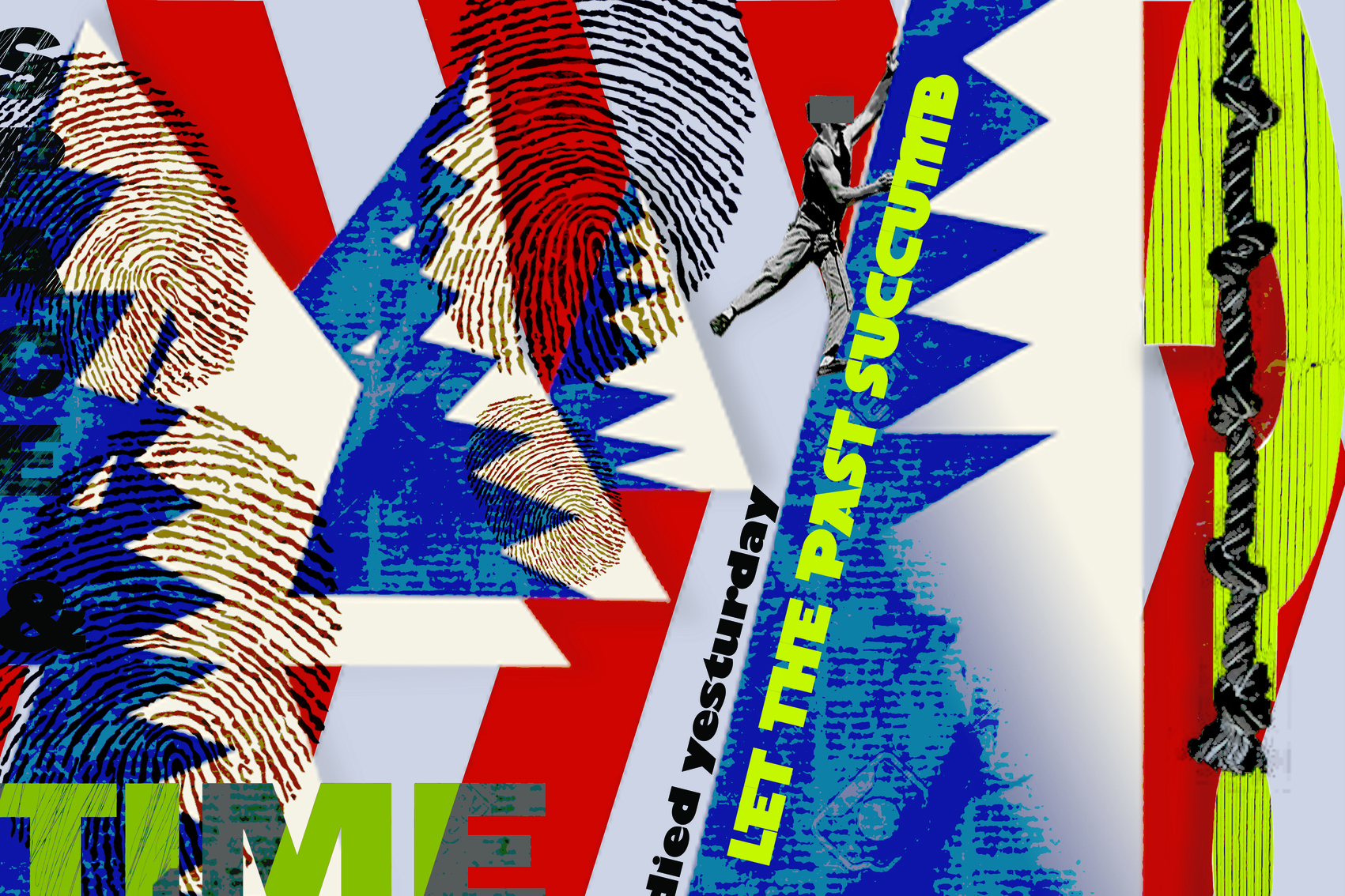
“We stand on the last promontory of the centuries! . . . Why should we look back, when what we want is to break down the mysterious doors of the Impossible? Time and Space died yesterday. We already live in the absolute, because we have created eternal, omnipresent speed.”
I have intended to bring the decades of the movement to the vision through the poster.I have tried to bring in the elements of futurism as best as I could.I tried to bring the quote to understanding with the imagery.
Please post your opinions and let me know what i have done right and wrong.
I guess it’s art so it’s whatever you want it to be. Maybe one day someone will find this after your long dead and it’ll be worth millions. From an art standpoint I’d say it’s got some sort of minor expresionism, futurism twist too it and gives an oppressed feeling probably due to the monotone man, jaggedness and the fingerprints. So if that’s what you were going for good job.
From a design standpoint it could be alright. I mostly don’t like thr typography. The Kerning on time, you can’t see “space and” the typeface and their pairing. Maybe that’s part of that oppressed feeling
Ok, admittedly not an expert on futurism.
I’m not seeing it here. At least not the Italian version, where the emphasis is on speed and motion. This is a very static design. There is virtually no movement.
Immediate observation, you spelled “yesterday” wrong. Intentional?
You’ve clipped too much of the quote to make it anything intelligible. Without the words in their entirety, does the art express the intent? I don’t think so. Maybe others would disagree, if they are more into the genre. Graphic design conveys a message through a combination of text and imagery.
Technically speaking, if the poster is something that will be printed, that electric lime green will not be reproducible in CMYK. Perhaps as an added cost spot. Maybe.
This is more an Art piece than a poster graphically designed for a real purpose. As Art, if it pleases you and has meaning to you, there is nothing right or wrong with it. If you can justify your choices to your professor in critique, you’ll probably be ok.
Thank you for your comments!The aim was to show an unappealing past that is left behind by the man.
Thank you for the corrections on typography.I,ll concentrate on them which i failed to do before.
Thank you for your observations.
The ‘yesturday’ was not intentional.It was a mistake that i didnt proof read in a haste.But to my advantage ‘yesturday’ is used to denote an awful previous day.
I personally feel like there is movement in this art.But i realize that the type isnt helping much of it.
And regarding the printing feasibility of the poster I didnt really think of it.Thanks again.