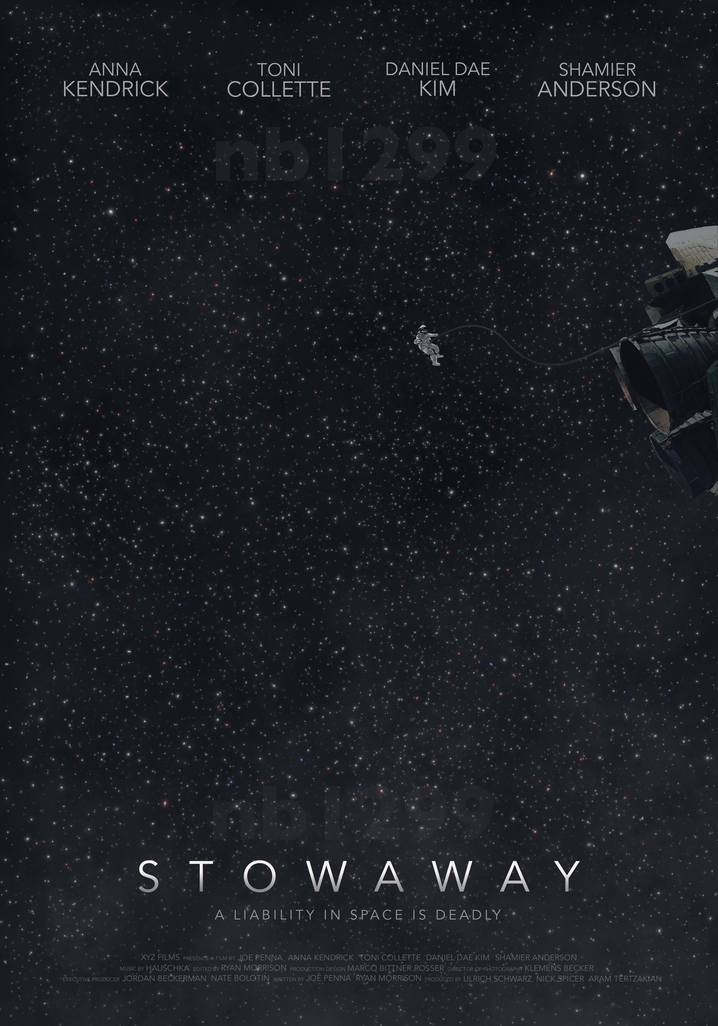
I’m trying to work on my poster design skills and I’m designing an upcoming movie poster for fun. Would really appreciate any feedback on how I can improve the look of it/make it more engaging. I wanted to go for a different approach than a typical film poster and make it kind of mysterious yet simple but I feel like it ended up being a bit dull. What are your thoughts?
Are the two instances of nbl1299 supposed to be visible? If so, they’re barely visible and not legible. If they’re not supposed to be there, remove them.
If you’re trying to create a feeling of loneliness and vastness, I think that’s good. For me, emotions play a huge part in design. Unfortunately, the tiny astronaut floating in space leaves lots of empty dull nothingness around it and, as you’ve noticed, looks a bit boring, lifeless and plain.
Also, stars aren’t as evenly spaced and consistent as you’ve made them. You might try making the subject matter — astronaut and spacecraft — larger and experiment with making the background more interesting by using an actual photo. Maybe similar to what’s below.
I like the typography, but you’ve underplayed it and made it a bit lifeless, which again, you’ve already noticed. From a practical standpoint, a movie poster is a marketing tool designed to attract attention, be memorable and maximize the chances of people remembering the movie’s title. That’s difficult to accomplish by underplaying all the visual elements.
Thanks for all the feedback, much appreciated. The nb1299s are just subtle watermarks, nothing important! You’ve made great points which I’ll take into account.
I like where you’re going with the minimal thing, but I find the stars preset distracting, actually. Do an image search for spacewalk. The background is usually solid black or the stars are not very prevalent.