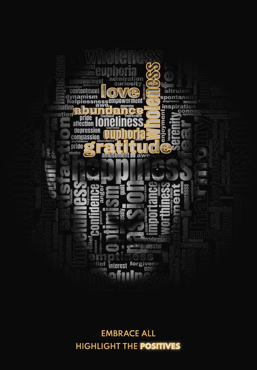
Hi again. This is a poster I made for a graphic design school project.
There was no specific briefing other than to use a face and the concept to be about psychology.
Do you have any recommendation how can I improve it?
Do you think the face is very intimidating?
1 Like
I think it’s a pretty interesting visual concept, and your execution is marketable.
I wouldn’t say the face is “intimidating”. It does look serious, but without more pronounced lips or brows, it would be hard to ascribe any emotional expression to it. That may be a good thing in this kind of application.
It does need more work in the messaging. The part you really want the viewer to read is far too inferior to the focal point (which ends up being the word “gratitude,” seeing as the eye is drawn toward the eyes, in the absence of anything with more weight). Seen from a fair distance, it would only be an unreadable jumble of stuff. If it were mine, I’d consider moving “EMBRACE ALL” to the top of the composition, and setting it large and bright enough to be the reason anyone looks further at the poster. Or, I’d drop “embrace all” altogether, and let HIGHLIGHT THE POSITIIVES be the (much more succinct) message on its own. Either way, I think it needs large, attention-getting type at the top.
1 Like
Thank you! This was one of my concerns that the message is very outweighted from the face.
This is a nice concept and looks pretty good.
You asked for feedback, though, so here it is.
The headline reads, “Embrace all. Highlight the positives.” I had initially assumed that the grey words in the text were less-than-positive things and that the words you had highlighted were positive feelings and emotions.
However, now that I look at it, many of the grey words, such as happiness and serenity, which aren’t highlighted, are equally positive. I turns ought that what I thought was a great idea doesn’t really seem to be what you’ve done.
In addition, if it were me, I’d skip the decorative treatments on the highlighted words — the glows, outlines, bevels, etc. They’re not necessary and only make the words less legible. If it were me, I’d probably just color them gold with, perhaps, some subtle effects and be done with it.
Not really. I can see that being a concern, but all the words on top of the face blur his expression. Initially, I saw the face as more pensive and emotionless than hostile.
Thank you for your reply!
I tried to highlight every positive word in the wordcloud, but then the facial attributes are smothered from the highlighted words.
So I chose to highlight only some of them, showing that highlighting the positives feelings in life is a long process and needs time. So for start a person could highlight some.
I see. However, your solution to that problem compromises the idea behind it. I’ll explain.
One of the great things about your poster is that it’s engaging in a way that grabs attention through compelling imagery and, then, refuses to let go. There’s an additional visual puzzle that must be resolved before the viewer achieves closure, lets go, and moves on. This helps make the poster more memorable.
Unfortunately, the reward of figuring out that the positive words are highlighted and the neutral or negative words aren’t isn’t there. Instead of a little reward from figuring it out, the viewer is left with a slight disappointment.
You might want to read up on Gestalt Psychology and how it relates to design. Here’s a link to a start.
If I were you, I’d bunch the highlighted positive words together in a way that didn’t smother the facial expression, then use less-than-positive, mixed-message, or emotionally neutral words for the remaining grey ones.
Thank you for advice!
I can see the solution you provide, my only argument is that I want the feelings to be mixed (as in reality).
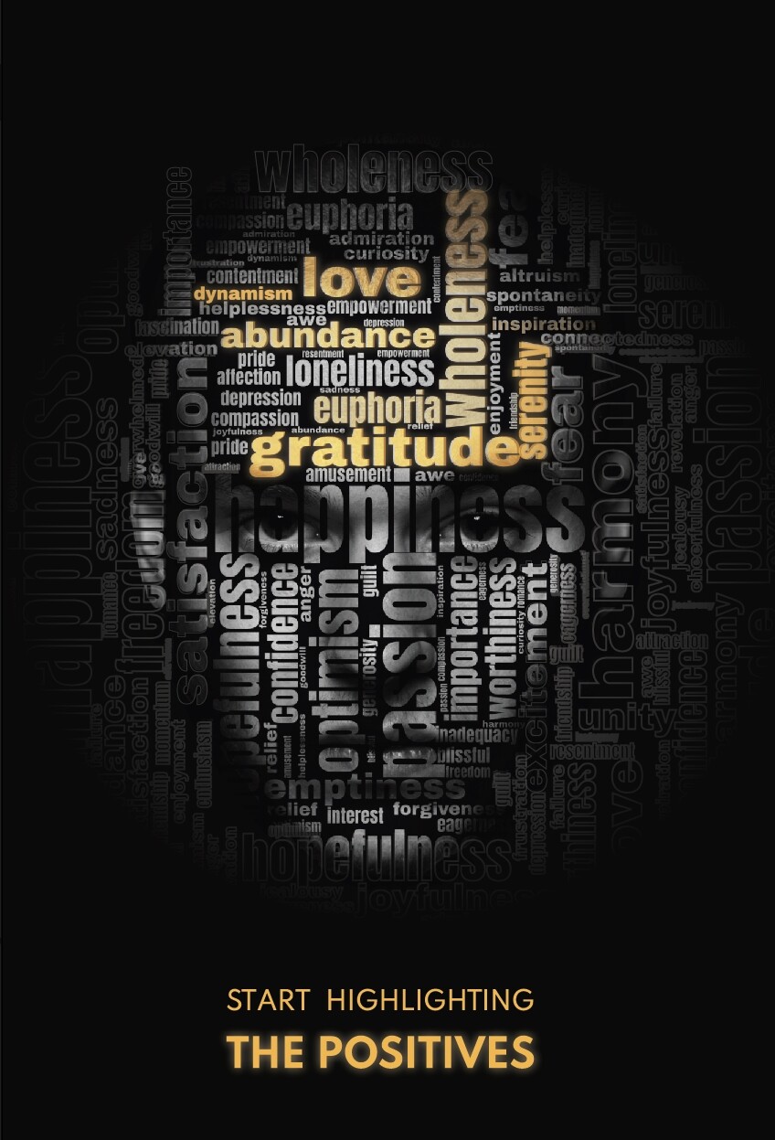
Here is another kind of solution.
The tag line says “START HIGHLIGHTING” so it indicates the process of highligthing
And the highlighted words are not of the same transparency, indicating exactly that process.
Some are fully highligthed (I used hard light blending) some are not completely.
What’s your opinion?
I like the simplified treatment of the highlighted words. I also like the larger sizes of the headline at the bottom, which contributes to the hierarchal arrangement of the information.
I understand your reasoning for wanting the imagery to be more about the process or a road to positivity instead of implying a transition from one to the other as an unrealistic instantaneous black-and-white thing. On the other hand, the subtlety might be challenging to communicate in the poster short of explaining it, as you did with me.
Whatever the case, you’ve put lots of thought into it, and you’re justifying your decisions with solid reasoning, which is fantastic.
Have you considered “BEGIN BY HIGHLIGHTING” rather than “START HIGHLIGHTING”? Maybe both say the same thing, but to me, “begin by” puts more emphasis on a journey or longer process.
By the way, great job with the word cloud and squeezing all that type together into a consistent composition.
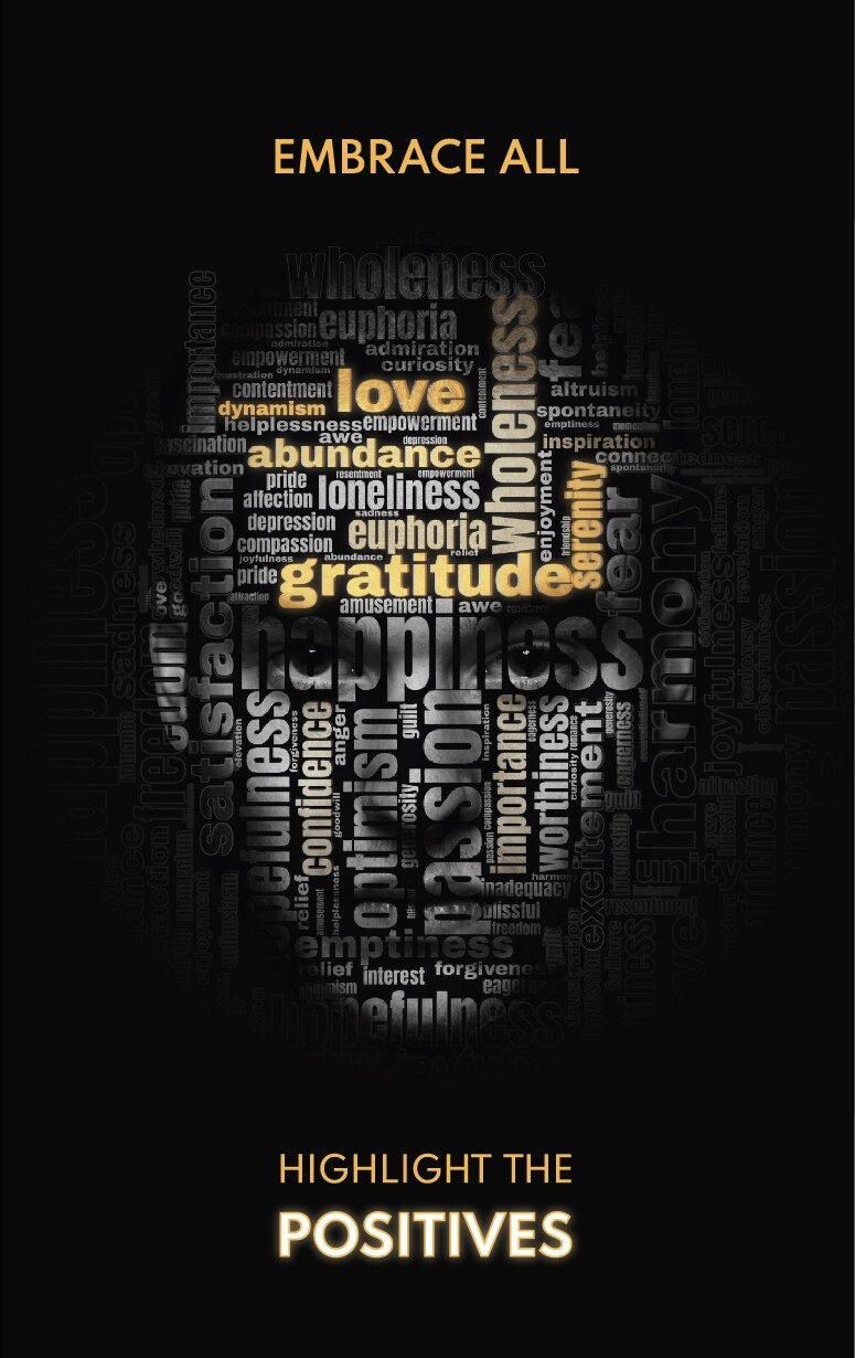
This is my last take on this poster.
I think that writing “start/begin highlighting” becomes overcomplicated.
I want to keep it more simple to retain the impact.
1 Like
I’d suggest taking out the ‘embrace all’ at the top. The text at the bottom is enough, to my mind.
This is coming along nicely! Good work!
It’s refreshing to see a coherent student work with some serious thought behind it.
Can I ask you a (bit silly) question?
What makes my poster to look like a student project and not professional?
You’ll be able to answer that question yourself in 15 years time.
I wouldn’t worry though; in terms of practical execution, I’ve seen plenty of ‘pro’ stuff that doesn’t touch it. The differences, practically, are subtle. It’s mostly a type thing. That just takes years to refine. You’re definitely headed in the right direction.
The biggest difference, is nothing to do with you. The brief itself is very much a student brief, intended to get you to think in the right way. It’s working. You are. In a few years, I think you’ll dig a little deeper and just go that little bit further, in terms of sophistication and refinement of thought. At this stage, I’d say you are ahead of the game. As PrintDriver said, it is coherent and well thought out.
You cannot be expected at this stage to be where you’ll be in 10 years time.
Years ago, when I first started to learn bass, I would listen to the greats and wonder how they did what they did. How do they play those 16th notes so fast, with such machine gun precision? How do they get that undefinable soul in there? Many many hours of practice later and I got close to the speed. Many more, the precision was nearly there, but that ‘thing’ that gives the best bass lines their ‘cool’ still eluded me. I got faster and faster. More and more precise. Still no joy. I could do it, but it just didn’t have ‘it’
It was only many years later, with many more hours of practice, it clicked. It’s the spaces in between. The fractions of a beat delay, the ghost notes. Many more thousands of hours later, I could almost do it. You plateau for ages, then all of a sudden, something clicks. I still have a long way to go, but then if you are ever going to be good at anything, there’s always a long way to go. The more you learn about something, the more sure you become of how little you know. The second you think you’ve made it, you’re done. Immediately you’ll be passed by someone still climbing. The biggest risk to talent is arrogance and complacency. There is always more to learn.
Type and creative thinking are exactly the same. It’s the ten thousand hour thing. You have to have natural ability, of course. 10,000 straight hours playing football will never make me an expert. 10,000 hours at something you have an aptitude for will see many plateaus and much frustration, but, by definition, the same amount of eureka moments.
Stick at it you’ll get there. You definitely have the talent and are headed in the right direction. Again, as PrintDriver said; refreshing to see – especially so, amongst the legions of wannabes that stopped climbing once they subscribed to Canva.
How do you get to Carnegie Hall? Practice.
Ouch, that was a long one! I bore myself sometimes!
Well, you did ask!
No! I appreciate the time you devote answering me.
What you said is true. My only fear is that I am already 37 yo, and I don’t know if I have enough time to “get there”. It’s my biggest insecurity.
To my opinion, graphic design has a lot to do with getting your eye and thus your aesthetic trained to what is visually working correctly. Before you can sing, you must train your ear to hear correctly the notes.
I still learning gestalt principles and try to detect them in many professional designs.
So practice is essential, but reading and researching ,I think, is more important.
Anyway! I really thank you for encouraging me and providing all these info.
Also, forgive my bad English, as I am not a native English language speaker!
You posted in the Student section ![]()
1 Like
haha! so that’s it?
Yup, it’s in the student crit section.
![]()
As @sprout said…
In the professional world, clients always have specific business motives for posters. They will want various items on the poster — dates, logos, sponsors, websites, company names, calls to action, QR codes, and other things that make sense in terms of serving a business or organizational purpose. Your poster has none of these items.
You’ll likely never have clients that want posters about highlighting the positive for the altruistic reason of it being a good public service message. Even if you did get a project similar to this from, for example, a government health agency, there would still be the obligatory odds and ends I mentioned needing to go on the poster.
In other words, it looks like student work because it contains all the signs of a student assignment divorced from the kinds of work a professional would get in the non-academic world. It has nothing to do with the quality of your work.
By all means it can’t do any harm to learn this kind of stuff, but I’d say, don’t be bound by it or use is as any sort of guiding light, in isolation. Keep a healthy perspective. It is one of many theories and ideas you can learn. I would wager you’ll learn more once you have a formal education under your belt and then get a job with a good studio. Three years of working in the industry will teach you far more. Learn from experts.
True, but…
Sprout, you mentioned playing bass, but even after thousands of hours of practice, there was a level that didn’t quite click until one day it did.
For me, the day things clicked in design was when I finally began to understand Gestalt Psychology intuitively.
I got good grades in my university design classes. I landed good jobs and produced good work. I had memorized all the many principles of design, such as rhythm, contrast, balance, hierarchy, etc., and regularly put them to good use. I had memorized the formulas until the components of those formulas and their use became instinctive.
But as I gained proficiency in design, I realized I didn’t fully know why some things worked and others didn’t. I could tell the difference between good and not-so-good work and identity those things that would improve the work. But this ability resulted from thousands of hours of practice, trial and error, and learning what worked and what didn’t.
However, I lacked an intuitive understanding of why things worked and what was behind the guidelines, rules of thumb, elements of design, and truisms that I’d spent thousands of hours learning to use. There was a level that I hadn’t yet reached, but I kept bumping up against it and not knowing how to break through.
At some point, the pieces to the puzzle fell together in rapid succession — it clicked. There was a psychology behind it. All the stuff I learned in school and from countless hours of practice were based on a deeper but more elusive foundation that had to do with people’s innate and never-conscious ways of identifying patterns, assembling pieces into coherent wholes, and experiencing emotions.
This was a bit before the widespread growth of the internet, and I remember heading to libraries and book stores to see if there was anything that could flesh out what I’d caught glimpses of. It turned out there was — an entire branch of psychology that clarified that the design rules, guidelines, and principles mainly were distilled and codified observations of deeper understandings of human cognition.
I’m certainly not saying that my design work became instantly better. But I am saying that I had a new, broader, more comprehensive, and less-cluttered basis on which to build that both transcended and enveloped the old memorized and instinctive rules with an intuitive understanding.