Hello everyone, I am Junaid Sayyed from India, working as a full-time junior graphic designer. I have designed this poster for a local fast food seller, which will be printed on a glass window. The shop is conveniently located near schools and colleges, specifically targeting school and college students.
It would be very helpful if you could give me some feedback. Thank you.
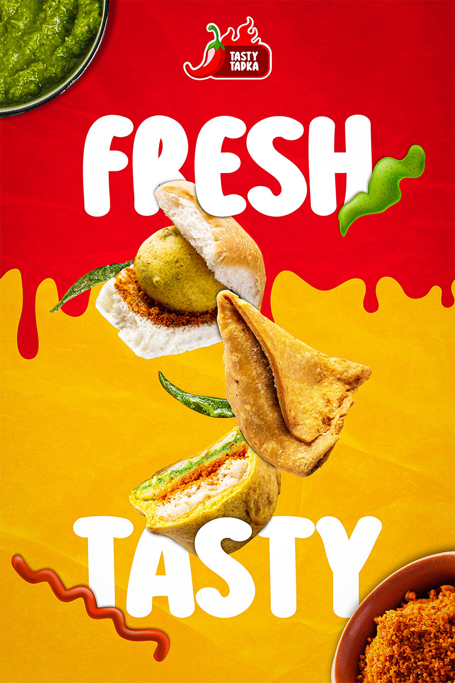
By itself, the poster looks good, although a call to action might be appropriate. I think a larger question is how well it fits in with the general look of the fast food restaurant and how well it matches up with its other visual branding.
1 Like
Overall the poster is competent.
The shadows were created without giving consideration to light source. Some elements have shadows cast to the background while others don’t.
By wedging products in between letters it makes the products look flat.
How come the letters do not cast shadows to the background? A little consistency goes a long way.
1 Like
Thanks for your feedback.
It looks like it’s getting close, it reminds be of the BK brand.
I’m sorry, but my take isn’t as positive.
I’m not sure what qualifies as appetizing in your locale, but I like Indian food, and I don’t think this looks appetizing. Weaving the type and the food items is a mistake, especially if those are supposed to be recognizable as particular menu items that are specific to this chain. Bled-off dishes in the corners are just superfluous decoration, along with the faked blobby and wormy stuff, and what might as well be dripping blood.
Food should be the focal point; honest, well-photographed, authentic looking food. Everything about this looks contrived.
2 Likes
I have to agree with @HotButton. To my eye, it looks like a hodgepodge of elements instead of a tight, cohesive layout.
1 Like
Thanks you for your feedback. I will keep these things in my mind.
Why all fast-food banners are so childish?
Appeal to the kids, and the parents will have take them there just to get them to shut up.
![]()
1 Like
I’ve seen recently a banner for London broil in crock pot so childish and stupid. These days with all the possibilities we can create more beautiful things.
True, properly trained and experienced designers can. But with the proliferation of Do It Yourself software and gang printers…wellllll…
Also, different cultures go for different “pop.” What might look silly to you or me, may actually be popular to the target audience, which may or may not beyou or me.