An older DJ client of mine does small monthly gigs at one of 3 locations.
He came to me and needed a quick poster for an upcoming event. He has tried to design posters himself but his Photoshop…wasnt legal. So he recently returned to me for a poster.
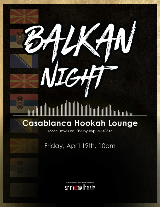
He asked: The title is Balkan Night (Yugo Night, he has both), I had to include his logo (also made by myself), and I had to include the location, date, time and 3 flags. Macedonia, Bosnia, and Serbia.
I made some quick sketches of the flags deconstructed, or type in a more ornate way. Time was of the essence and any flashy ideas I had were put on hold. Now that it’s completed, I was just wondering if I could have feedback on my work, and if I should show it off in my portfolio.
I do like the dramatic look and feel of the reversed type for this event. But…
Assuming the poster was to be posted in order to attract attention for the event at a normal viewing distance, I wouldn’t give a high score for readability. Some font sizes are too small.
And everything is centered, which doesn’t look professionally done.
Do you feel this is an example of your best work? Only your best should go in your portfolio.
Well I like the outcome. I should have specified its a digital poster, and wont be printed. So anyone who would see it, it would be on their phone, tablet or screen at a close distance.
(The client also likes everything centered)
I’ve tried different rags before. Hes one of those “just center it” clients.