Pre-service graphics critique

Hello, figured I’d share some currently/previously used pre-service graphics I made. Critique welcomed, figured I’d share something different I’ve worked on.

The purple one is the first one I had done in Oct 2022.

The gray ones (done in Feb 2023) were the 2nd ones I had worked on. Had to do different variations and ended up not using this one at all because we project onto a big white brick wall so the gray doesn’t even look gray no matter how dark I go. On a monitor, it looks gray but on the wall, it still looks white so I scraped it.

The black one (done in march 2023) is the one that is currently used and the one I like the best.


SilenceElectronicDevices240

You may not like this, but here goes… You asked …

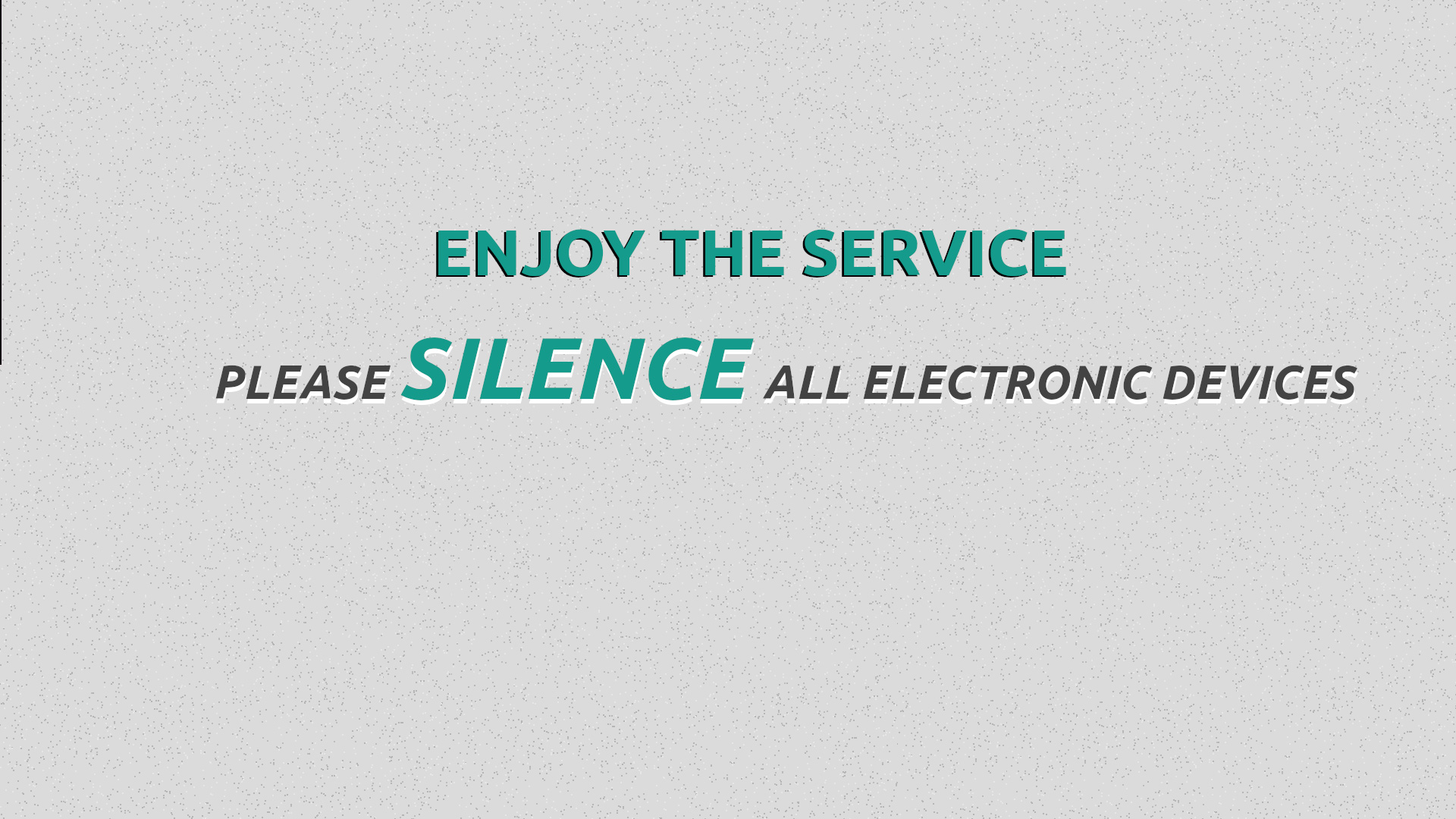
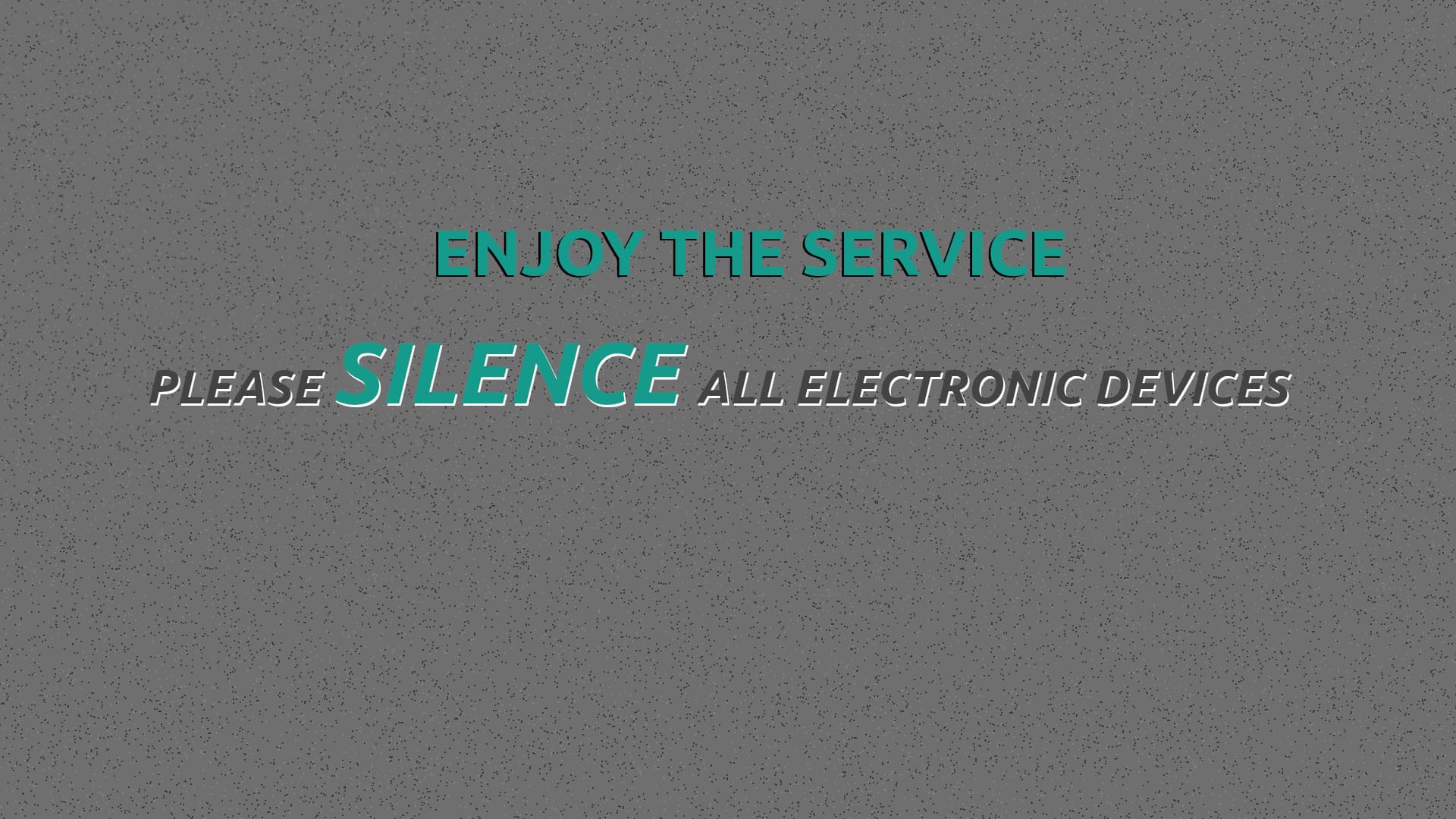
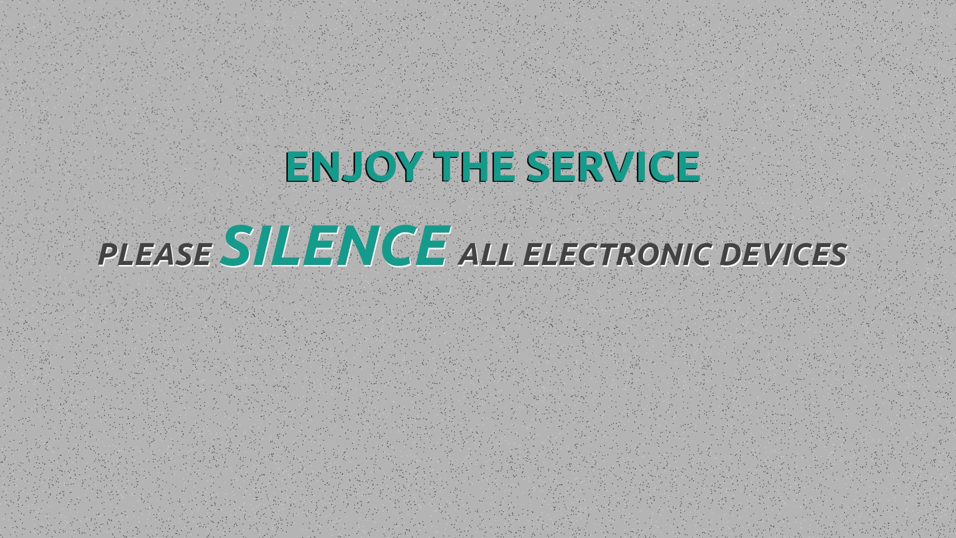
The grey ones are all but illegible, in two cases, because of low contrast and in all three cases the long sentence in all caps, italic severely hinders readability…

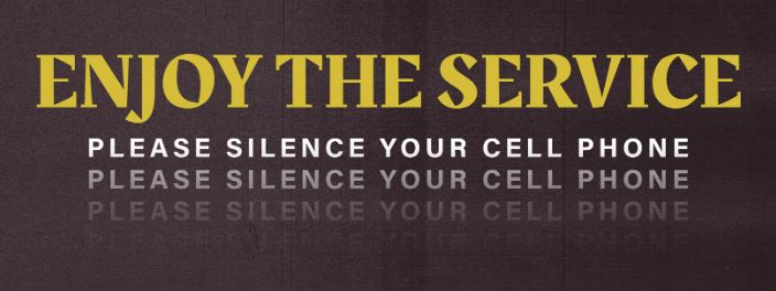
The purple one also falls over on the italic caps issue. Not sure why the line is repeated a second time with even less clarity than the first. The background is gratuitous.

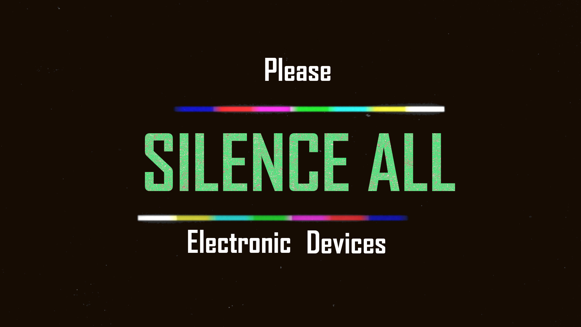
The top one, although a little more legible, the typography has completely the wrong feel and overly-saturated colours are also gratuitous and serve only to hinder. I’m not sure why you would want it to look like a bad 80s sci-fi movie title.

Most importantly, your hierarchy is all off. The first thing you read is ALL SILENCE, which reads (in bad English) as an imperative, ‘be quiet’, rather than turn your phones to silent.

Do some research on information design. But, moreover, your understanding of typography, generally, needs considerable improvement. If this is something you want to pursue, then you have a lot of learning to do. Thus far, you haven’t really demonstrated an innate aesthetic ability.

All these examples, and the flyers, are a bit ‘all over the shop’ (apologies, if that’s a Britishism) with little coherence. Furthermore, there is no sense of the organisation they are supposed to represent. I assume, your church is part of some denomination and this has some kind of existing, cohesive visual identity. Your work should reflect this.

This ties into what Just-B meant when he talked about creating a common feel across flyers for different events. They in turn, should sit, visually, under the umbrella of your diocese, or denomination – as should these informational announcements.

All,you have presented so far, I’m afraid, feels a bit chaotic, with the untamed expressiveness of a toddler’s drawing. There is no attempt to control the information you are presenting and serve it in a way that makes it easily digestible by its intended audience.

I understand that we all had to learn and start somewhere. My own first attempts were shamefully embarrassing. However, this all feels as though you are trying to run before you can walk. To be honest, to my mind, you need to gain more knowledge before attempting real-world applications – especially if you are taking on any paid work.

I am sorry, I can’t be more positive, but I am afraid, with both these and the flyers you have posted in the other thread – and I have intentionally stayed out of commenting on those, as others have said what you need to hear in a far more generous way than I might have – it all feels like you are minded more towards self-expression than communicating information.

Please understand that I am not saying any of this to be offensive or punitive. Think of it more as tough love. You have a long way to go. I am not saying don’t do it, but in order to learn effectively, you have to first understand what you don’t yet know.

Good luck.

You didn’t take the time to center the text. That makes it look like you didn’t care, or you didn’t know how to use the tools. Don’t guess. Measure. In the real world, if clients have to point that out to you, they probably won’t stay on as clients very long.

Don’t want to get into too much details. Not required.

First one the text is broken up and reads badly due the graphics breaking up the sentence.

Second one - why put the 3rd line, it’s not required. Hard to read etc.

Third/Fourth/Fight - just a thumbs down, boring, grey, illegible.

Most say ‘Enjoy the Service’ but one does not, why?

These kinds of announcements don’t benefit from special graphics treatments. It’s best to keep them nice, simple, and to the point by using a typeface that matches the flavor of religious service. If it were me, I wouldn’t decorate them with graphics, multiple colors, shadows, multiple type sizes, or unusual typefaces with too much personality. I would probably make the type large, easily read, and leave it at that.

1 Like

@sprout I appreciate the detailed feedback. Even if some of it is hard
to hear, the only way to get better is to know what you’re doing wrong
and how to fix it. If I want to grow I have to be willing to take
constructive criticism and that is what the crit pit is about right?

The line is repeated because I found it in a picture (see below), and
liked it so I wanted to replicate it. This wasn’t the exact one I had found but it mirrors the idea.

For the purple, I had taken the background from a free background church sampler
(FREE Worship Media & Creative Church Resources – CMG | Church Motion Graphics) and figured
I would add text to it.

The black one was another free template and I just put in the text. The black
one I liked that it had some color to it but not a lot which is why I wanted to use
it. Some color but still just simple.

Our church is VERY small. There is no existing cohesive visual identity aside
from a very very old logo. We aren’t part of a denomination, we are non-denominational.
We aren’t a branch of any church/congregation if that is what you were referring to. We don’t have another campus somewhere.

The previous flyers from years past were done by another volunteer in Microsoft
Access or Word/Powerpoint.

I am not doing this in a paid capacity. I only volunteer and I was asked to do this.
The other person didn’t want to do this anymore.

No worries about not being more positive. You have given good information and its
beneficial to me. I realize I do have a long way to go. I didn’t think of
a hierarchy in regard to these graphics.

I appreciate your honesty.

@Mojo Thank you, good points. I will go back and look at these w/the grid on.

@Smurf2 Thank you. Honestly, the Enjoy the service I was just trying to
add something besides silencing all cell phones. Like the picture in the above reply I did, it was something like that I was trying to replicate.

@Just-B Thank you. I figured w/these it would be okay to try and get better at design since it’s not a flyer. I viewed it as an opportunity to try something new since the only things I have actually work on design wise are flyers and its usually a few weeks to a month before the event that I get the theme for an event I wanted to try. This site (https://www.creationswap.com/) has free welcome, goodbye, etc. graphics that you can put up before/after service. It also has some blank canvas’s that you can use to put whatever text/image you want, which is why I figured I’d try to come up w/something for silence devices because we did need something stating to silence devices.

Here is an example from the site I mentioned above that has a welcome design.

We currently use this sometimes before service. I do not know how they create these things but I do look at these and other sites for design ideas/inspiration. As you mentioned in another post, I believe it was you, that said to try to look for designs outside of just church things. The other day I caught myself doing just that, looking at a design and thinking about why I liked it, what I liked from it, etc.

1 Like