Hello everyone.
Since I am new to the forum I will start by saying that I teach Technology in secondary education. My background is technical, so what I know about graphic design I have learned on my own in my spare time.
A few years ago I created a web page with Technology contents for my students and I designed the logo on my own. Since then it has undergone some changes to thicken the lines and simplify the colors.
I would like to know your opinion about the logo and, if possible, how to improve it.
I’ve increased your user privileges so you can post links and images. Is your logo the same as what you use here as an avatar? If so, it’s a nice logo — especially for electronics.
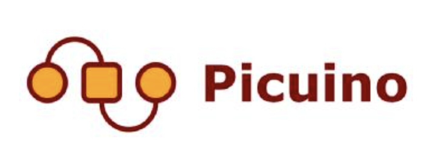
Thanks. My logo represents an electronic control board connected to both satellite boards.
Here the complete one:

From: www.picuino.com
The brand name comes from Arduino control board: https://www.arduino.cc/
It’s very good — especially for someone with little training or experience in graphic design. It’s simple and memorable, and the typography matches the logo perfectly. I like your use of the same stroke in the logo and the type. I also like how you’ve lined up the name with the square and circles to create a nice horizontal element that unifies the name with the logo even further. I’m impressed and wouldn’t change a thing.
1 Like
Thank you very much.
I have improve the logo step by step over the years.
This is the original one, designed in Word (instead of Inkscape):
Another different thing is the main web page (i do not know how to improve it without a lots of work)
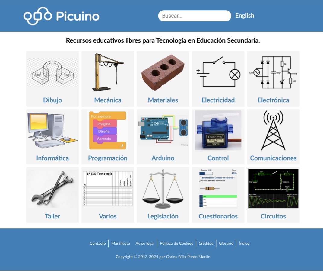
Is a mesh of own images and wikimedia ones.
1 Like
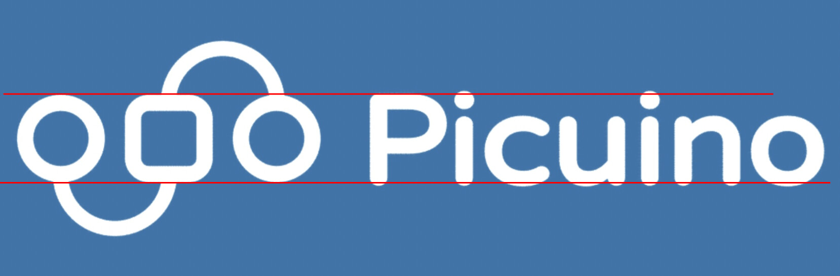
I found one minor adjustment that I would make. It concerns what are called overshoots.
Look at the example I posted. Notice how the dot on the i extends slightly above the top of the P. The type designer did this on purpose. If the top of the dot were lined up with the top of the P, the i would appear shorter. In typography, this adjustment is called an overshoot. All quality fonts use overshoots; the glyphs with curved tops and bottoms always extend slightly above and below the flat-topped and -bottomed glyphs.
Your logo doesn’t contain the overshoots on the circles; consequently, the square looks slightly larger than the circles. If it were me, I’d enlarge the circles slightly to make its top and bottom even with the overshoots in the typography.
1 Like
Wow, what detail!
I’m going to follow your advise shrinking the text and the square.
I have made the proposed changes and also reduced the overall width of the text so that all strokes (horizontal and vertical) have the same thickness.
Do you think it has improved?

Already off to a great start. This statement alone shows me you understand how a logo needs to be easily readable at small sizes, and work at a glance. I’ve seen the suggestion above to bring things more in-line with the square and I think the fact that THAT is the only thing anyone has thought of to suggest is a real compliment to how well thought out the initial concept is. Frankly I couldn’t think of any major issues. You’re good to go, in my book. IT WORKS.
Yes, the logo is what I’ve spent the most time on and I think it’s ready.
This is a personal project, of free content (Creative Commons license) and I’m not looking for the final look of the page to be completely professional. I am not a commercial publisher of educational content, so an amateur look also speaks of what my project is.
The main page is what now squeaks me the most.
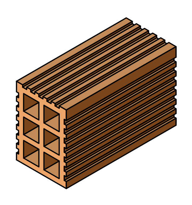
The brick (third image, materials subject) is a recent change, but it still doesn’t convince me. It’s too massive.
I recently changed all the thicknesses of the electricity, electronics and communications tower to match and not clash with each other. However the balance (legislation subject) has too fine lines in comparison. It is a stock image, so I will have to design one myself.
The last black image represents the look and feel of the web application linked, but it is very clashing.
A website is a much larger problem than a logo. It might be likened to the difference between designing a hood ornament and designing, engineering, and building the entire automobile.
I agree that your front page has problems, but they’re broader and deeper than you mentioned and extend throughout your website. However, I don’t want to comment on the other issues since you only asked for opinions about the front page.
You’re right; the illustrations on your front page don’t match each other. You also linked to another website where the images don’t match. However, their entire front page visually hangs together as a cohesive whole due to the stylistic consistency of all the parts. Try to pick apart what they’ve done that you haven’t done to provide that consistency and visual interest. For starters, It has to do with consistent color schemes, various graphic devices, and creatively using the inconsistency of the photos and illustrations as the spice in the layout.
1 Like
Keep in mind that I am a Technology teacher and I have to teach in the mornings. The web helps me to deliver the contents to the students, but it is a non-professional editorial work done in my free time in the afternoons.
The linked website (Arduino) is a company that bills millions a year and can afford to hire a team of designers to make their website with good graphic design.
In my case, I’m like a one-man band that does it all. I do the graphic design work, the web design (modification of the standard theme in CSS and HTML), maintenance of the web software (programming Python and JavaScript), creation of didactic content, SEO positioning, advertising through teachers’ social networks, etc.
I have to think about how to dedicate the little time I have free when creating the whole project. The graphic design part has always seemed important to me and the fact that the web is responsive, well laid out and has drawings and diagrams well done with appropriate tools already says a lot about the project quality, comparing it with other personal projects (not with other professional projects that have at their disposal many more resources).
Anyway I am aware of my limitations and with improving the design of the main page, I think I’m satisfied for now.
One of the ideas I’ve had for some time is to replace all the images on the cover with black and white diagrams of the various objects. This would make all the images consistent with each other and with electrical diagrams, and avoid the need to use a consistent color palette.
The problem is that this could take me more than 10 hours of work and I’m not sure that the final result would be good, because it would lack color, which is always welcome in educational content for 12-16 year olds.
Thank you for better defining the problem. I wasn’t sure if you were developing this for your students or as a commercial product.
Either way, closely examining similar layout problems and their solutions, such as the Arduino website, can provide insights into their designers’ thought processes that you might use to help solve your particular design problem.
If you perform a Google image search for “icons,” you will find thousands of icons similar to the line drawings you’ve used. There are also many examples of how the backgrounds on those icons can be colored, shaped, and arranged to impart a cohesive look.
For example, here is a single image of vector icons on a stock site — all are stylistically similar and positioned within brightly colored circles. Some of these and similar icons are available at low cost from stock sites; others are free to use. You mentioned some proficiency with Inkscape, so you’re in a good position to redraw or modify some of the icons to suit your needs and preferences.

Recently, I incorporated icons similar to these to help solve a design problem for a city’s recreation program class booklet. In addition to the cover, I also incorporated the relevant icons on the section front pages within the booklet, which would also be an option in your situation.
I will say Streamline has some free icon options that might work. If you go that route I would work from one set. Such as “Core Pop” or “Core Duo” perhaps. Some sets have 1000 icons in the, so hopefully you can find ones that work for you.
I should add if you review their licensing, while the icons are free they do require an attribution link which you could include in your website footer.
https://thenounproject.com/ is a good source for icons as well.
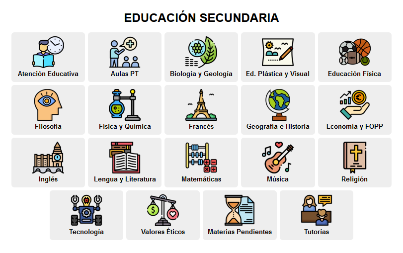
I have done similar work with stock icons before. For example this home page of a Moodle virtual classroom, with icons from Freepik.es.
The problem with my website is that I have a hard time getting icons of the subjects (electricity, drawing, mechanics, electronics, materials, etc.) and I have not succeeded with many subjects.
Agreed. You may have to find icons that are a little more abstract rather than being very specific if you are having a difficult time finding specific icons.