ProBono Logo Design for Seminar Series

Hey Y’all — This is a pro-bono logo I am designing for a not-for-profit organization called OMAC (Operation Making A Change). This organization works with at-risk High School kids and this logo will be used for a new seminar series in the Central Kentucky area.

This is my first draft and I am not completely satisfied with it yet. I’m sure you guys will have lots of good input for me, so have at it.
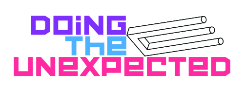
Doing The Unexpected LOGO-2

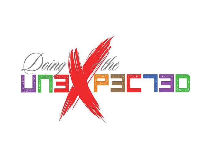
Here is a second option with type change

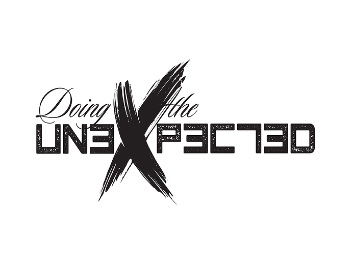
Doing The Unexpected LOGO-3

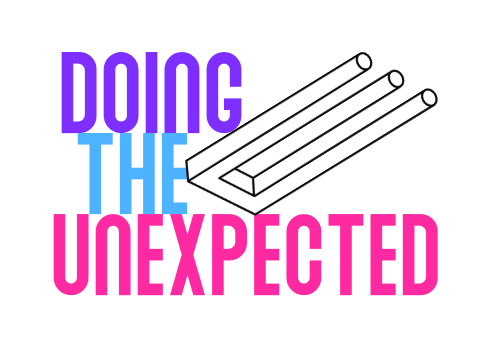
I think there’s an inharmonious relationship between the illusion graphic and the typography — different personalities, different color schemes, different angles, different line weights, etc. There’s not much tying them together as a coherent whole. They come across as two separate entities rather than a complementary pairing.

On the other hand, this visual juxtaposition is unexpected, but if that was the intention, it’s competing with the primary unexpected thing — the illusion.

If it were me, I’d likely abandon the illusion graphic and concentrate on doing something unexpected with the typography you’ve come up with, which I’m liking.

I am not big on the lower cases as a feature of the upper case characters. The poiuyt (a name I learnt from Mad Magazine), like @Just-B said, is creating disturbing visual conflicts.

I’d consider @Just-B ’s suggestion.

Poiuyt? I had to look up that one. It’s a good word to tuck away for the next time I play Scrabble. I’d never thought of Mad Magazine as a vocabulary-building tool. :grinning_face_with_smiling_eyes:

1 Like

I only remember the spelling because it’s the top character row on the keyboard, from right to left. In the beginning I thought it was French.

Generally, I’m not a fan of that either, but in this instance, I’m liking it because it’s a little wonky in an unexpected way that’s consistent with the name.

Do the trident thing with the n in unexpected.

Thanks for the input guys. Really good so far. And yes, Just-B, that was my intention. In addition, the audience will be basically teenagers. I thought the typeface might appeal to them, and I am hoping that at least some of the kids will discover the fork is two images combined into one, or that it is one image with two different outcomes, and that that surprise will get passed around among the kids.

Like you, I originally considered a much different typeface, but I’m really wrestling with it (I do have about 2,000 faces in my Font Manager app to choose from). I’ve got a week to ten days to figure it out. Please keep the comments coming.

I also considered this, not as the letter “n” but as the letter “E” which would work much better, but when I made a pass at it the first time, the thin lines on the image turned out too small overall. Plus, the word “UNEXPECTED” is a long one, which complicated matters. Most important, I feel the optical illusion in the image is perfect for the message and therefore, should not be so small that it does not communicate the idea.

I have to agree with @Just-B that there seems to be a disconnect between the illustration and the type. I could see this project implementing a strong, type-based solution (think Pentagram).

To be honest, if it were me, I’d ditch the Escher-esque drawing. As B said, it doesn’t sit well with the type

In a way, it is a fairly expected way of illustrating ‘unexpected’. Again, as B said, I’d make it just typographic and do something actually unexpected with the word, ‘unexpected’. Melt it, explode it, give it antlers, etc – obviously keeping it legible, whilst pushing that legibility to the extreme, you’ll get away with it as it’s for teenagers.

To my mind, the whole thing needs to be a lot edgier and 'yoof’ culture. Maybe look at graffiti tags and doing one in Baskerville, et al - dunno, just thinking out loud.

Perhaps flip the whole idea and rather than taking something sane and expected and making it unexpected, Take something anarchic and make it predictable. Not sure what. I am just spewing, hopefully to give you other avenues to explore.

To my mind, if you are dealing with kids – especially at-risk ones – you need to speak their language if you are going to get anywhere near getting them to engage with mainstream ‘conservative’ (as they will likely see it) culture. Have you got access to these kids? Speak to them. See what their influences are. What music they are listening to (ergo, album covers they are looking at), etc.

You’ve probably been through all these thought processes a thousand times already, but, if I’m being honest, the whole thing feels a bit like talking to kids using what ‘grown-ups’ think is ‘down with the kids’ phrases whilst wearing a baseball cap backwards.

Kids see through that sort of stuff straight away. At best, they may see it as patronising, at worst they will find it risible. Either way, they’d be unlikely to engage. That age group – especially if they aren’t on a fast track to the ivy-league – are very culture-savvy and extremely nuanced. You need to speak their language,

Apologies if it is not what you want to hear. Hope it helps in some small way.
Sorry Sprout, I don’t understand what you are saying in this sentence. Clarify this point further, please.

Not entirely sure myself I was just thinking out loud really.

When people treat things in an unexpected way, they usually take something expected and do something anarchic with it. Try flipping that idea on its head, taking something that is usually seen as anarchic and out there and treating it in sane way. There was no more thought to it than that. Just an avenue to think along really.

For example, where you may see ‘unexpected’ as Bank Manager in a bright pink, flowery suit, do the opposite. Carmen Miranda in tweed. Not sure if there are any legs to that, but it may just lead you somewhere else. Who knows?

The reason that popped into my head was largely because what you are doing it trying to appeal kids that are often ‘outside’ the system and trying to educate / talk to / appeal to them and perhaps bring them into the fold of expected norms and accepted society so they can live a satisfying and rewarding life, then it is about making the abnormal (used in the loosest sense of the word), normal.

Okay, Guys — You Asked For It, and HERE IT IS for your viewing pleasure.


The way I read your brief in the first post, this logo is for a seminar series for teens. So the mark should appeal to teenagers. Granted, I’m not immersed in teen culture, but I don’t think this is it. Honestly, I like the type better from the first two options you posted. I like the color palette better in those options, too, and think the more muted color palette will resonate more with teens than the brighter palette in the third posting. I’d be inclined to go to the first two options, drop the optical illusion and then see what you can do to push the type. Just my two cents.

I just worry about the reproduction across different substrates and output methods.

Not sure if a Grunge type like this is good for teens.
Almost looks like a dinner invitation mixed with text aimed towards tweens not teens.

I like the treatment of the X I even think it could be used in iconography. But it needs to be simpler for reasons mentioned earlier.

I think the backwards lettering is too childish for a teen market.

And the script font is to too adult for a teen market.

Would there be a way to stack the unexpected so it’s a block of 5 and 2 and also a block of 2 and 5

UNEXP
ECTED

And

UN
EX
PE
CT
ED

Perhaps just an idea to have a long and short version.

I think a bit more research into teen logos might be required.

https://www.google.com/search?q=at+risk+teen+logo&client=ms-android-samsung-ss&prmd=inv&sxsrf=ALeKk03GdERWHKWImjghZ3fUMraM7tARIw:1627536868664&source=lnms&tbm=isch&sa=X&ved=2ahUKEwjk_6inx4fyAhX7WxUIHSJhDzwQ_AUoAXoECAIQAQ&biw=384&bih=723

A trip to the mall may be in order to do a little recon at teen-oriented stores. Or just browse online.

Vans

Hot Topic

I don’t have teens nor do I do any client work focused on this market, so I am not too familiar with teen culture these days. Ask a teen / kids / grandkids where they shop, what they listen to, what they’re watching, etc.

In my first reply, I mentioned Pentagram. Here’s sort of what is in my mind’s eye.

Thanks for all the comments, but sorry Guys — I just showed this to the client organization this morning and they loved it. It’s going to press in all it’s forms. My client organization is as savvy as it gets in all things that relate to the teenagers they are working with, so it looks like I hit the bullseye on this one.

1 Like