Hello everyone, I am new to you all here, so I thought I would start by getting some critique from you ![]()
These are all product displays I made for our company.
Hello everyone, I am new to you all here, so I thought I would start by getting some critique from you ![]()
These are all product displays I made for our company.
Any free samples?
![]()
![]() … kidding
… kidding ![]()
We do free samples for clients from time to time on new products, especially ones who review ![]() You’re welcome to use coupon code: GRAPHICDESIGNFORUM to get a nice 10% discount if you’re interested
You’re welcome to use coupon code: GRAPHICDESIGNFORUM to get a nice 10% discount if you’re interested ![]() (just made it special for anyone else who cares to get it. use it as often as you like!)
(just made it special for anyone else who cares to get it. use it as often as you like!)
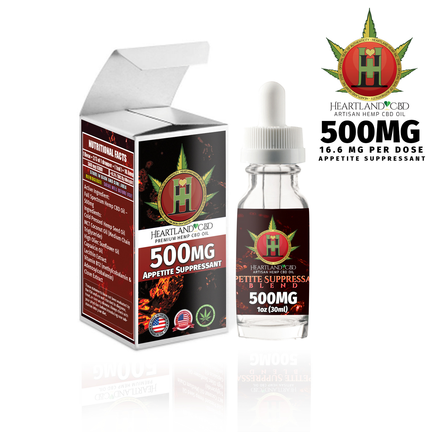
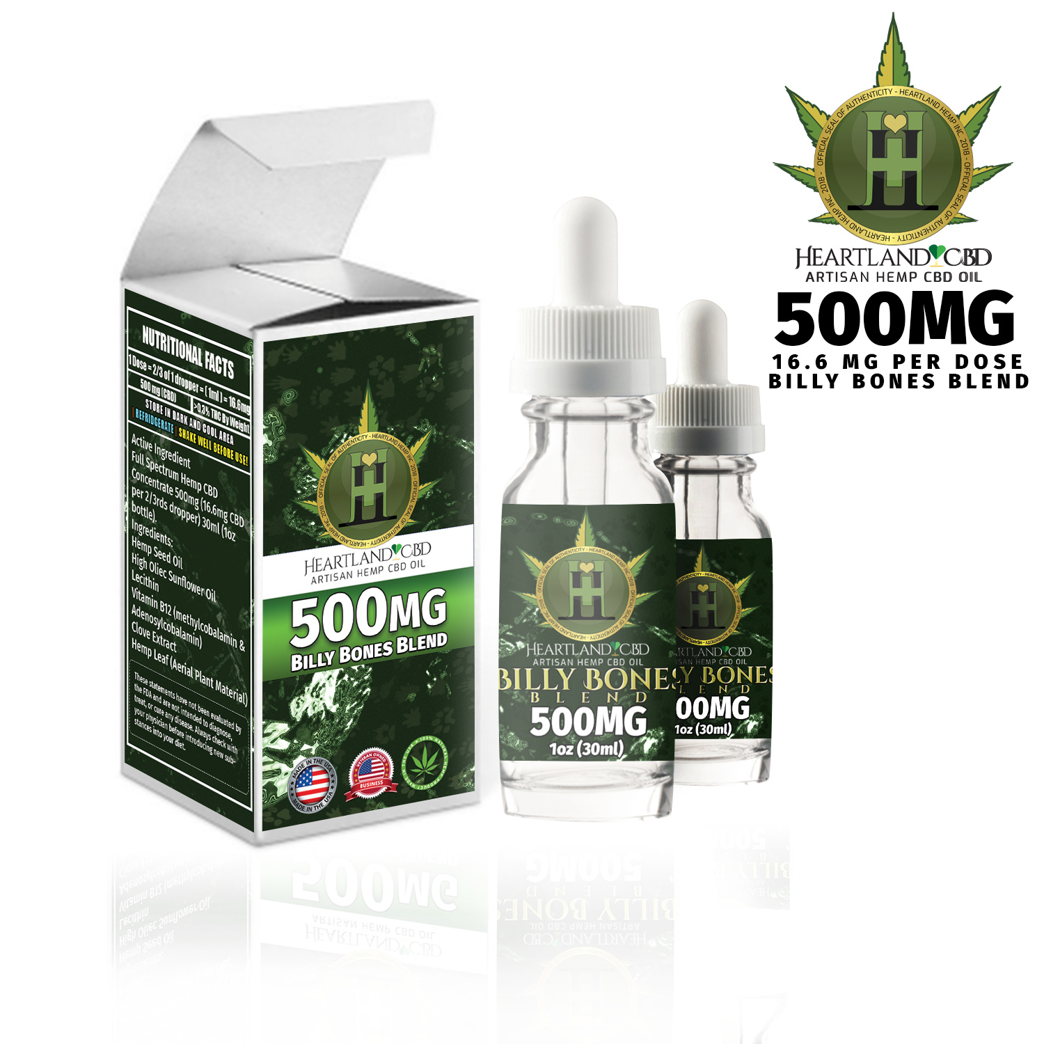
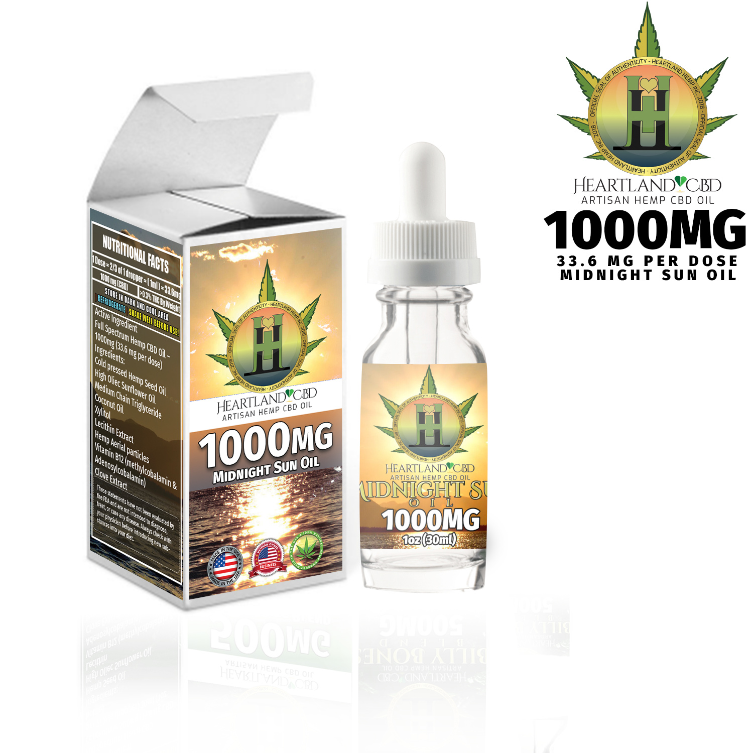
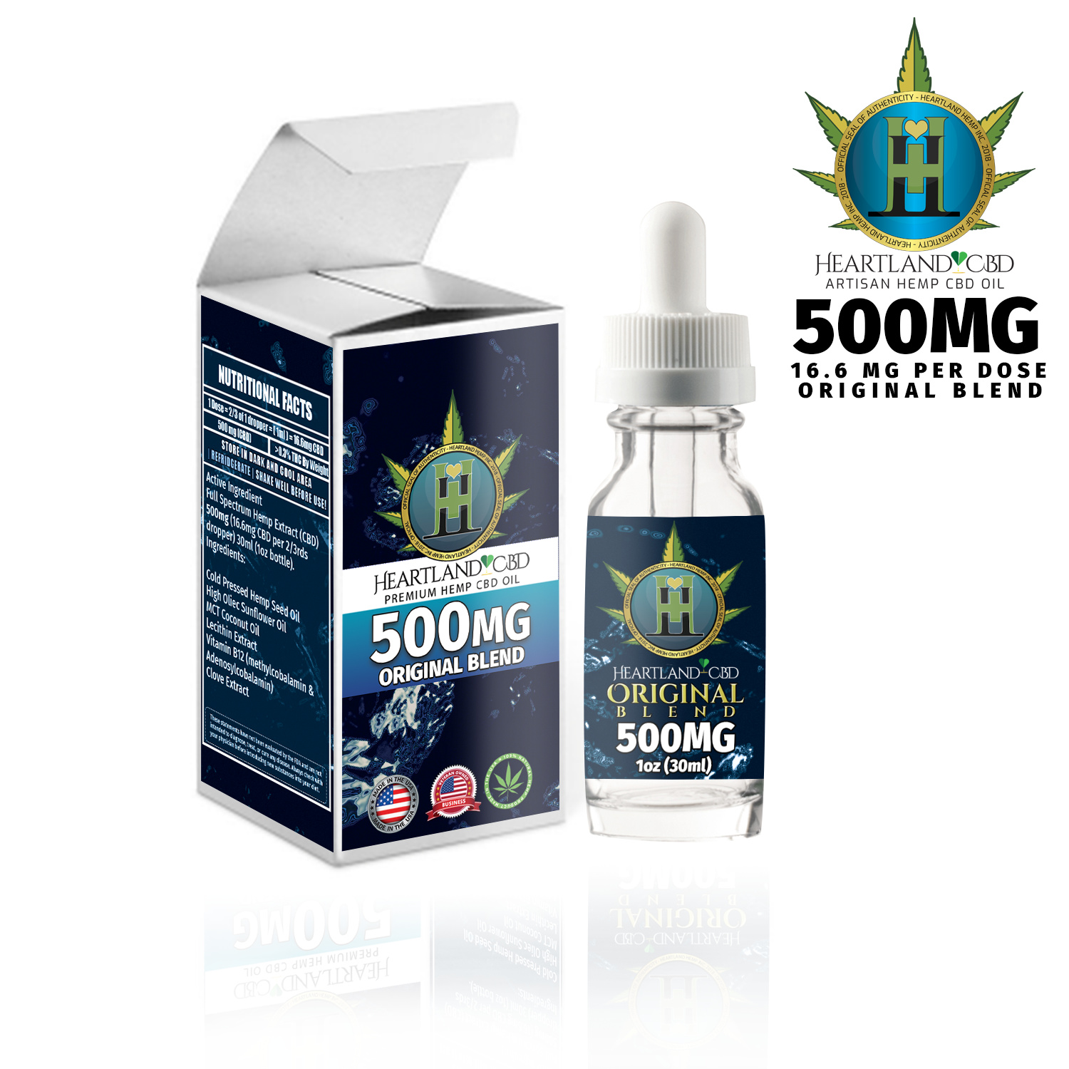
Isn’t it a little misleading to put 500mg and 1000mg on products containing only 16.6mg and 33.6mg respectively?
I understand the confusion. It is 500mg in the entire bottle, where in a single dose, you get 16.6mg in 2/3rds of a dropper. Nobody should be ingesting more than 50mg - 100mg on at the highest on a single dose. Most after just 50mg will get very sleepy. Many will generally take about 15mg - 25mg before they feel anything. But thank you for your pointing out. What could I do to make this clearer?
I think you have a hierarchy issue. My eye first goes tot he logo (not the type, just the mark) and then goes to 500MG. The “premium hemp CBD oil” – which tells me what I’m looking at – is one of the last things I see.
On the red box, you have “appetite suppressant.” That’s pretty easy to understand. But I’d have no idea what the benefits of “billy bones blend,” “midnight sun oil,” or “original blend” are. I will say that I’m not into hemp, so if those things are readily apparent to your target market, I guess you’d be fine.
It bothers me that the size and position of the logo varies from one box to the other.
Try to get the type on the label to more closely match the type on the box. For example, on appetite suppressant, the words appetite suppressant should be in the same front with the same treatment on both box and label.
Watch your vertical spacing. For example, on the midnight sun label, you need some aid between “artisan hemp CBD oil” and “midnight.”
Agreed with the hierarchy issue. I had no idea what this stuff was at first glance, only when someone was asking for samples did I go back to see what it actually was.
Wow, thank you very much for your detailed critique.
I do use the same fonts across the board, but I did not notice that the positioning of the logo changed, I will have to look closer there to see it.
I also appreciate your input on what you see first, where the last thing you see is exactly what the product is.. I am trying to imagine an attractive way to present that.
Awesome you’re input is incredibly valuable and I greatly appreciate it! ![]()
Thank you all for your incredible eyes ![]()
Does anyone have any thoughts on what I can do bring clarity to what this product is? Especially those of you who have no idea what CBD actually is?
There are some things I can’t do, like make health claims such as “pain relief” or “arthritis pain relief” or “anti-convulsant” or anything like that. Legally speaking.
You’re welcome. I have a bit of experience with packaging.
Artisans Hemp CBD Oil … needs a more prominent presentation.
I too had no idea what these products were until I read the fine print.