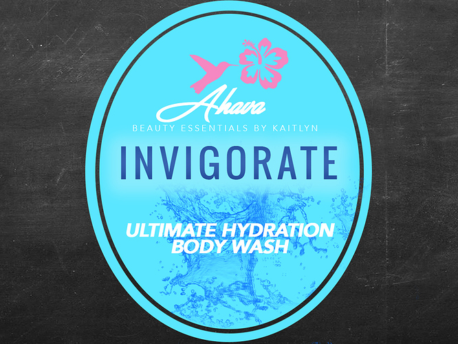
Hi! I’ve been a graphic designer for a while but this is my first time doing product label design. This label here is for a natural body wash, any thoughts? I’ve modeled it after Suave, Dial & other labels. I feel like Ultimate Hydration is competing with the water splash behind it. I want the label to feel refreshing and clean! Any thoughts or critiques?
Your design is very cute! One thing is I’m having trouble reading what it says below the bird and flower. Ahava? You may want to work on the letters after the A so they don’t smudge together.
To me, the label comes across as an assemblage of separate elements that lack visual cohesiveness. It’s as though there are several ideas going on — each of which is competing for attention with no discernible winners.
Just-B pretty much nailed it. It feels like you pulled together a bunch of elements with no thought to how they work together, so the whole thing feels disjointed. Also, do you have four different fonts going on there? Is invigorate the most important word on the label? My eye goes there first, then up to Ahava (which I agree with Trent is tough to read). I’d say back to the drawing board on this one.Sorry.
Thanks! I will definitely tweak my design!
I agree with the comments above regarding the design, however there are a couple printing issues you should be aware of with this design.
Since each color plate tends to move around a bit on press, the printer will need to trap the Magenta Bird/Flower graphic with the Cyan background so a white gap doesn’t appear between the 2 colors. This will inherently create an outline around that bird/flower graphic that is a combination of the 2 colors. You may want to consider redesigning that aspect because the outline will make it look pretty ugly, maybe just keep the Bird/Flower as white. Read this to better understand: Trap (printing) - Wikipedia
I’m guessing the water splash image in the background is being made of a tint of magenta overprinting on top of the cyan background, which is a good way to go about it. However since it is against reverse type (https://www.lifewire.com/reversed-type-in-typography-1078172) the magenta plate will move around a bit and some of the magenta will peek through in the type. To solve this, add a 0.75pt outside stroke of the cyan background color around “Ultimate Hydration Body Wash” type.
The type for “Beauty Essentials By Kaitlyn” is too thin and will close up in printing due to dot gain (Dot gain | what is it and how to compensate for it). To solve this, choose a bolder typeface or add a 1pt white outside stroke to that type.
This is more of a tip since I’m not able to see you exact color mix for each color (assuming you are actually printing this in CMYK and not 4 spot colors), try to ensure you aren’t using more than 2 color channels per color. As mentioned above, press plates jiggle around a bit. Asking a printer to align 2 color plates to make a piece of text legible is doable in most cases, but if you are using 4 colors to make one object its going to get fuzzy… for example, make sure that black line oval boarder is just K, the “Invigorate” is just M and/or C, the background is just C…
This label looks like it could be printed using only three spot colors, which would be less problematic than 4-color process and yield better results (and be a bit cheaper besides).
Depending on the substrate, dot gain probably wouldn’t be much of an issue (but I agree that very thin, small type is unnecessarily setting the stage for possible problems).
So assuming spot colors and traditional printing techniques, the only registration problem would be where the pink flower & bird meet up with the background, so yeah, a small trap might be warranted.
Then again visible registration issues on printing labels are nearly non-existent when using a good printer that specializes in them. I just got out a loupe to look at a few labels around my office — I couldn’t fine single one misregistered by more than a quarter of a dot. That wouldn’t have been the case 20 years ago.
Convert the oval border to blue and you’d have a 3 color job. Although, the price these days, at least in the north east, may actually be cheaper to just run it 4 color process at it is. We always have a press set up, and ready to go, for 4 color process. We also have smaller 1 or 2 color color presses washed up and ready for whatever PMS ink you might way to run. But 3 Color? well, were not going to break down the 4 color press, and the smaller press only has two heads. we’d have to run it in two passes. Which is pain. Unless a speciific Pantone is called for, this would go 4 color, all the machines auto trap on the plate RIP. No need to manually trap or choke any more.
20 years ago it wouldn’t even be uncommon to have splatter marks from the soft flexo plates being ran at speeds higher than recommended. Registration ..was.. inconsistent..to say the least.
Sort of depends on the nature of the label. I interpreted that dark border as being a clear area on a transparent vinyl label that enabled customers to see through it to either a dark gray bottle or the liquid inside a clear plastic bottle. The OP didn’t really get into what the rest of the packaging might be, the quantity needed or budget considerations.
Whether three or four colors, I’d prefer spot colors instead of conversion to four-color process (even if it, unfortunately, meant not using your shop, Biggs, which would have been my first choice of course ![]() ).
).
Edit: Then again, if it were printed on clear vinyl, the white type would become the 4th spot color. I wasn’t thinking clearly the other day. ![]()
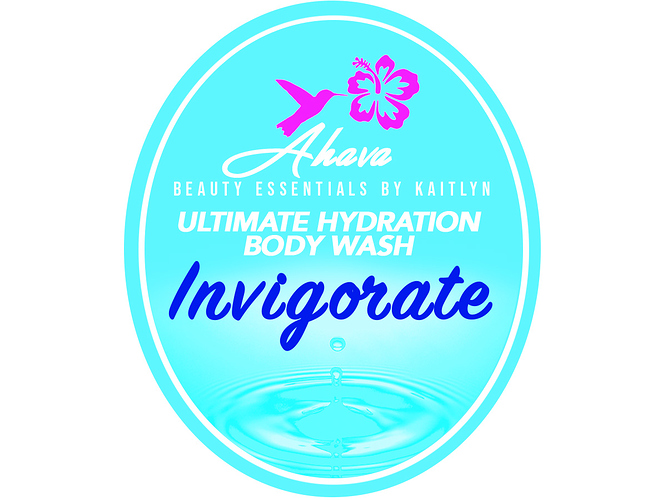
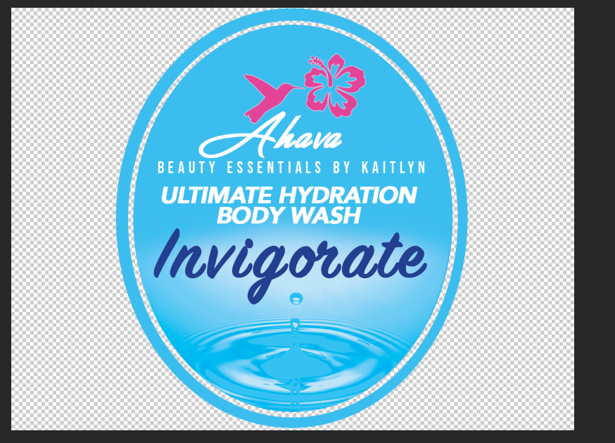
Here are my revisions! Thank you to everyone for your advice. I will most likely use VistaPrint for printing my labels. These labels are for natural skincare formulas, would you all suggest weatherproof material for the labels? They have several materials but I wanted to make sure the labels would stay put as they would be used in a room with lots of humidity (a bathroom). Any other material suggestions? (Matte, Gloss, Thickness, Vinyl)
Are you showing us the final design or are you wanting us to critique the new version?
I’m asking for critique on the new version and if you have any suggestions for label material ![]()
The new label is definitely an improvement, but I think the type could still use some work. Too many different font families, loose tracking on some type tight tracking on other type, not crazy about the Invigorate font.
The colors are much better, but I’d agree with Steve about the type.
- The brand is too weak.
- The E-S-S of ESSENTIAL are too loose.
- The disconnected script of Invigorate degrades the whole thing.
I don’t know about doing this in Photoshop. I would do this in Illustrator.


