In case if you are not aware, this post is associated with my other one where it shows three logo designs that I asked you guys to give me feedback on.
In this post, I am asking for constructive feedback on my designs for a webpage to be used for the three client companies mentioned in my other post.
The reason I am posting my work separately because I want to make it easier for you guys to provide your own feedback to each specific work that I have made for the three companies. For context, these designs were made from a client brief known as ‘Linked Identities’ from the ‘Graphic Design Exercise Book’ by Jessica Glaser.
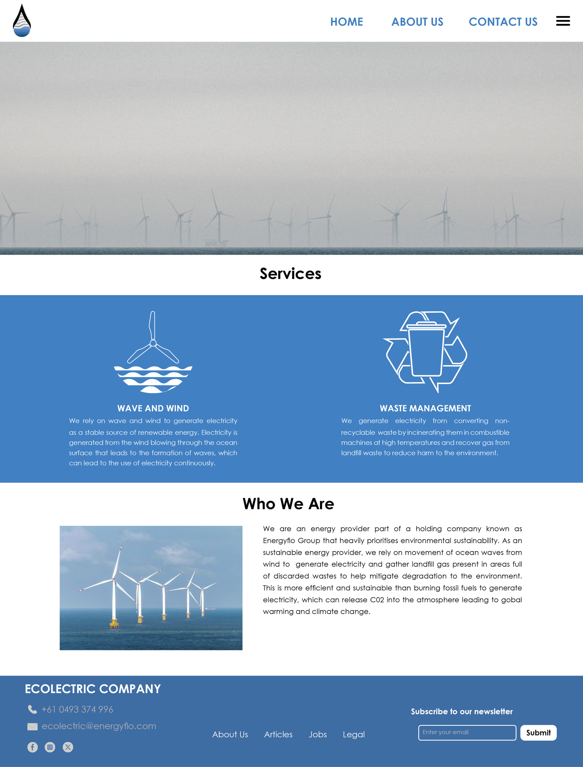
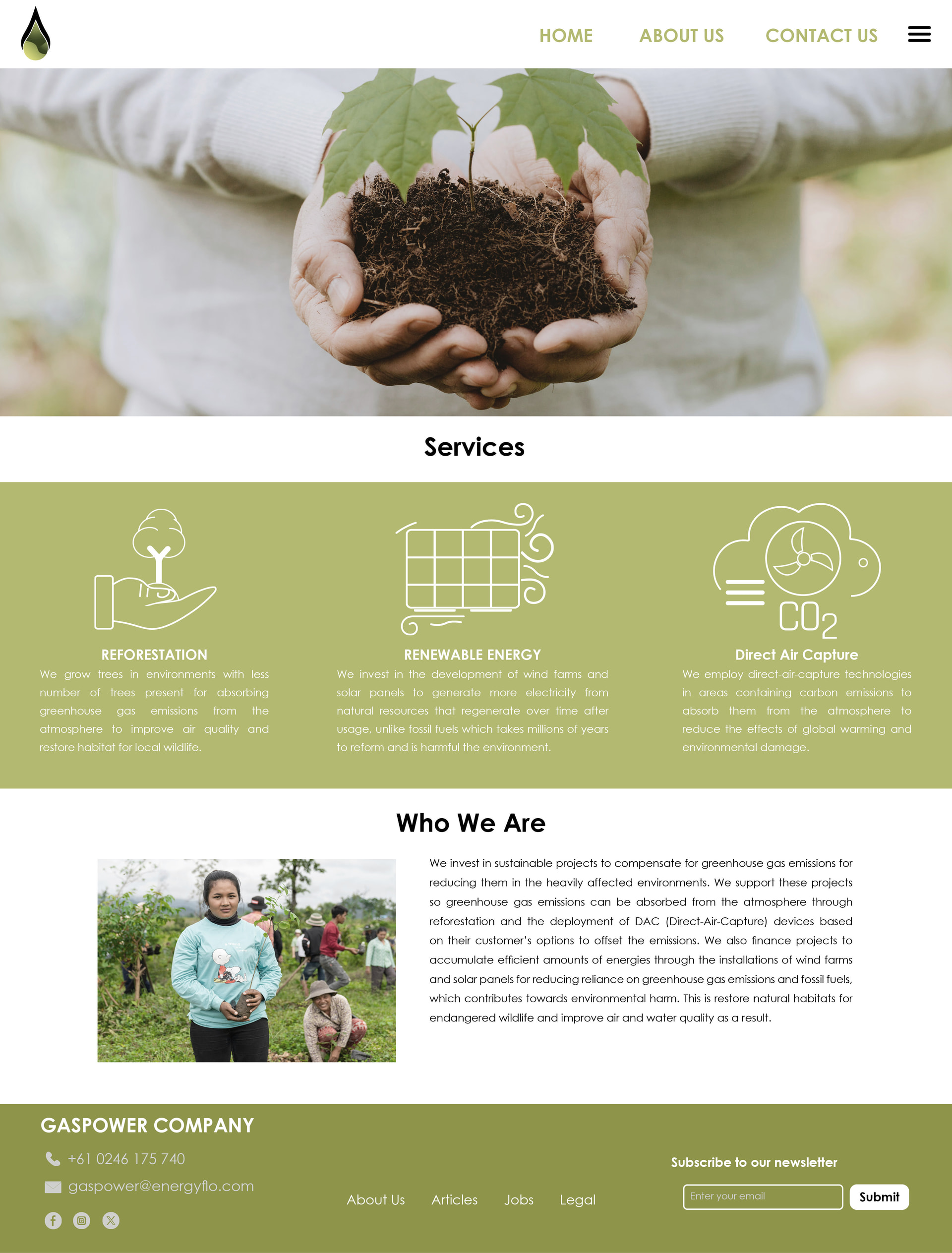
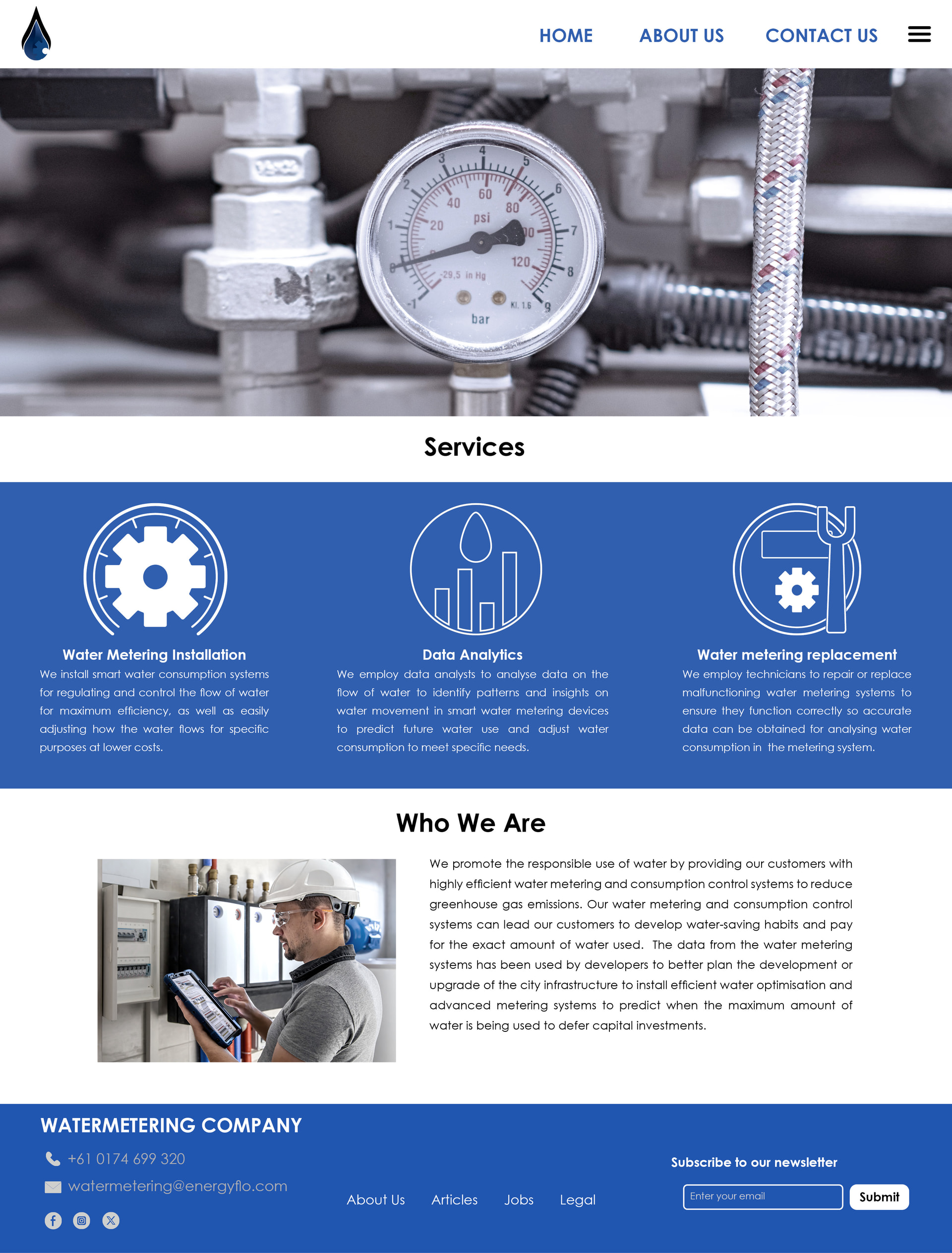
I would say that your webpages are ok, but they look the same (are you using the same Html template ?). I would suggest making a variation, use colours combinations or shapes (icons related to the theme you are speaking about). As a suggestion, check this: Who we are? 1- Should be first (because to the intro of the company) then after 2-Services that the company offers to people and 3- Contact Info. Usually is this way : 1- company Info then services and after contact.
If English is your second language, have someone read your copy. It’s convoluted and not grammatically accurate.
Why are you using full justification? Do you need to? Look at the rivers in your text. (per wiki: “In typography, ‘rivers’ are distracting vertical/diagonal streams of white space running down through a block of text.”
All of the imagery and icons look generic and cliche.
I am just saying that your webpage look all the same, you should make them to use different things and You have to make them to look different. Even you may need to use some UX Design which could be great on your portfolio, your design look like the same. Make them to be different, all your design looks like they were made by an HTML template, you just change the text and the images. But also as Print Driver said you need to take care about the grammar that’s very importat (I did the same on my online portfolio).
I looked at all three pages, and a few things beyond what’s already been said. The biggest gap is the hero banners: each one is a large photo with no headline, no subhead, and no call to action, so the first thing a visitor sees says nothing about the company. One strong line of copy plus a button would anchor the whole page. Second, the body text in the Services bands is set extremely small — at that size most people will skip the descriptions entirely, so bump it up and trim the copy while you’re at it. Third, on desktop you show a full nav and a hamburger icon side by side; pick one, since the hamburger implies hidden content that isn’t there. To add to the “they look the same” point: you already vary the brand colors well, so vary the page rhythm too — reorder sections, restructure the services band, or treat the type differently per site. Same layout with a different color reads as a template; different layouts with a linked color system reads as an identity family.
I initially interpreted GASPOWER as a natural gas company rather than one devoted to curbing greenhouse gas emissions and promoting sustainable energy and environmentally sound solutions, as the website mockup spells out.
If the company isn’t about gas-generated power, the GASPOWER name is really misleading — 180 degrees away from what the company actually does.
Your stock images are cliche right? Should they not be bright and cheery? You have image of a windmill sitting still. I think you should get one of them appearing like they’re moving. A little motion blur. Text: I found it a bit hard to read against your background.