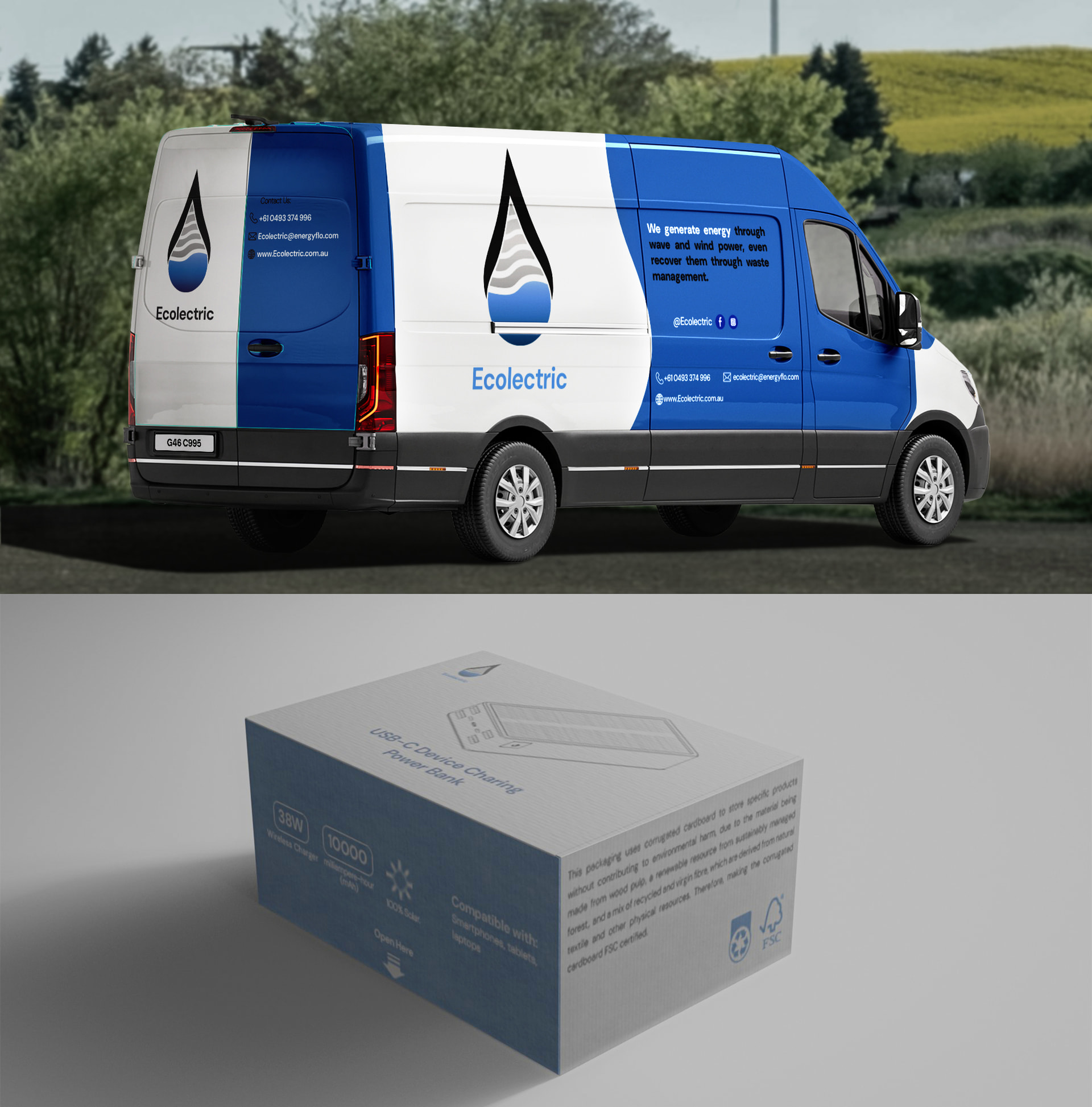
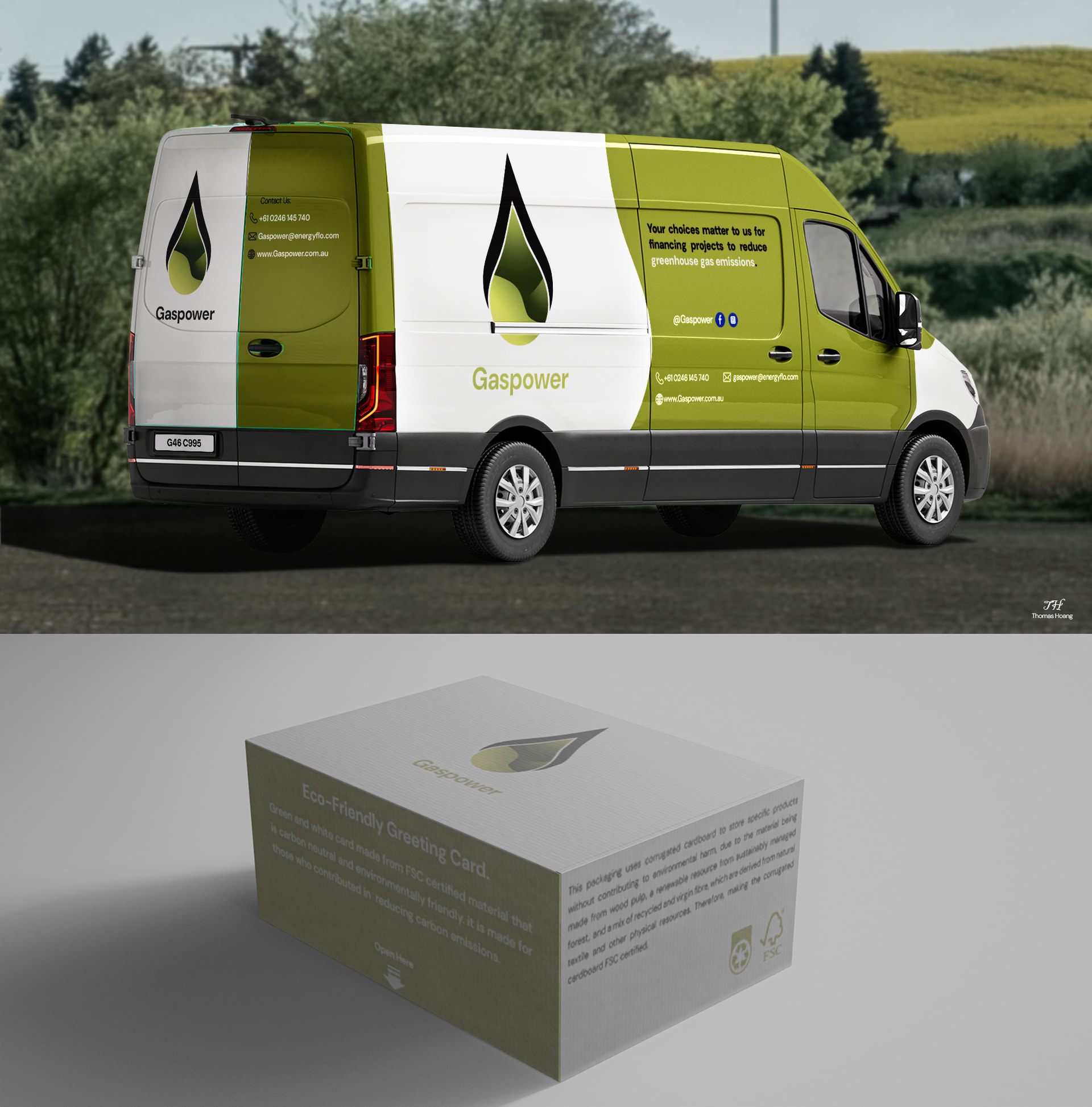
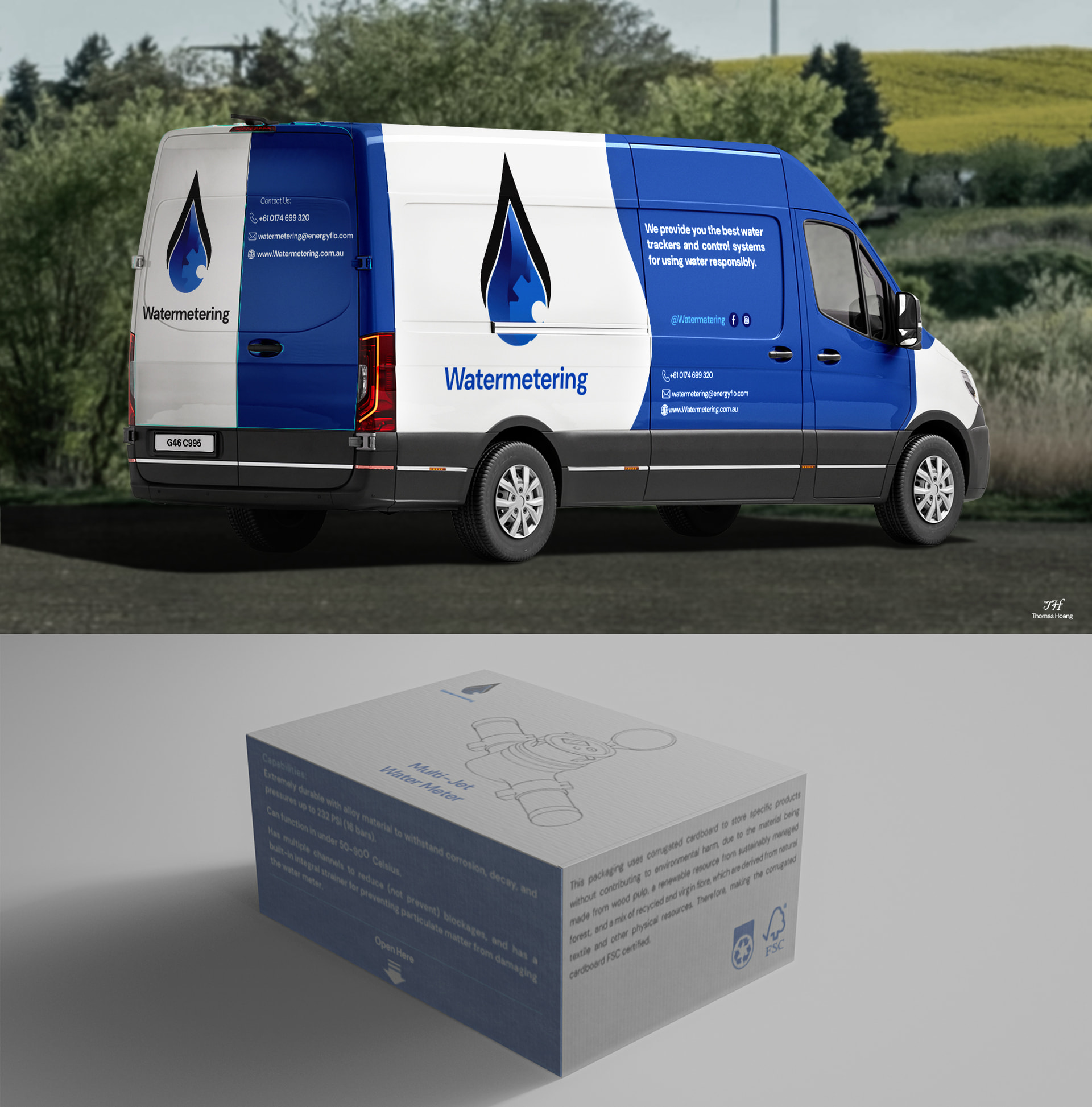
They are all the same logo. If this isn’t three divisions of the same company, you could have a trademark infringement argument happening here (I understand that these are practice briefs.)
If it is three divisions of the same company, what is the umbrella company’s name?
The only one a droplet really relates to is Watermetering.
The packaging…what are all those tiny words? Who are they aimed at? The tech isn’t going to read it and the part doesn’t exactly look like it’s available to the general public (who also won’t probably read all that.) Also decide which side of the box is front facing when stacked on the shelf (how high can you stack it if it’s standing on its short side.) You may want to change the orientation of the product image, and give it a part number in bold type. Think about your shelf competition. Is is going to stand out or blend into the scenery? If it’s tossing around in the back of the truck, will the tech be able to find it? If it’s only warehousing, make it easy for the pickers (and the tech) to identify the right box (part number/bar code/ UPC code, whatever)
On the truck, do not run logos or any other important information through the door slide. Keep all important details well away from places where it needs to be cut for the vehicle to be functional (door seams, door handles, lights, hinges, etc.) You didn’t do it here but always keep vinyl appliques off the raw (black) ABS plastic parts. It doesn’t always stay stuck there. Be mindful of your letter and logo placement when it comes to body stamping. You do not want lettering interacting with deep body curves and the logo placement on this is kinda iffy. It will not lay flat over that body detail and will look distorted.
Farazkhan has a point about text size. And you don’t need a paragraph explaining what the company does on the side of the truck. A few short, succinct bullet points, if you must.
Just an observation, when I see a truck on the highway, I’m usually reading the back of it, not the sides (unless the driver is an AH and I want the company contact info…) Granted the info can be read if the truck is parked, but consider where and when it will be parked.
If those are social media logos, you do not need those. Website and phone number. Anything else is distracting. All important information should be readable in under 20 seconds.
Check local Dept of Transportation ordinances. Here in the US, the full company name and phone number must appear in certain cap height. Some states may also require the address.