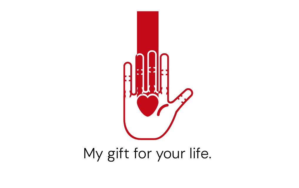
I’m using a textbook known as ‘The Graphic Design Exercise Book’ - written by Jessica Glaser - to not only improve my design skills but also add my creative work to my portfolio. One of these designs that I have created was a donor card, and from the brief mentioned in Glaser’s textbook, it states that I have to create a donor card with a ‘distinctive and meaningful namestyle and symbol’.
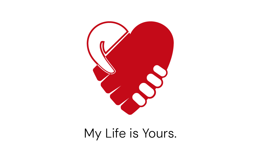
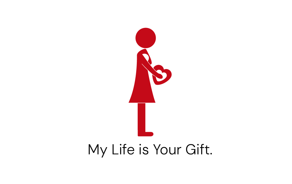
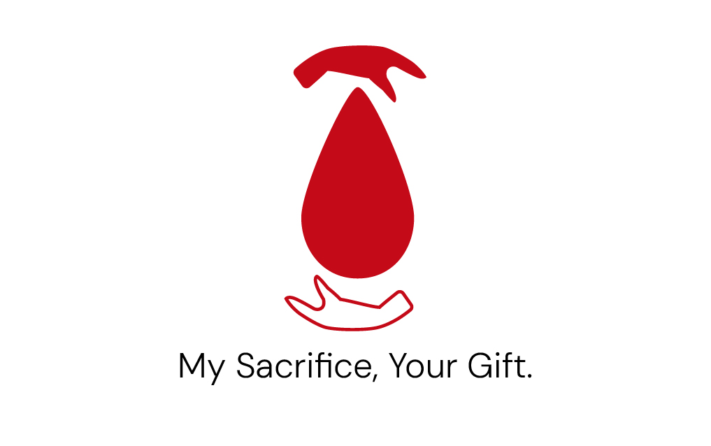
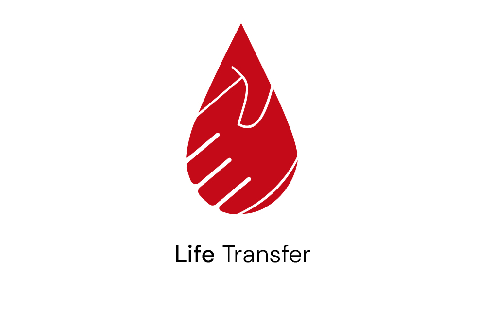
Also, in case if you are wondering the reason why I created the five different variations for the front cover of the donor card because I wanted to see which design variation you guys like most out of all of them. So, which front cover variation you guys like the most? what do you guys think about these designs that I have made? Any issues you see in many of them so I can improve?
Hi and thanks for answer, well what I would say is to use more colours than only red I mean is too much red that’s I was asking about red cross. I mean if you want to encourage people to donate you should focus on a Health organism, like the red cross and that is something I don’t see. See some advert like people asking to donate for support people with hunger, etc …
Why do people on reddit think they need to be enticed to become a donor? Either they are of the donor mindset or they are not. A card isn’t going to sway them either way.
The purpose of the card seems to be to inform first responders.
It only has to appeal to the person carrying it, and convey the message succinctly and purposely.
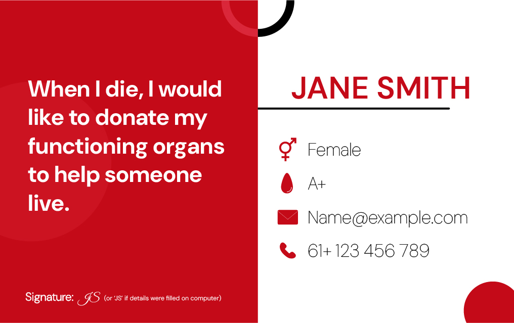
The last one is the most useful, though if someone is reading that card, they really don’t need your email or phone number…
The other thing, the card doesn’t appear to be proper proportions for a ‘business card’ to fit in a wallet slot. And in these days of cell phones and no wallets, maybe it needs to be a digital app.
Building on what @PrintDriver said, organ donor cards are not meant to persuade someone to become a donor. Anyone with a donor card has already made their decision. The card’s only purpose is to notify first responders and doctors that you are a donor.
As PrintDriver also pointed out, a donor card should be the size of a credit card so it fits in a standard wallet slot.
There are also legal requirements for these cards that differ by jurisdiction. For example, they may need to be signed and dated, and may include donor registry numbers so doctors can verify information and protect themselves from liability. Have you checked the rules in your area?
You might think these practical details aren’t part of the design, but they define the problem space where the design must operate. Primarily, the card’s design must function as a legally binding donor card and meet all legal criteria. I suspect you overlooked the functionality and focused more on aesthetics.
You mentioned maybe adding this to your portfolio. Every experienced art director reviewing your work will see the same issues that PrintDriver and I pointed out. Of course, you need to design a nice-looking card, but that only comes after you’ve fully defined the problem, which, in this case, includes meeting both legal, regulatory, and practical concerns. Think through the entire problem before diving directly into how it looks.
Okay, so to summarise everything you said here. Donor cards do not need to entice people to the register - enticing young people into the register was literally part of the task according to the brief where I made this card from. My donor card needs to be the size of a credit card, and that I need to research the legal requirements for the donor cards from my own jurisdiction (which area that I am from) then design mine to meet those legal requirements, then make them look nice. Correct?
Well, if that’s what the brief said, OK, but it makes little sense. I’m having a hard time imagining that someone would give permission for their organs to be harvested because they wanted a cool-looking donor card. Those kinds of donor marketing efforts would be better handled through other collateral materials, which the donor card design would match as part of a branding and marketing effort. As I understand it, though, your exercise doesn’t include those concerns.
Aside from that, I think you’ve understood what I wrote.
In all my years as an art director, one of the most difficult tasks was shifting recent design graduates’ perspectives from thinking only about making cool-looking stuff to fully appreciating the problems and goals, then creating a cool-looking, appropriate solution that tackles the problems and accomplishes the goals.
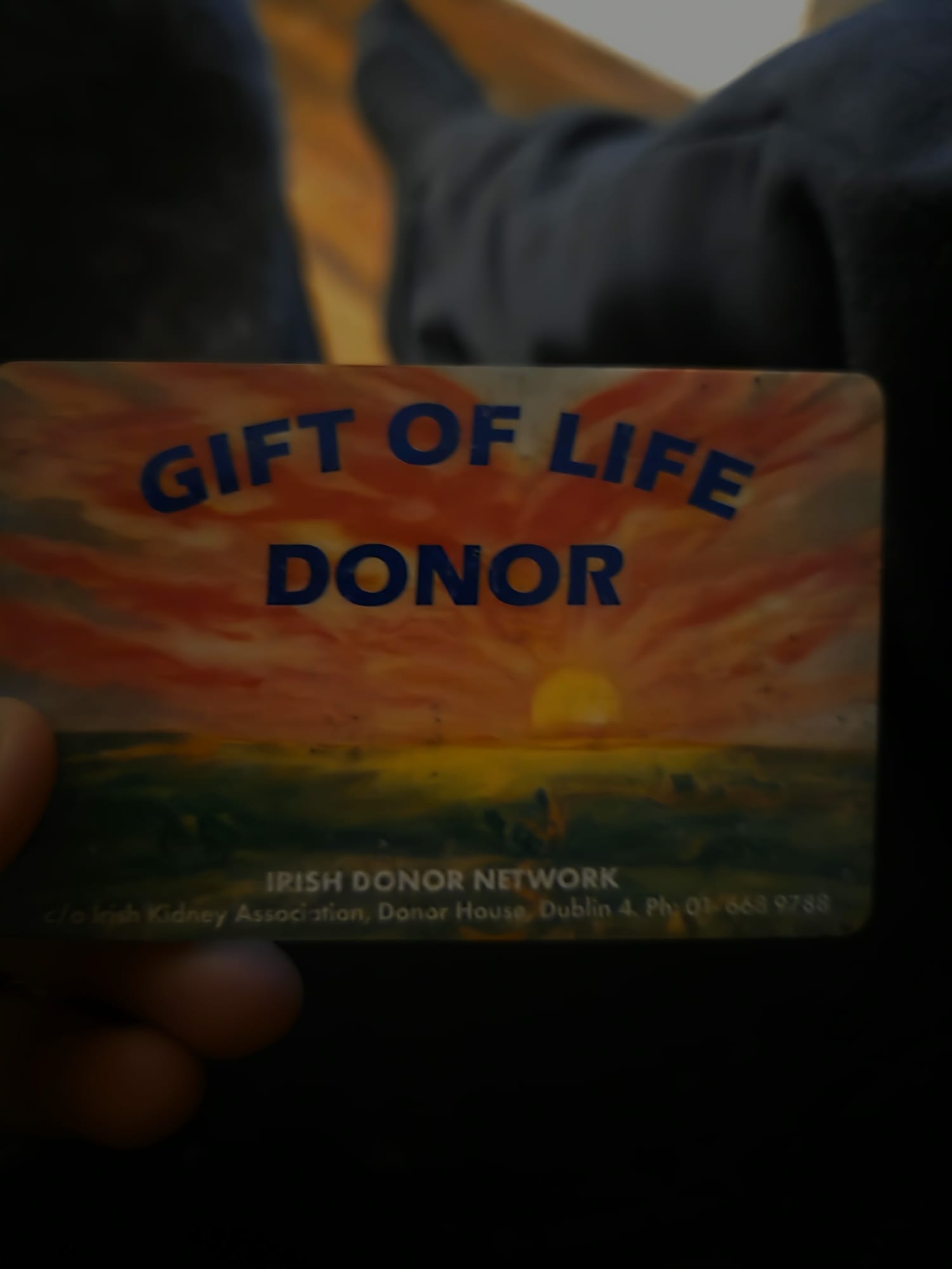
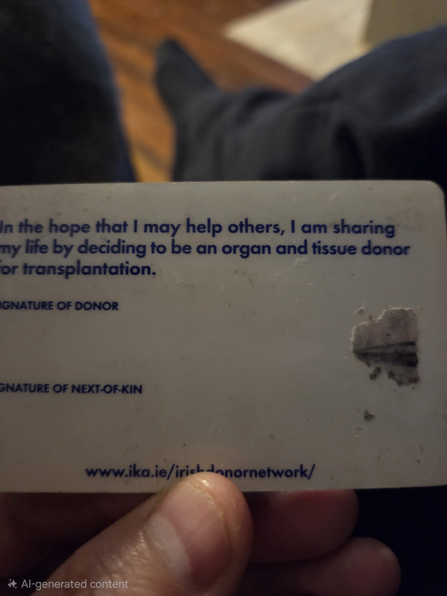
I’m an organ donor. And I also give blood regularly as I have a rare blood type, what’s use in having something rare and not to share would be rude.
But all my organ donor card says is that I’m a donor and it has my signature on it that I’ve deleted for here obviously - that’s why it says AI Generated content cos I used the phones AI to remove the sig.
There’s also the emergency info on the phone, it shows what meds I take, and that I’m a donor, and also my blood type.
In case of an accident where I can’t be recovered it means first responders can start to harvest me so someone else gets a second chance.
Where am I going with this.
The donor cards presented here are too ‘sexy’ - they’re like adverts to become a donor.
The person has already committed to be being a donor.
And I agree about the ‘business card’ information - it’s really not necessary - unless they work at the organ donor/blood donor centres.
None of the covers work. Some don’t make grammatical sense.
“Organ Donor” would cover it, cuz you aren’t advertising to the recipient that you gave your life for them (and that just sounds kinda weird too.) The only people seeing it are first responders and you don’t want them guessing what on earth the card is supposed to mean.