In another one of your posts, I asked you to let us know your level of education, your level of experience, what we were looking at, and how the design solved the client’s problem.
That request fell on deaf ears, apparently.
Instead, you continue to post things with no background, no information, no brief, nothing to work with.
Based on your activity, I am going to guess you are a grade school or high school student who is mucking about and learning some software. I suppose that’s fine; and this is a public forum, so you are welcome to post work.
What I don’t see is a solid grasp on basic design principles. Design doesn’t exist in a vacuum. The purpose of design is not to look cool or to decorate a page. Design has to work. What you are posting is not working.
1 Like
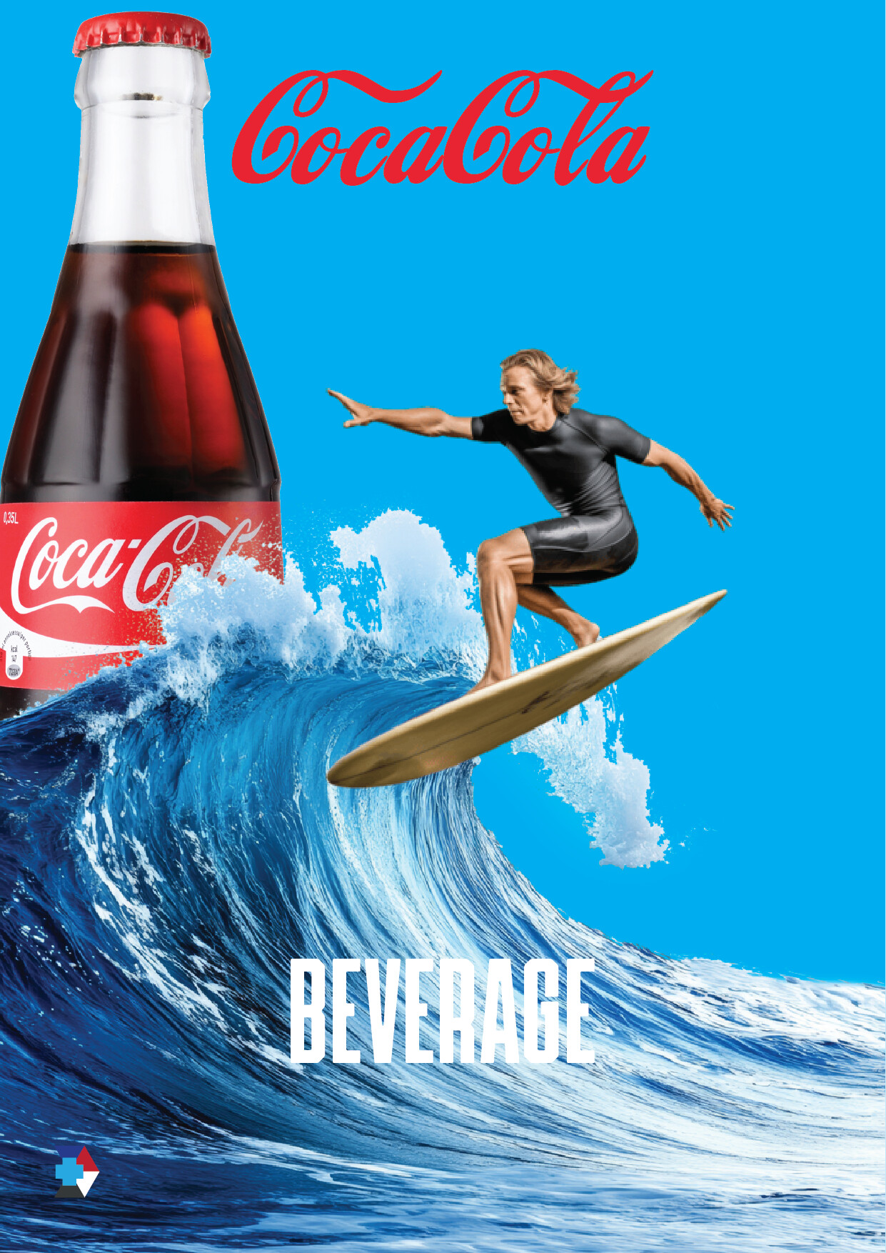
Hey, I’m digging the energy here! This has a total “summer blockbuster” feel. You’ve nailed that classic, high-contrast Coca-Cola look that makes you want to grab a cold one and head to the beach.
First off, let’s talk about blending. Right now, your surfer looks like he’s floating a bit because his lighting doesn’t quite match the blue surroundings. If you add some subtle blue “rim light” (just a thin line of light on his edges), he’ll look like he’s actually getting splashed by that wave. Also, a few tiny bubbles or “fizz” textures where the board hits the water would really sell the idea that he’s surfing on actual soda!
Next, the typography. The word “BEVERAGE” feels a little bit like a placeholder. Since the Coke logo is so curvy and iconic, that tall, skinny font at the bottom feels a bit stiff. You could try a bolder, wider font or a more playful “action” phrase like “Catch the Chill.” Giving the letters a little more breathing room (tracking) would also make it look more high-end and intentional.
Finally, don’t forget the “Thirst Factor.” The bottle looks good, but if you add some tiny water droplets or condensation on the glass, it instantly makes the viewer feel the “cold.” It’s a simple Photoshop trick, but it’s the secret sauce for beverage ads. Keep it up you’ve got the layout and the vibe down!
1 Like
You are missing some really important details, there is a blue sky, but where are the clouds and even the sun ? Also, usually surfers are not alone they are with other suffers so where are them ?
The surfer, his hair, his wet suit, the surf board … they’re all dry.
I also see two different Coca-Cola logos.
… and the bottle – aren’t they supposed to be transparent?
The word “BEVERAGE”: why is it there?
3 Likes
I don’t live anywhere near the ocean, and I know nothing about surfing, but isn’t that surfer facing the wrong direction?
The top Coca-Cola logo isn’t Coca-Cola’s logo. It’s drawn in a similar style, but it’s not their logo. It’s also red against blue of similar values, which creates a “visual vibration,” of sorts. The Op artists of the '60s used these kinds of color and value clashes in their work, but I doubt that’s what you intended.
As @Smurf2 said, the photomontage has energy and a feel that says summer and Coca-Cola, which is a good start.
I wish you would answer @Steve_O’s question. I assume you’re a teenager interested in graphic design, but it would help us to know more about your experience and the purpose of the images you’re posting for critique.
1 Like
The Coca cola logo on the bottle shouldn’t be covered, I think - the logo’s an important part of your poster. And please change the word" BEVERAGE", I mean, its clear you’re promoting a drink without having to say it. Maybe something similar to “Cool down with a coke”.
One more idea: Maybe make the surfer ride on a wave of coke, for a dynamic effect. After you’ve turned him the right way around.
Sigh. This should not be in The Crit Pit. It belongs in Corporate Speak.
User has been removed