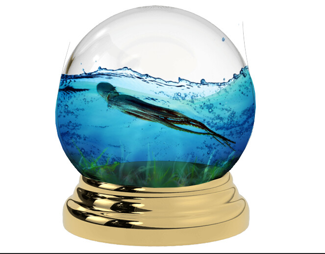
Started using Photoshop to gain skills (I’m a complete beginner learning from tutorials in Youtube). I made a random design combining stock images together down below - might add more detail later. But what should I improve in?
It’s not a design. It’s at best an illustration.
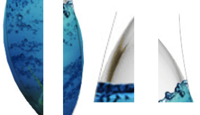
Practice more. Clipping paths and perspective.
Decide if going for realistic, or cartoon artistic.
The globe should be a sphere and sit better on the base.
What are the weird vertical lines for?
1 Like
I’m going to be a little picky, but you’re asking for opinions.
First, this isn’t a design. It’s a practice exercise in using a tool. Similarly, practicing with a hammer isn’t carpentry.
Second, I can’t assign a rating, but I can critique it and make suggestions.
Yes, I’m being pedantic in a way that’s annoying, and I wouldn’t normally mention these things. However, in the professional world, words and precision matter. This is especially true of design, where much of the job involves working with words and interacting with writers and editors. In many environments, designers aren’t taken seriously. We’re viewed as artsy, fartsy, creative dummies instead of intelligent problem solvers. Designers don’t do themselves any favors by feeding into the stereotype. For that matter, we need to go the extra mile (or kilometer) to disprove the biases.
As for your practice exercise, there are problems — a globe is round, but you’ve been sloppy with your clipping paths. These are easy problems to fix, but for some reason. you didn’t. Once again, precision matters.
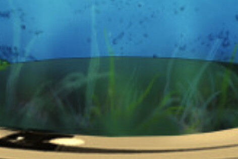
Translucent grass or seaweed below? This problem would be more difficult to fix than cleaning up the clipping mask details, but it’s just as important. Using Photoshop to create photo illustrations is difficult. The details are where the time is spent, but if they’re ignored as too difficult to fix, the results will be unsatisfactory.
As the saying goes, “practice makes perfect,” which is exactly what you’re doing.
1 Like