Hello Creatives, here is my recent Logo design for Reav Estate. It is a real estate agency. I’m a self-taught student.
What are your views?
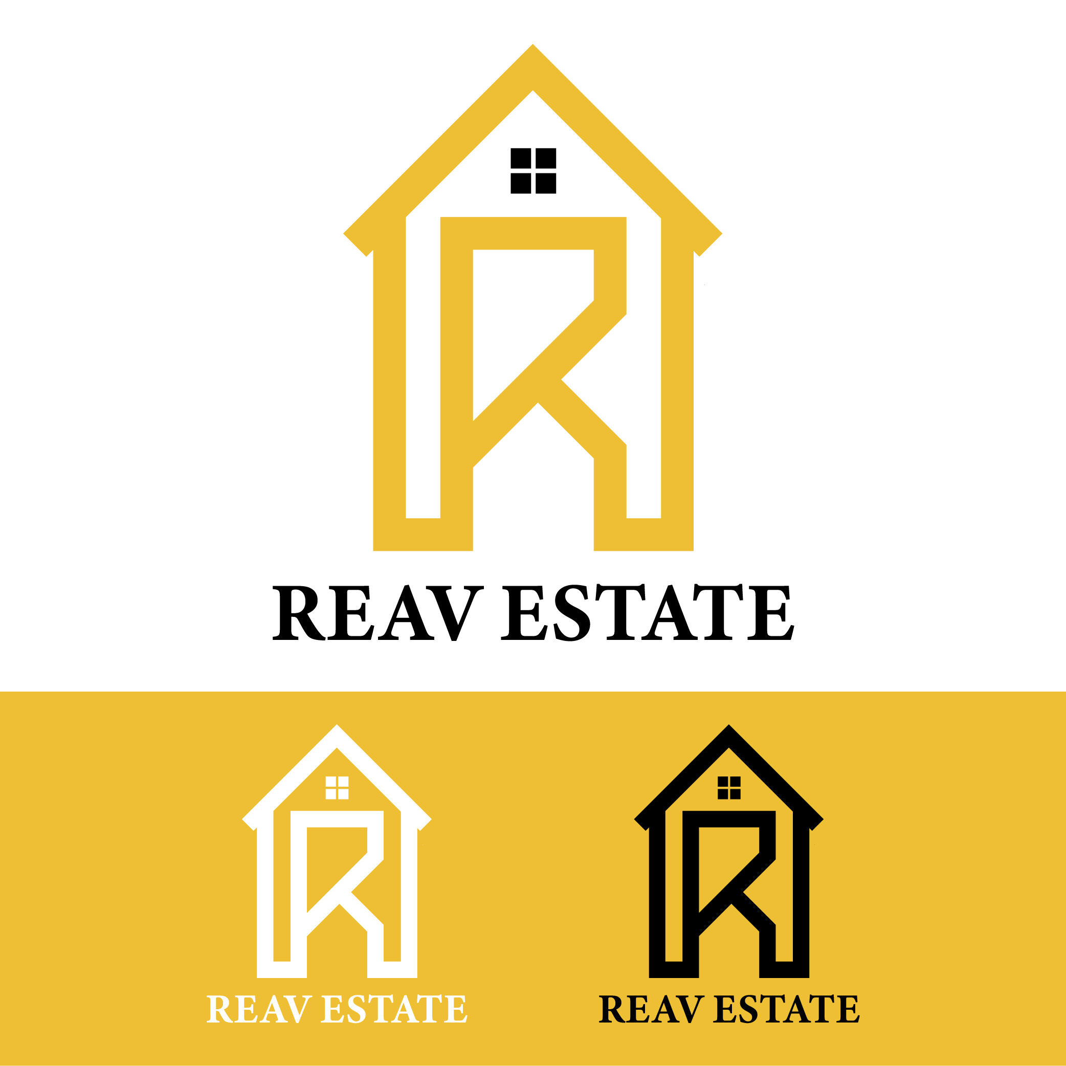
You can already see the detail in the window is lost at smaller sizes.
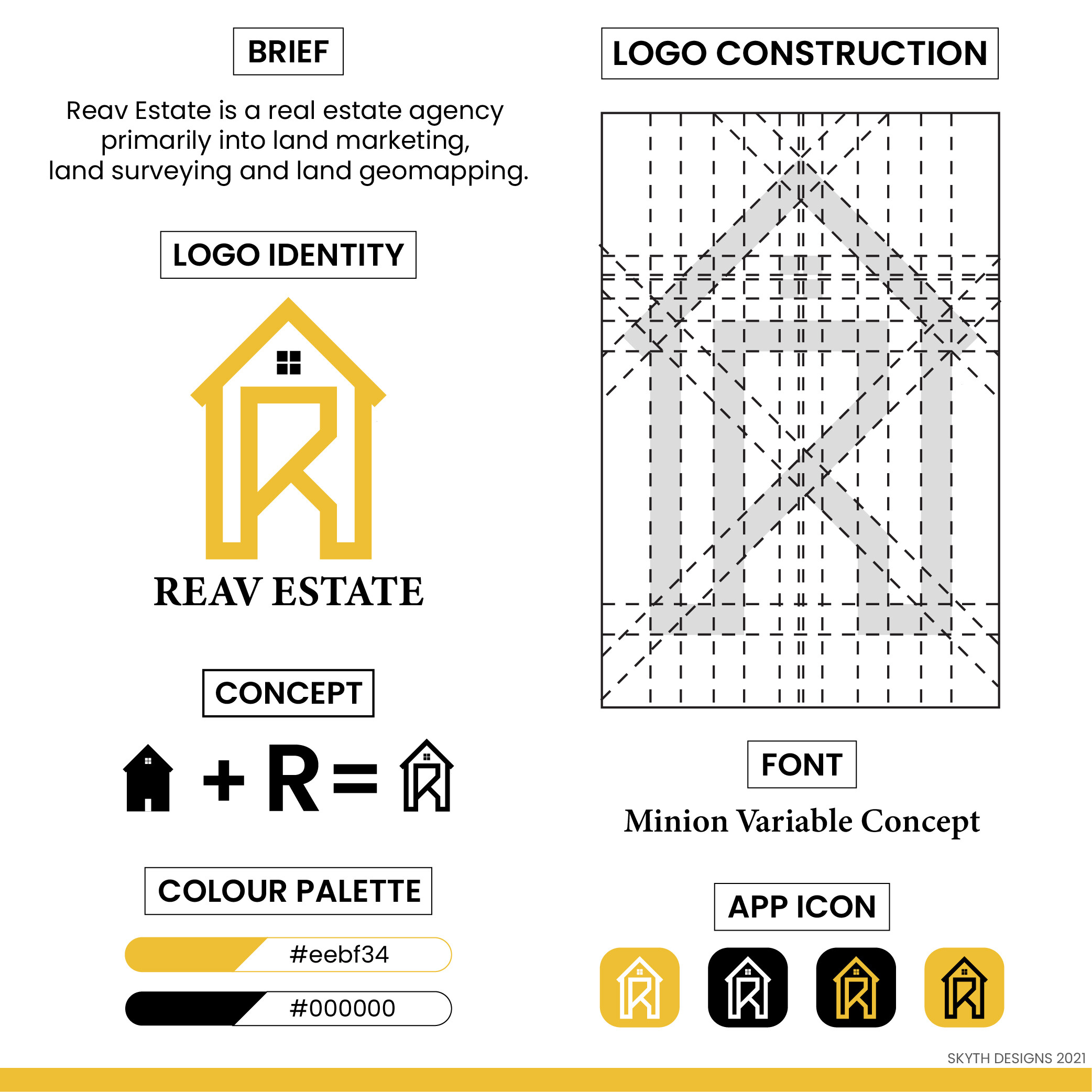
Screen hex colours not achievable in print - mostly. What’s the Pantone equivalent from a Pantone Book (or any colour book?) - what CMYK?
At your small sizes - they won’t work in screen printing - you’ll have to check the smaller sizes and maybe make a different version - you’ll need a minimum of 0.1mm line thickness and approx 0.3mm distance between gaps.
Why not have the house a solid colour - then the R would be a hidden feature.
Overall - it’s good, lacking some technical knowledge in print and different mediums - but can be fixed easily.
Minion font - really??? Surely you can do better than this in terms of typography!
1 Like
Thank you very much for the feedback.
I will work on it.
I do like it though - just needs refinement.
Wait - hang on a sec - did you not read your own brief?
“Primary ------ Land Marketing ---- Land Surveying ----- Land Geomapping”
How does this convey their 3 main primary targets?
I don’t think you hit the brief at all.
It’s far too generic, to my mind. Also, you are over-intellectualising it. There is no concept. House + R is hardly a brand concept. The construction diagram is a bit meaningless. It is OK, if uninspiring. If I am honest, it looks a bit like something that comes from one of those sites that will do your logo for $50.
It is a start, but I think you need to dig a lot deeper. Never stop at your first idea.
Keep at it.
1 Like
Initially I liked it because I didn’t find an exact match across image search sites - so at least it was original and some effort put into it.
But then again, it’s very generic and uninspiring compared to other real estate logos using the R and incorporating it into the shape of a house.
Wasn’t ‘bad’ for an effort - and gave it a go without copying someone else.
I do think with some refinement it can be ‘good’ - but certainly not ‘original’.
And after I saw the brief (which I wasn’t really looking at originally, I was only judging on the images) - but once I saw it - I couldn’t believe what I was seeing.
It’s way off the mark of what is asked for.
If that one sentence is all of the brief, it’s hardly a thorough and comprehensive one at the best of times, and yes, as you say, even with that meagre brief it’s still missed the mark.
Sorry, Skyth, I think a bit more effort is needed here.
1 Like
First thing is might try to talk them out of the name. But it usually is what it is.
They obviously don’t sell houses.
Do over.
You’re concentrating on what, as a “self-taught student,” you think is important in a logo, but you’re exaggerating the importance of some things while failing to adequately consider what’s most important.
On a positive note, you’ve built the logo in a simple, organized way. You’re considering both positive and negative spaces. Logos like this one can often benefit from the consistency a grid imposes, which you’ve used. You’ve limited the number of colors, which keeps the logo easily usable across a wide range of uses and production limitations.
All these things are good, but concentrating primarily on the form of the logo without, first, considering the bigger picture of who the client is, what they do, who their audience is, who their competitors might be and other similar issues, is a fundamental mistake. You need to have all those preliminary considerations nailed down before starting on the design because it’s those things that determine the parameters of the design problem. A logo design is not simply (or even mostly) a matter of coming up with a clever and aesthetically pleasing shape — it needs to be the right logo that accurately represents the company in a positive and memorable way.
So with that said…
It’s already been mentioned, but you seem to be confusing this company, whose business involves real estate, with a realty company. Those before me have already pointed this out, but this company’s business, according to your own words, is land marketing, surveying and mapping — they likely don’t sell houses. And even if they did sell houses, what you’ve drawn looks a more like a garden shed than a house. This complete oversight on your part is an absolute, total, sure-fire deal killer of a mistake. It’s the kind of mistake that would cause an art director to erupt in a verbal tirade aimed at you of the sort that would pretty much guarantee that you’d never, ever make a similar mistake again.
You’ve also placed lots of attention on the presentation of your logo by creating a nice layout in which to present it. This is totally fine, but once again, you seem to be focusing mainly on aesthetics and what you think is a nice presentation while ignoring other practical and common sense issues of more importance.
For example, a client doesn’t care how you’ve constructed a logo, so the graphic you’ve built showing your grid serves no real purpose. It’s just a gimmicky, obfuscating, BS sort of thing that some designers toss into their presentations to make them seem more technical and complicated than they really are.
Your brief isn’t a brief at all. You’ve just described the company, then seemingly not paid any attention to even the minimal information in your “brief” regarding what the company does. A brief isn’t just a perfunctory bit of nothingness — it’s a boiled-down summation of how to proceed based on all the client conversations, research and thought you’ve put into the problem before you even pick up a pencil for the initial sketches. The brief defines the parameters of the problem in front of you. In other words, it’s of primary importance — not a one-sentence thing tossed into a presentation layout.
As @Smurf2 mentioned, colors aren’t just limited to RGB hexadecimal values. You also need to determine CMYK and Pantone colors. This is an absolutely must-have need.
Your concept isn’t a concept at all, as @Sprout already pointed out. You’ve just come up with a gimmicky way of saying you’ve combined an R with a building, which doesn’t need to be said at all since it’s obvious. A concept has more to do with the WHY of something rather than the HOW. In other words, why this logo? Why did you choose it? Why is it the right logo for the company? What is your reasoning behind it?
As already mentioned by @Smurf2, Minion? Why Minion? And why specify a variable font version of Minion? Minion is primarily a text typeface. I like it a lot for text, but it’s not exactly an ideal display typeface to be used as a logotype — especially when juxtaposed with a logo that has qualities more consistent and compatible with a sans-serif face. As for the variable font — the logo uses one weight of one typeface, which is something along the lines of Minion Bold. It’s an outlined part of the artwork itself. The only reason the typeface needs to be mentioned at all is in case the client wonders about it or needs to know the type family as part of a larger branding effort. Specifying the exact variable font you use to produce this particular weight of Minion serves no purpose and potentially just confuses things.
Despite all this, as I said at the beginning, there’s a lot of good things to be said about what you’ve done and your approach to it all. It’s just that you seem to have only a superficial idea of what needs to be considered. A logo design is far more than just coming up with a simple, clever image. Instead, a logo is a critical piece of the parent organization’s public face. You need to think it through from the viewpoint of the logo being a strategic business asset — not a just pretty picture.
1 Like
They sale houses too.
I didn’t just include it in brief
Completely agree with everything that’s been said here already.
It nice to see you put some effort into your presentation here and explored some different applications of your mark (this goes a long way to make your work seem more valuable), however it feels like you were trying to save paper craming it all into 2 images. Spread it out a bit ![]() .
.
A common trap for designers starting out is feeling the need to incorporate literal representations of ther clients business into their logo or mark i.e. including house if they’re selling real estate. Sometimes this works well, however unless it’s cleverly executed can feel a bit superficial or generic.
Part of being a designer is that you need to have a process to excavate the information required to understand your clients business, their goals and their customers and then craft a mark that speaks to that. And what you will find is when you start asking these questions and set some objective parameters around what the logo needs to do, is that there’s a whole lot less guess work involved.
1 Like