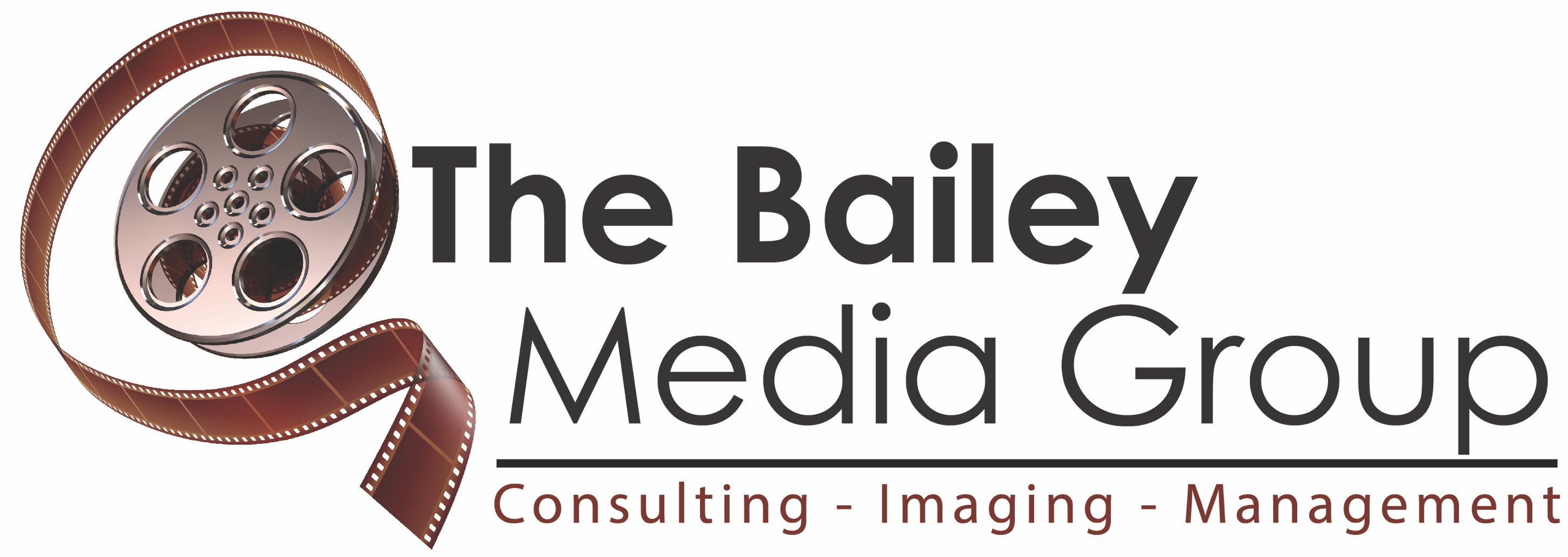
Below is the original logo and my initial attempt on modernization/simplification of it for a client, to which I was told it was too “Plain Jane” Am I missing something, or is my new version really inferior to the original??
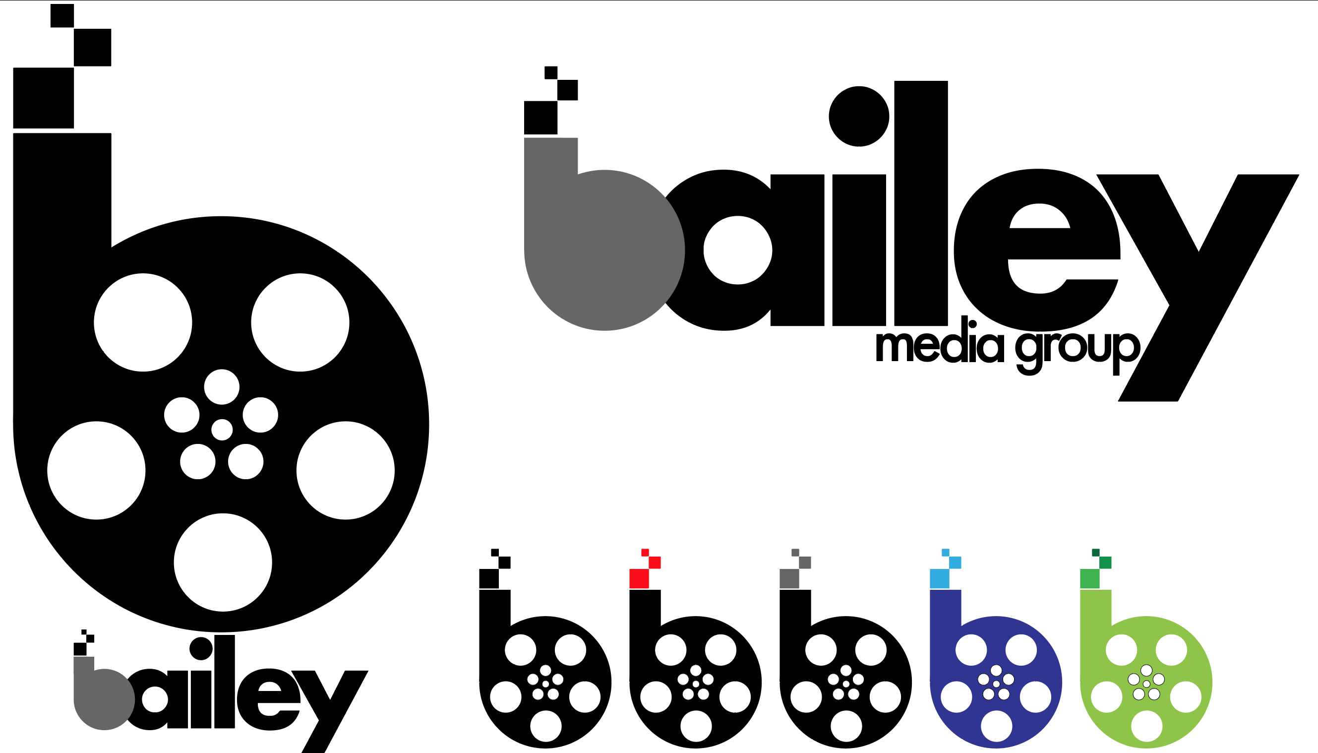
Your version is not nearly as lively as the original. And it makes the error of duplicating the idea of a film canister and the B in the company name. Kinda sorta redundant.
Modernizing and simplifying doesn’t mean boring.
You’ve also sacrificed legibility with the jammed kerning and solved a potential issue by overlapping the B. Not sure if that’s a good solution, but it makes using the B as a logo bug somewhat difficult.
Let’s be careful not to mention the company’s name here since you probably don’t want this discussion to show up on a Google search.
Anyway, I looked them up and visited their website. This is a company so mired down in across-the-board ineptitude that I think it’s hopeless to get them to buy off on any improvements. I seriously doubt they can tell the difference. I’m sort of wondering how they can even stay in business.
Not to be a Negative Nancy (since we are being keen to use names in conjunction with adjectives), but I am not looking for critique of the company. I understand that they have their challenges… I was attempting to actually perform the rebrand as a favor for another client of mine that is trying to help this company out.
@DocPixel, @PrintDriver I can see the tight kerning being an issue with the words media group, especially at small sizes, although I feel that the main logo type maintains legibility down to about 2" X 1". I’ll try it with a tiny more breathing room between the letters to see if that helps.
@PrintDriver I agree that the canister version of the b should be replaced with a modified letter form from this font (futura) in the stacked vertical representation. I’d be interested in hearing your opinion or suggestions on ways to make this less “boring” as I think the original logo is far too busy to work as a logo.
I also would appreciate clarification of your last paragraph where you say “solved a potential issue” as I am not sure what you mean, nor do I understand how the overlap makes using it as a logo bug difficult.
Kudos, though, to “Kinda sorta redundant”…nice wordplay.
@docpixel - Flashy Jane is best represented, I think, by Comic Sans or, possibly Papyrus!
Anyway, thank you all for the feedback. I appreciate you taking the time to comment and provide some insight.
The original logo is not a proper logo. But it does convey an energy or at least some sense of movement as opposed to something static and boring. Maybe I’m misreading the intent of the company, unlike others I didn’t check the website, but if they are media developers, that implies engaging an audience, not just standing at the podium looking bewildered.
Try thinking along that line for a bit and see if it leads anywhere.
Not saying it will.
My initial thought is that the ‘b’ looks like bauhaus and the rest of the type is another font. That bothers me. The second thing that comes to mind is that why does ‘media’ have to entail an old film reel? If that is what they deal with regularly then sure, but ff this business does all sorts of media (digital?) why not go for something more modern for imagery?