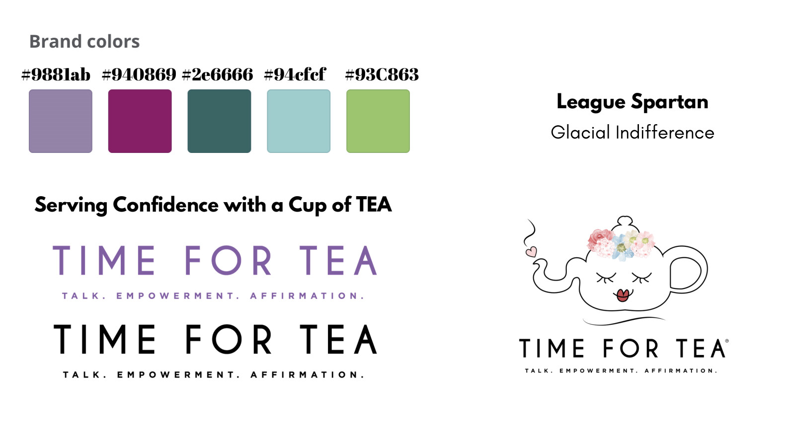
Time for Tea is a non profit organization whose purpose is to build confidence in young girls and women through etiquette training and networking. Time for Tea has a mission to bring women in Orlando, FL together and create a diverse community. The organization hosts etiquette training for young girls centered around the elegance of tea time that helps girls build social skills with one another.
For the branding the client wanted something that was professional while still being very appealing to a younger demographic. The client also wanted to stay true to it’s original branding with an elevated look.
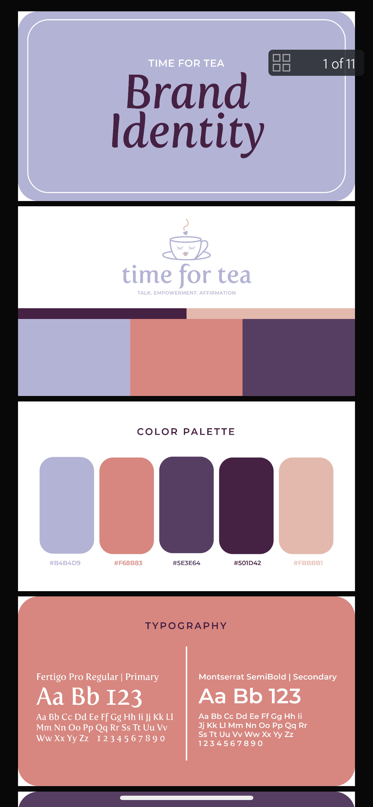
In the end I decided on a color palette that I felt worked well with conveying women empowerment that was both colorful but still very classy. For the logos I kept the same feminine cartoon face that was used in the original logo but completely changed the typography and other elements.
I would love to get your honest feedback on this rebrand.
This sounds like something from Victorian England.
Anyway, I love the color palette. It’s soft, feminine, and modern. Nice!
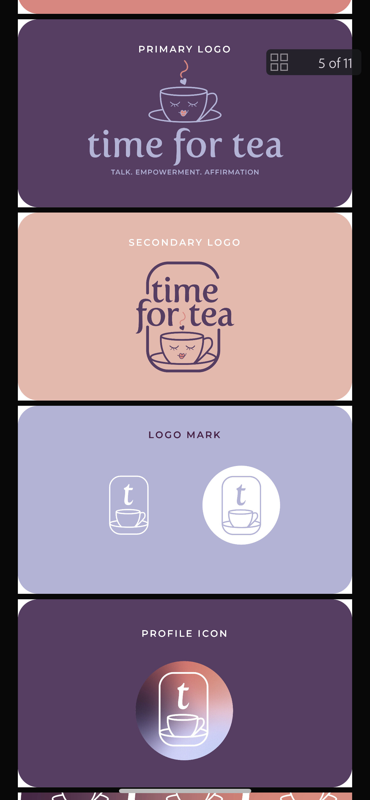
I’m less enthusiastic about the vertical versions of the logo. I’m unsure why you drew the rounded rectangle since nothing like it appears in the horizontal logo.
The vertical version with the single “t” seems unnecessary. It seems you’ve taken the alliteration of “Time for Tea” and compressed it to a single t, but I’m not sure the connection to the full name is obvious.
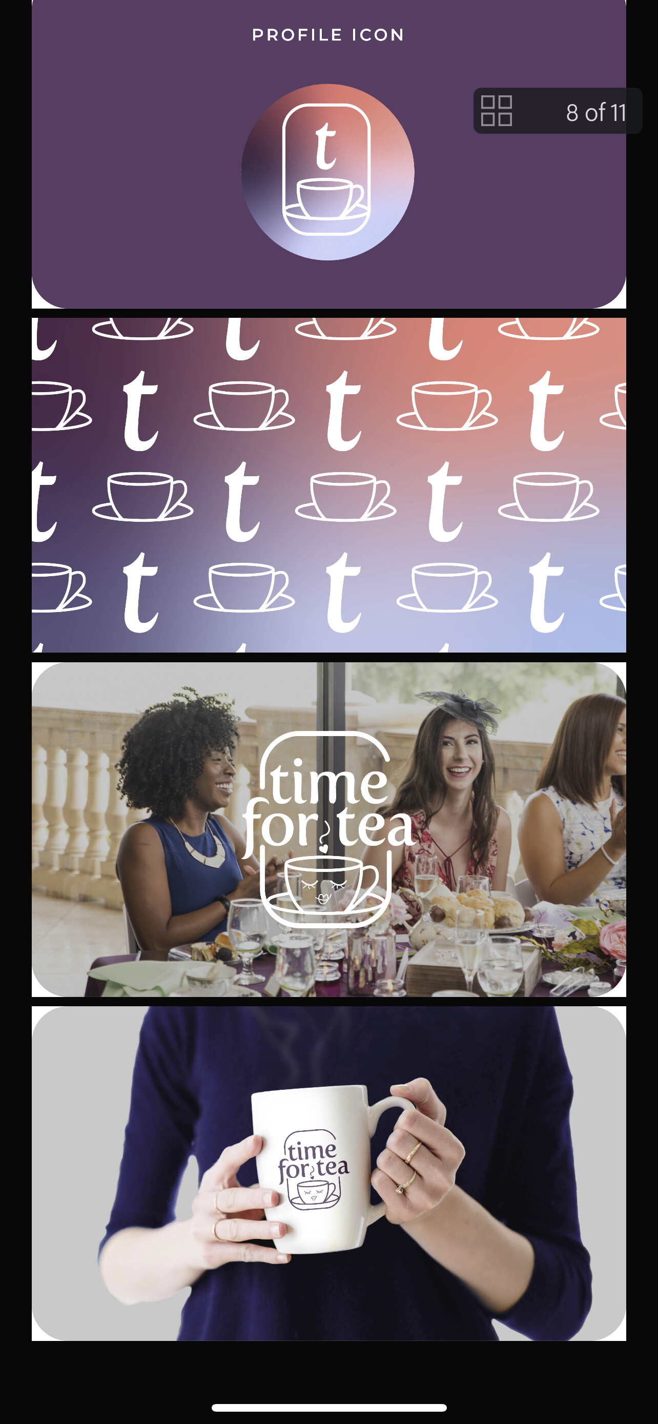
I actually prefer the vertical logos much more than the primary logo without the rounded frame. I like how the frame follows the shape of the saucer. It also gives the logo a bit of an Instagram flair, which should be popular to young women. My only pet peeve is the inconcistencies created by the cartoon face and steaming heart: Firstly, the line weight of those elements is lighter than the teacup and saucer. Secondly, they’re completely dropped in the alternate logos. Fix that and it’s a better package.