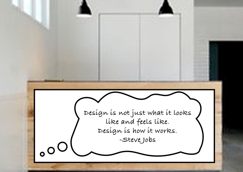
I’m currently doing a design course and we need to come up with a 2D idea for a reception area. I thought it would be fun to roll over some white board sticker, have printed out a thought cloud, and then have different quotes in white board pen daily / weekly / monthly.
My question is - what do you think? Would it be a good idea or do you spot some major pitfalls or flaws?!
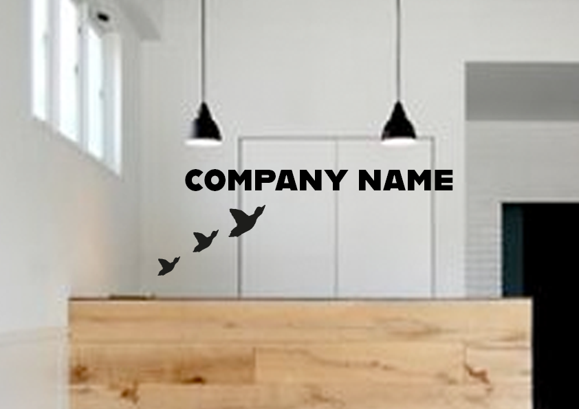
And this is what I was thinking for behind the desk. The company name is going to be around my name (Gosling) so it’ll be bird / goose related. I thought having the kitch ducks rendered in black perspex with the same treatment for the company name would make a bold statement but still be playful.
Gray Goose anyone?
Other than that, I have no opinion on the logo.
If you are going to use mockups, at least use a mockup that isn’t so badly rasterized.
The way you have this now, it looks like your logo is floating somehow in front of the light fixtures.
Whiteboards…Daily use makes those look pretty ugly unless you are fastidious about cleaning them. I suppose you could change the vinyl, but it will rip the finish off your desk on removal. I’d just get a real whiteboard. However, they rank right up there with the now passing chalkboard trend.
Here’s another problem. People walk up to that desk to talk to the person behind it, right? Anyone leaning against that board is likely to get black ink all over their fine clothes. It’s low enough to the floor that someone’s backpack or purse could lean against it too.
But that’s only my opinion.
So tell us why you think your clients need to see a big white board quote? What is the message you are trying to get across? Where is it in relation to the seating area? Would it be better on the wall to the left? Or over the door to the right? Why cover up that nice pine planking with a piece of plasticware? Would that be a better place for the logo?
I’m sorry Julia, but I think that’s a terrible idea, for several reasons:
Quotes are subjective, and buy-in is a gamble: Your example is an unfortunate specimen, for instance. If I was to walk into that office and see it, I’d quickly perceive that I was about to encounter a bunch of Jobs worshipers who believe that quote isn’t seriously lame, and frankly, it would cause me to turn right around and never come back. Maybe that’s just me, but it’s not. Maybe the previous quote would’ve drawn me in. Maybe not.
Penmanship: The overall presentation would be subject to the style of hand printing employed by whomever is . . . employed. Maybe with luck, the receptionist or someone else in the place is artistic enough to do something aesthetically pleasant with it. Maybe not.
Opportunity for ill or foolish intent: “While you were at lunch, someone drew what on the desk? And the clients you brought in the door saw it before you did?” Interactivity is also a gamble.
The biggest issue I see is that none of that has to do with the company itself.
What type of company is this?
What is their Mission/Vision/Values?
etc.,
Once you research and gather information for this company (even if it’s made up), then you can start ideation, and mocking up concepts. You’ll find that your ideas make more sense, and will add value to the design.
I think the white board is a nifty idea, but it depends on the type of company. If anyone who entered the area could draw or right on it, cool! but is that apart of the company’s culture, does it play to their staff or visitors/clients? Then you have to consider profanity and inappropriate content that people may draw.
A nice typeface can make a bold statement with the mission or vision of the company on the back wall. For the receptionist desk simply placing “receptionist” communicates very well where someone coming into the building may go.
I’m sorry, Julia, but I don’t see much in what you’ve come up with any particular promise.
White boards can be functional, but they’re rarely attractive additions to a room. As already mentioned, customers will brush up against it getting ink on their clothes. Someone with significant artistic skills will need to redo it nearly every day. It’ll end up getting stained with ink, look untidy and just isn’t the kind of thing you want visitors to notice first when they walk through the door.
The behind-the-desk logo/words are not working either, The concept isn’t bad, but you haven’t developed it into something that hangs together as a whole. The typography is uninspired and bulky above the birds that are flying directly into it. No real thought has been given to creating a well-balanced and cohesive composition.
If these are just rough ideas you’re tossing out, OK. However, even if they are rough ideas, you really need to step away from your computer and quit using Photoshop as a sketch pad. A pencil and paper are much better at quickly sketching out ideas in ways that maintain the kind of looseness and spontaneity needed during the initial idea development phase.
This is the latest project profs have been giving their entry level graphic design students. This is supposed to be their own office space.
The profs tend to drop the students into it without any preparation for real world applications, Just having them make a pretty mockup.
At least Julia has taken the initiative to look at Perspex as an option for the logo. Most don’t even go that far.
This project has been a pet peeve of mine since it started appearing here.
It also tosses unprepared students headfirst into an area with all kinds of technical and production considerations that they know nothing about. Now if the instructor used all the mistakes made completing the assignment to educate the students about those things they would need to know to tackle these kinds of projects, well, it could work. I’d never assign it to a first-year student, though. A senior student, maybe.
And I think you’re right, why mix interior design with graphic design — at least for beginning students? There’s often is a spillover between the two in certain ways, but it’s a specialty thing, like environmental graphics and indoor signage.
It isn’t necessarily a specialty thing. And it isn’t silly either.
Lobby decor can be considered as much graphic design as interior design. These are “branded” spaces and branding is something a graphic designer is supposed to know about.
It’s great that students are given a hint of design beyond flat pieces of paper and web work, but unless that professor has given the students access to materials like trade magazines that explain this field and show the possibilities available, and knows more than a little about the field themselves, the exercise is nothing more than photoshop 101. Quite honestly, in the real world, mockups are a 10-20 minute project undertaken to get the “look” in a form a client can visualize. It isn’t a 5 day project to show off photoshop skills.
PD’s virtual class wouldn’t allow self-directed projects. It would give a brief for a client’s space requirements. It would give specifics starting with the corporate branding standards and include an overview of the client’s business, the type of demographic visiting the space, and for what purpose the space is being branded. Is it a reception area for outside clients? A lounge for employees? A meeting room for the board of directors?
Then it would give specifics that the students would have to research. Maybe the client wants a 3D logo on the wall, custom printed wallcover and branded tabletops. Or some other combination of 3 processes the student would have to research.
In a perfect world, a room would be selected on campus that the student would have to measure and photograph. Sketches would be required. And a final dimensioned drawing.
Thanks to everyone for their comments, really appreciated.
It didn’t even occur to me that people would lean on the desk and get ink on their stuff!! Very good point. I also really appreciate the point that a non-company-approved quote might end up on the board.
It is a graphic design course, and it is a little tough to come up with a reception design for an unbranded company, which is why I kept it really simple. But I’ll definitely do some more work around the branding.
I’d put something more relaxing on that wall, for example, some abstract world map. Thus you won’t have any limitations for the company’s image, people will see just some simple image that also is able to get their attention when they’re bored.
Jiramco, the whole idea behind branding a space is to enhance the corporate image. Some random abstract map, in most cases, isn’t necessarily going to do that. Never add “design” to fill up space. Each piece needs to serve a purpose. A lot of places will have a portfolio available for viewing. Or brochures. Or at the very least, wifi signal (LOL.) Everyone has phones. No one is going to be so bored they need to be looking at a world map.