Hello again!
I have to make a label for a reed diffuser which is quite small (45ml).
The dimensions are 4X3.5 cm (landscape) or 3.5 x 4cm (portrait)
Here are my drafts. Any opinions?
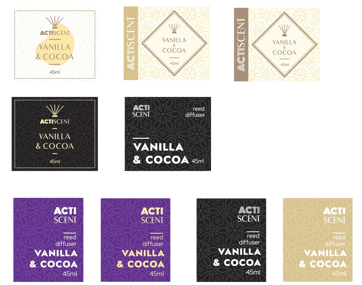
These all look very nice, the labels would be fairly small in person if its 4x3.5cm. I’d like to see a bit more contrast when it comes to scaling elements. I’d be concerned with ink bleeding on the thin line and type.
I’m not sure what a reed diffuser is but the texture in the back really complements the idea and flavor. I think the black and tan iterations are the strongest. Although the tan and white could look nice if the tan was a matte finish and the white had some plastic emboss.
Size of the label vs the font size, which must be small, could mean details on thin line could be completely lost
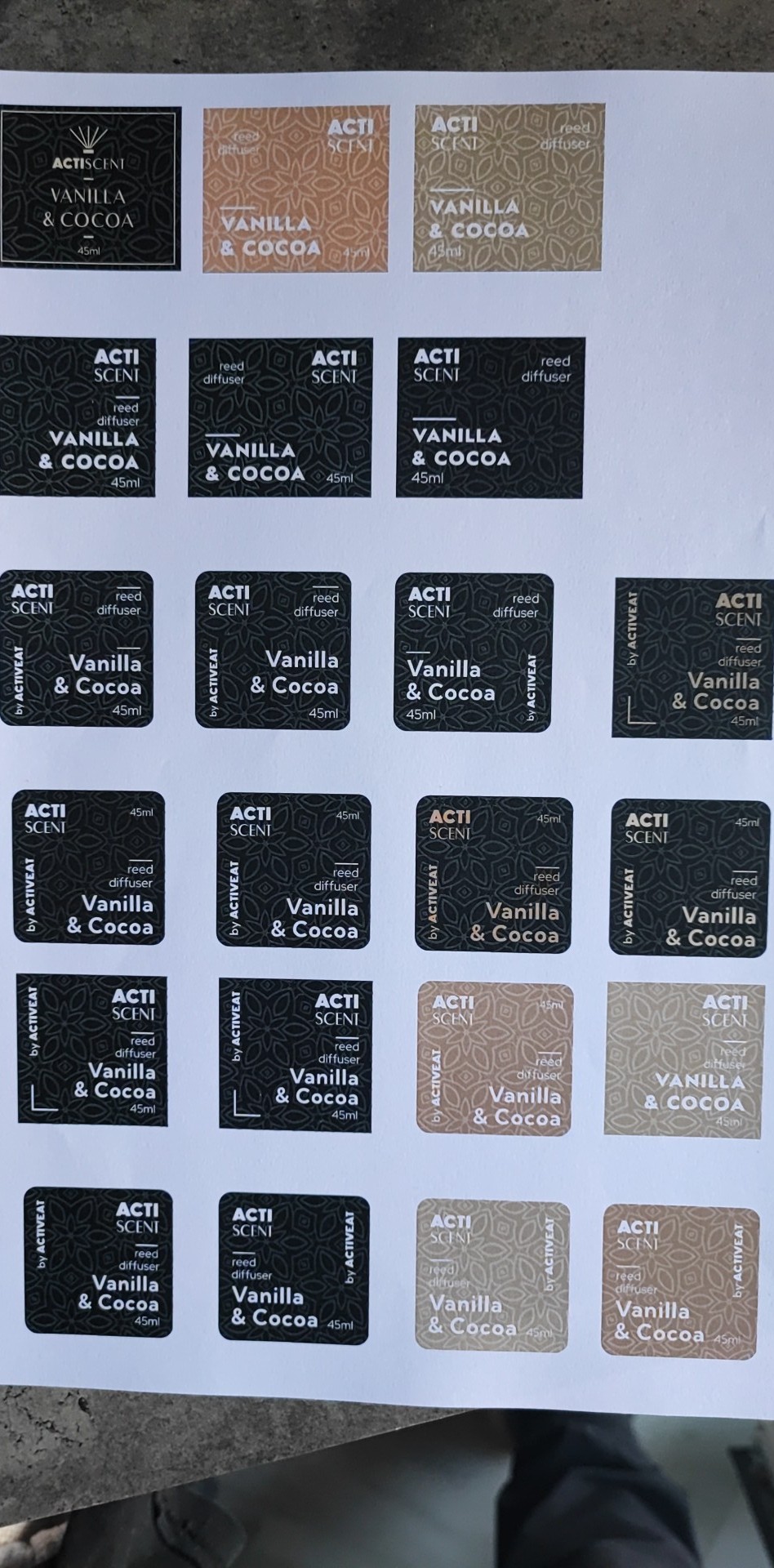
As the others have mentioned, I’d be concerned about the thin lines and details. The designs look nice. What I always try to do before I send anything for approval to my clients for something like this, is to print it off on my desktop printer to actual size, if it doesn’t come off legible or I am seeing possible issues, I make adjustments and then check again. I realize a desktop printer is far below the quality of an actual print shop, however if I know they look decent on that, they will be great done on high end equipment. Just my 2 cents though.
Here is some test labels printed (on a simple A4 paper).
And here is an effort to test it on the diffuser!
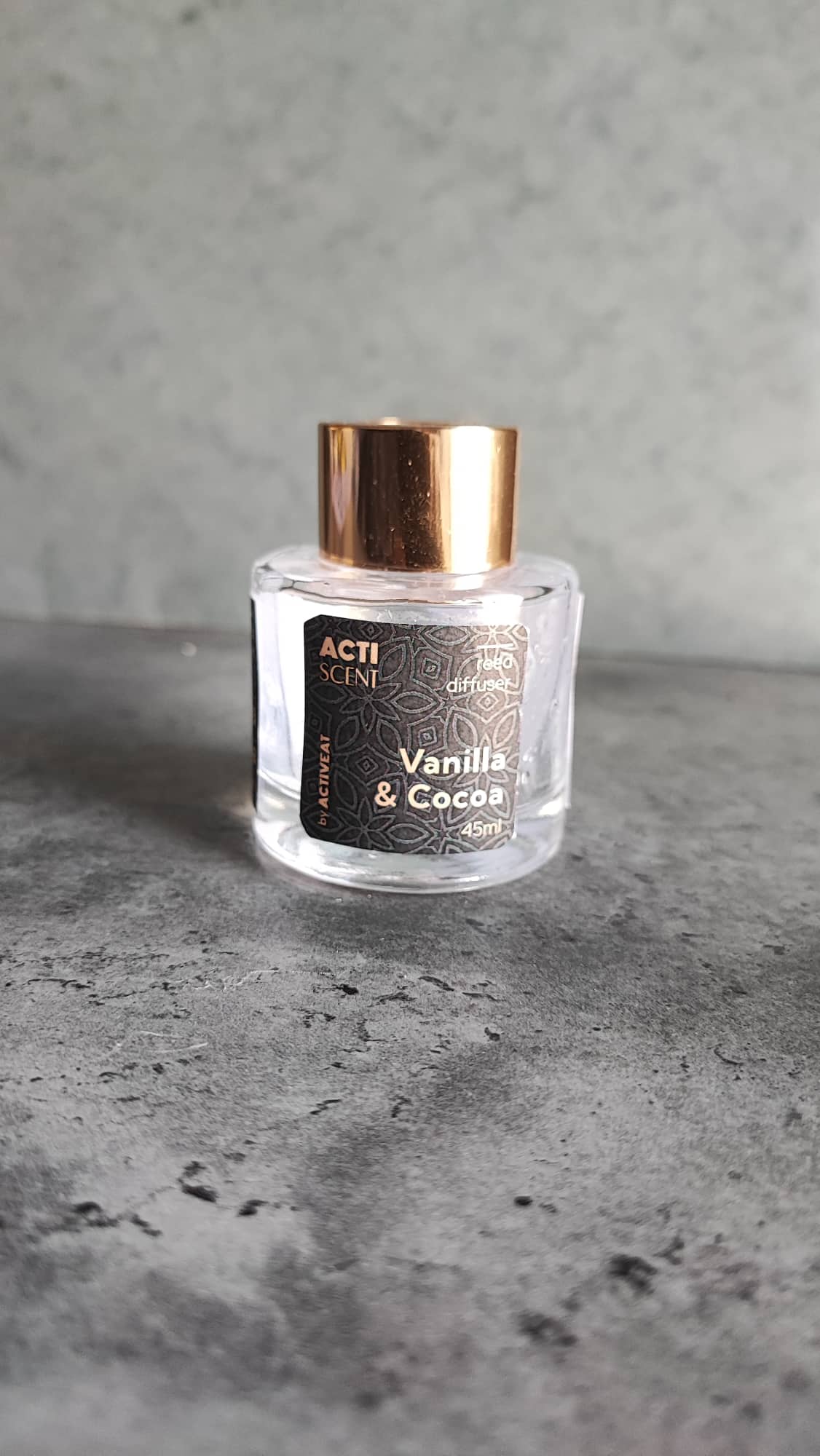
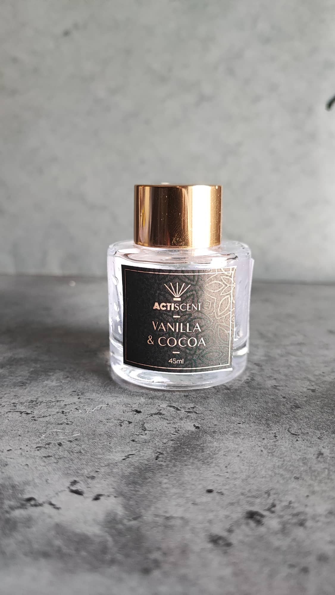
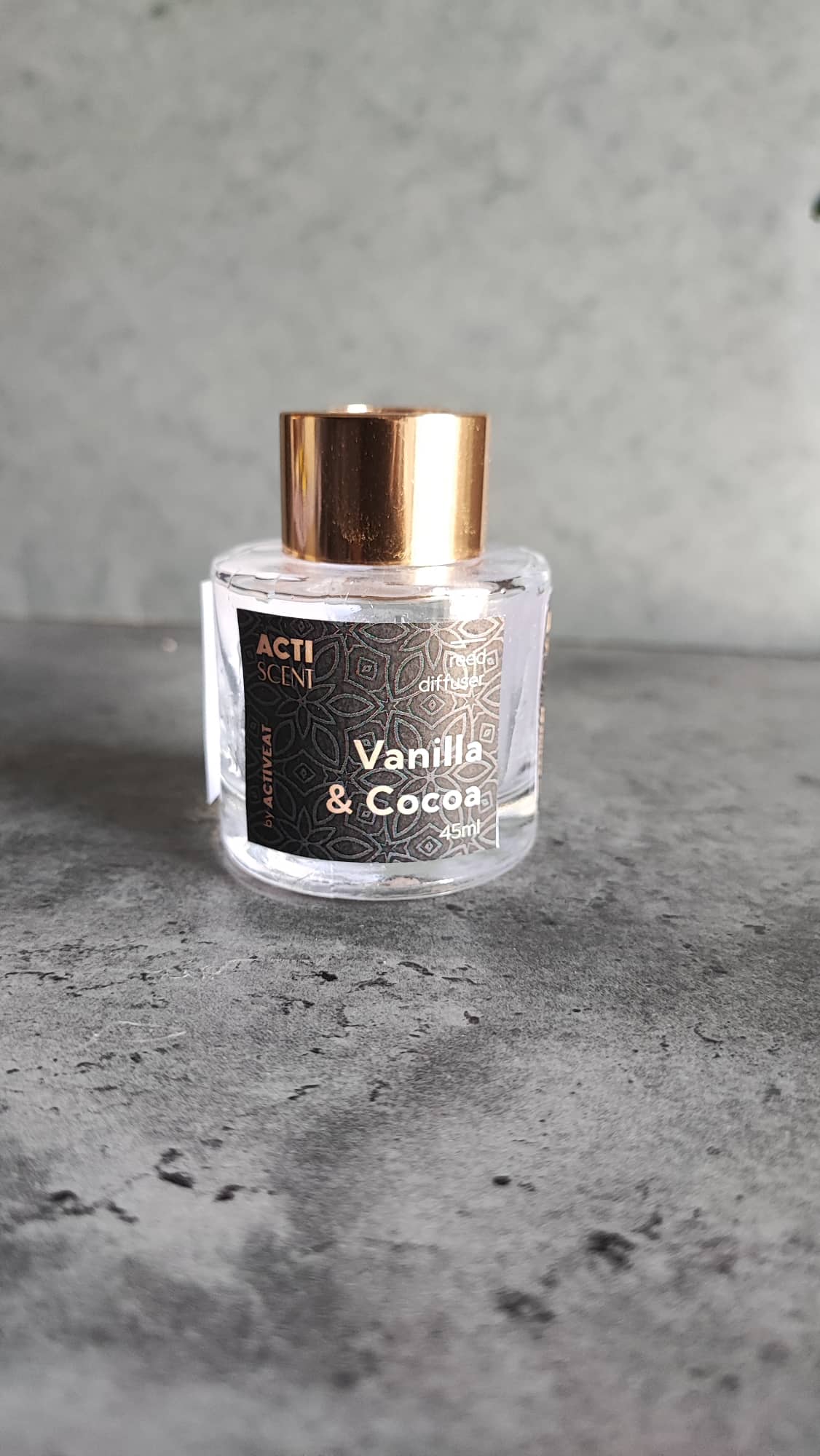
Pardon my awful scissors skills…
The budget for printing (as my client said) is very low and the production will be only 150-200 bottles.
So the most probable is to go with a simple digital print.
I can’t really see the prints - I’d need a loupe to stand over my decision.
But I can see some of the letterings in the T is far too thin and not legible from a distance.
Other than that - they look very nice - and you can see for yourself the labels with thicker lettering is better.