Hello everyone,
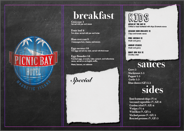
I am looking for a critique on this tri-fold restaurant menu. The white space where it says special will have a clear business card holder attached so they can change the daily specials directly on the menu.
First off the bat; never squash a logo to fit in a space.
I am guessing this is a college project. Not a bad first attempt.ive seen a lot worse in actual restaurants.
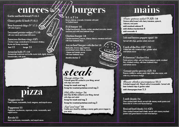
However, the white in black text is going to make it more difficult to read. Although the secondary job of a menu is to help give a flavour of the food and experience customers are about to have, fundamentally, its job is to make it as easy as possible for people choose the food they want to eat and thus make a profit for the restaurant. If their whole experience is difficult, they may only visit once. You need them to want to come back.of course a menu alone is not going to make or break this, but it can certainly help. Put people at ease, Make their experience a pleasant one. After that, in the case of a burger joint, add the fun and the levity. I am afraid this does neither. If I go to a burger place, I want to have a light-hearted, easy dining experience and not feel like it is a school meal with clipart thrown in. You need to lighten the whole thing up.
Hope this helps.
1 Like
looking great, but the home page with logo it’s looks some bad make it with clear.
1 Like
With the logo, I was trying to make it look like it was drawn with chalk, should
I make the effects less pronounced? Scrap the chalkboard idea altogether? This will be on A2, so the fonts are size 18 at the smallest. Would you recommend photos instead of chalk drawings, or simply restarting the process?
Perhaps bindery standards are different where you are, but, if this were printed and folded in the U.S. where books are bound on the right, the logo would be on the gatefold and the kid’s menu would be on the cover.
1 Like
This is probably a menu that will be seen close up. You can push the type smaller (18pt is quite large for this size), and bring in the rags. You could also drop the script typeface, or pair it better with something else.
Consider putting the prices on the same baseline, but aligned right of the text in a vertical row.
Menus are tricky.
1 Like
Overall, I like the white on black chalkboard effect.
But I’d bring the content in away from the edges and add some “white space”, to give it some breathing room. It looks crowded. I agree that you can make the text smaller as was suggested, because your target audience is probably young enough to read it easily.
This piece doesn’t need to capture their attention, because when people are looking at this, they’re already sitting there captured. So it needs to give them the information they want right then, which is about the food.
And if the menu will be black and white, then I’d do something different with the color objects. Because they’re competing visually with the text. They pull my eye away from the food information. I’d either move them away from the text, or make them a lot smaller. And/or put them in white on black outlines.
I’d also change the menu script headers to a non-script font, for better readability.
And the back page with the logo? I’d add the restaurant’s address, phone, url, and maybe a QR code to their website. That makes it more shareable with their friends.
1 Like
Hey hey, I reckon OP is in Australia as Magnetic Island is in Queensland. Anyway speaking from a bunch of experience in commercial print and binding here in Aus, maybe our standards are different but I could put that in a folding machine either side first and get the logo on the ‘cover’. As in, it could be a concertina fold instead, or 6pp gatefold would just opening backwards I suppose. To be honest as this is a menu, I guess its for just sitting on a table mostly open, so probably a concertina is the intention. But maybe I’m way off base, I saw someone talking folding and posted. Hi ![]()
To the menu itself, I think OP captured the chalkboard idea really well! I like the chalk pictures and wouldn’t like to see it with photos instead. I’m unsure if the font is a placeholder but the serif seems a little mismatched to me. Apart from that well done! I say change that logo back to normal proportions and go show the client, hope they like it!
Yes, this could be folded with the logo on the cover. In the U.S., this is commonly referred to as a roll fold or letter fold. If it is folded with the logo on the cover, however, the folded edge will be on the right – which is non-traditional, at least in the U.S. where the bindery is commonly on the left edge. But, hey, maybe they do things differently south of the equator. ![]()
Since the BG is chalk board the font should be something like readable hand-written style.
As for the scratch paper, I think it would be cooler if you use something like typewritter fonts.
About the icons, I think it would be nice if its a vector type icons.