Well, hello, gorgeous…
(click image for link to Flickr gallery)
I have several logo books from the 1980s, and some of the logos you mentioned are in those books.
Some of the logos are definitely dated — especially those that use typefaces that were popular during that period.
Many others, though, hold up pretty well. They look dated when seen in a montage of other B&W logos that were obviously scanned from a book. However, add a little color and move them into a modern setting and they’d look fine 40 years later. For that matter, many of them are much better than the overly ornate, blinged-up logos that so many designers aim for today.
That channel 7 with the channel 63 next to it also Barlow petroleum, I don’t know why those ones in particular but I just think they’re so cool and
And Keystone International!
That was designed by Primo Angeli. If you aren’t familiar with Primo, look him up — especially since you’re in the package design space. He and his studio turned out some great work. There are several other logos in the group that he designed.
You have to love how some of these have really stood the test of time, good find.
Primo is pretty damn cool. My favorite thing on his website is that picture of him drawing with triangles and a steel ruler. I love the marker sketches. He’s done some real iconic work. Thanks man.
like this?

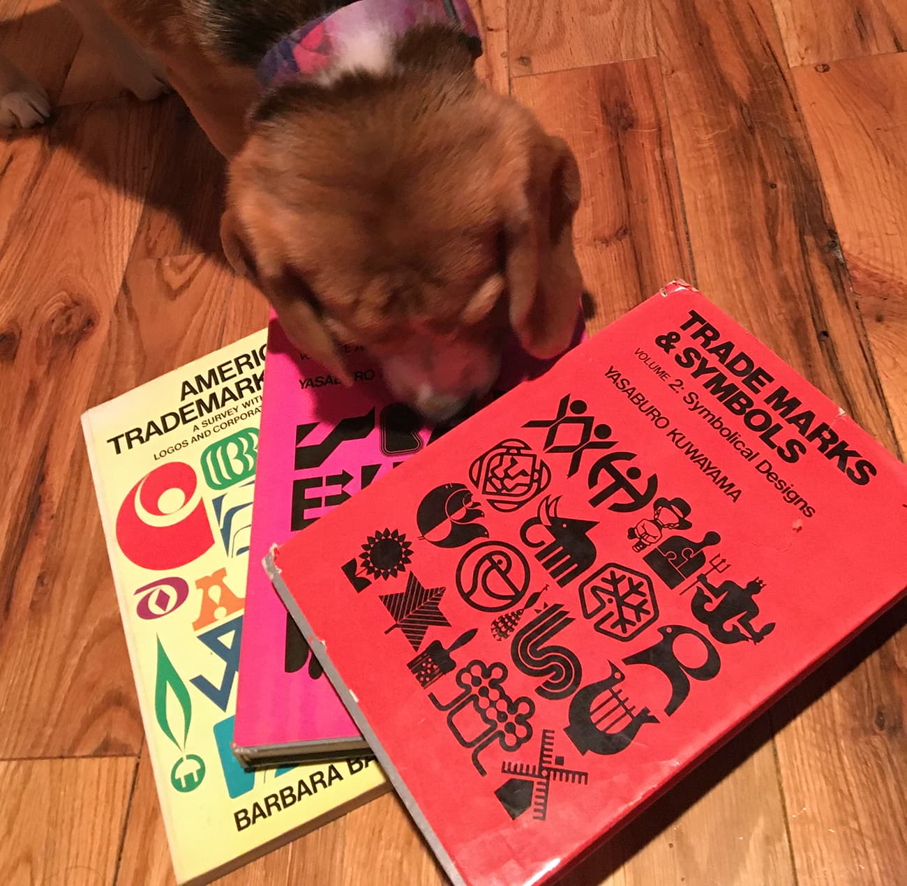
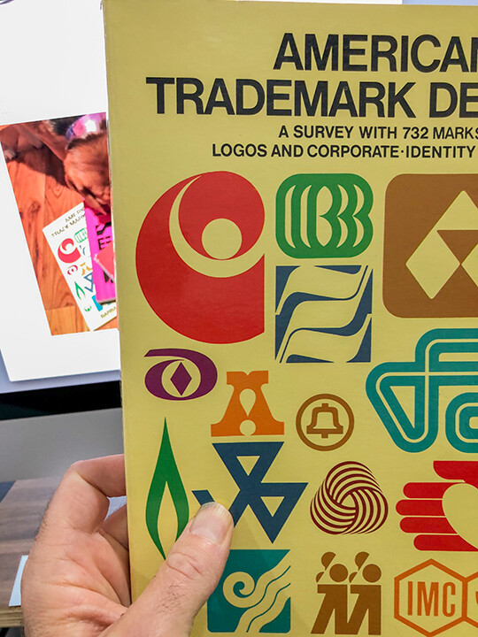
Not the same but very similar. Here are the books I referred to, along with our beagle who always photobombs everything.
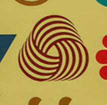
I’ve always liked the wool trademark. It looks just like a handful of spun wool from my family’s sheep operation when I was a kid (minus the sheep ticks, of course).
That’s such a beautiful mark, have always been fond of it too.
2 posts were split to a new topic: Question from talhapartners