Revamped portfolio site

I’ve neglected my portfolio site for too long, so I spent the past couple of weeks rebuilding it. I’m wondering if I can get some honest, critical feedback — whatever it might be.

I didn’t want what has become the standard Wordpress look, so I coded it from scratch, which gave me more freedom to improvise. It was something of a rushed project, so I have lots of clean-up and fine-tuning to do. Aside from a few things I haven’t gotten to yet, it’s mostly there.

The images are large and the shared hosting package is a bit slow, which isn’t a good combination. I might need to look into a pricier hosting plan and squeezing down the images a little more. It’s likely going to load like tar over 4G mobile.

Like many designers, I struggle doing work for myself since I lose the objective distance I have with client or employer work.

Anyway, if a few of you could take a look and provide some feedback on the site and, for that matter, what’s in it, I’d appreciate it.

1 Like

Just-B,

I’ve never have been exposed to your work. You do a very good job with it all.
As you know the site took forever to load, but when it did load it was pretty cool. Coding it from scratch is a challenge, and ill come back to my thoughts on this later below.

Would it be possible to combine projects with over arching themes? Such as Wildlife Projects, Typography. In the banners you list, Campaigns, Guidebooks, and so on. So maybe these are in intro pathways to those projects.

However starting off the first project you list is, “Bear Country” and I’m not sure this is the strongest project to lead with. It may be more useful as a foot note, or in an illustrative category.

The site works pretty well when it comes to reactivity. It only looks jarring to me because of all the negative space on the sides, which may just be a limitation to the screen size you design on. I’m viewing it on a 4K monitor.

I think Apple does a great job using 100% of the screen space on their site, while keeping the site spacilly dynamic. I’d like to see you more away from a boxy layout, which can give it a wordpress feel.
I moving banner is neat and may show what you can do. But the flashy banner aspect screams, ‘mid-2000s’ to me personally. The two main colors I see are red & black (a slightly offset black), and this gives me a vibe of late 90s, early 2000s HTML. Maybe consider a bluish-darkgrey or a light grey gradient in the buttons and a thinner divider?

I hope my feedback, and impressions help. Its a good start!

1 Like

The landing page was bold and recognizable, but I felt like the cohesion of the website got lost once I started visiting different pages. The red nav buttons and block text weren’t what I remembered about your style from the homepage, so when they were the only parts that stayed over into the individual projects’ pages, I thought that I had been taken to a different website. I think you should feel free to keep that animated banner around, it gives us a nice anchor in your style and reminds us that everything on the website is yours. To make it look less mid-2000s, in addition to Billyjean’s comment, you could use a smooth function to gradually increase line brightness and circle size when the nodes get near eachother. Otherwise, good work. I just think you’ve gotta empasize the parts of your site that are unique.

1 Like

Thanks for the feedback.

The site has a max-width of 1200 pixels. Are you not seeing that or are you saying that you’d rather see it fill all the space no matter how wide the browser is opened? I too am using a 4K monitor, but I rarely use more than a fraction of that width for a browser window. Maybe I’m in the minority on this.

1 Like

Thanks for mentioning that. I have mixed feeling about the canvas animation. It’s a a bit gratuitous and draws attention to itself in ways that aren’t really warranted. I asked a few non-designers what they thought of the site, and most asked about the animation and said good things about it. This left me thinking that since the site is mostly directed at non-designers who are looking for a designer, maybe it’s good to have it there to grab their attention. On the other hand, I’d rather have them look at the work itself — not a bunch of moving dots and lines.

2 Likes

I’m planning on sharing some thoughts, but it might take a day or two to put something together.

1 Like

Alright, you’ve been incredibly helpful to many folks on this forum, so I am going to try and repay that with a thorough review.

My overarching comment would be that you do nice work, but the work could be showcased a bit better to make it really stand out.

Now the nitty gritty.

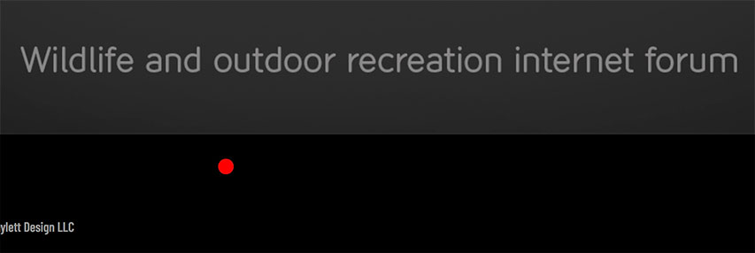
I gotta just rip the bandaid off and say I’m not that crazy about the home page for three reasons – but they’re all personal reasons. The first is that I prefer design work to be shown on white rather than black. The second is that I’m not crazy about the bright red navigation on the black. And the third is that the animation is a bit distracting to my eye. Again, these are all personal, and, yes, I realize that the connecting dots animation ties in with the statement at the bottom of the page.

You have a strong outdoors / conservation / nature clientele base. This makes me wonder about a color palette and graphic motif that is a bit more organic than black and red.

Two more things on the home page. I’d combine the two sentences into one paragraph. The bee seems to be random and unrelated. I tried clicking on it thinking it was some sort of an Easter egg or would trigger something.

I think the copy could be improved. For example, on the bear country page “Bear Country – Utah’s mountains and forests are home to many black bears” could be changed to “Bear Country Awareness Campaign – Environmental Signage Increases Safety Of Outdoor Enthusiasts.” The latter is more descriptive and it talks about the problem your designs solved, namely increasing safety.

As with the home page, I’m not crazy about the black surrounding the content on the individual pages. Again, personal preference.

I’d segregate the design work and the fonts.

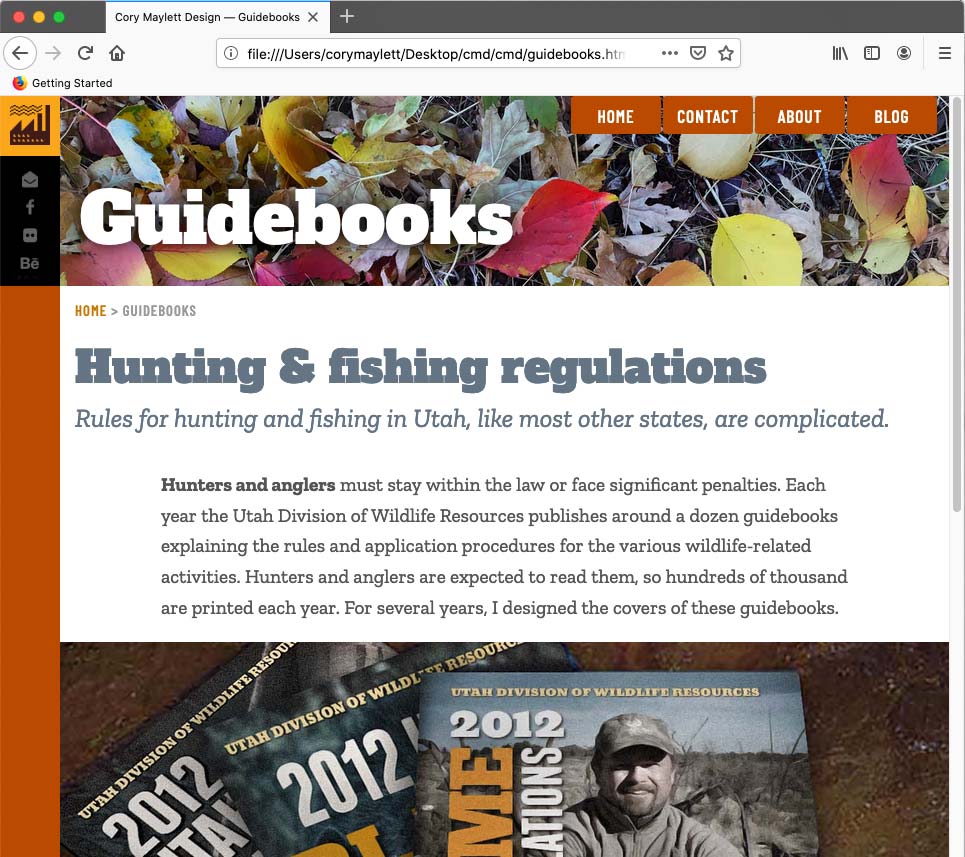
Comment about the copy on the bear country page would apply to the hunting and fishing regulation page, too. Something like “Focused design helps clarify Utah’s complicated hunting and fishing rules” makes the subhead about your work rather than about Utah’s rules.

On the guidebook page, you have a graphic with 8 covers. They’re nice, but they all sort of run together. I’d like to see them larger, with more space between them, and maybe show an inside spread.

Same goes for the Daz 3D page. The work is nice, but it’s all blending together – at least to my eye.

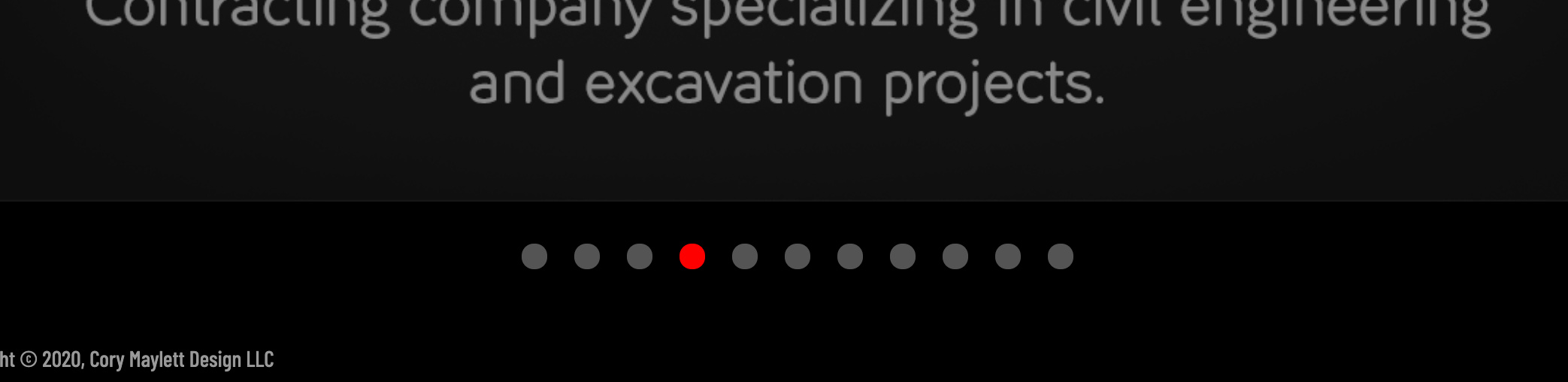
On the logos page, I’d like to see arrows for navigation. Or add white dots along with the red dot so it’s clear to the viewer right off the bat that there are multiple logos and that they can click through them.

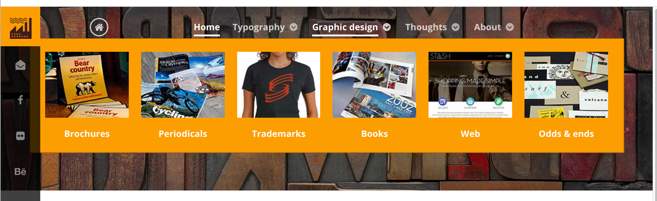
I’d say the work is presented the best on the booklets page. Three photos. One, two, three. Easy for someone to take in as they scroll through. Nice looking photos. I’d shoot to have all of the work samples pages resemble this one.

I suppose I’d say it seems like you tried to make the website the star of the show when the star should be your work. Let the work speak for itself and stand on its own.

That’s it. Hope there’s something there that will help you. Of course, feel free to ignore it all. :grinning:

Thanks Steve!

I’ve been working on a slightly different layout based on feedback I’ve gotten so far. The black will be downplayed on it. The overall size has been expanded to 1600 from 1200 width, which makes everything larger (don’t want things larger than that — the site’s already too slow). Instead of centering, I’ve anchored everything to the left edge. I’ve done away with the bright red navigation and replaced it with more of a burnt umber sort of an orange color, then created a 70-pixel-wide border on the left side of every page that’s the same color (which will disappear on mobile). I’m anchoring some social media links in the border/column. Over the two weeks I’ve been working on this, it’s been just a straight-forward jump into it with little time for reflection and just sort of making it up as I went along, which is why I posted it here for comments. I switched directions in the middle of things two or three times, and I think it shows, but it shouldn’t be too difficult to fix.

I’d post, but I’m out of town and relying on my iPhone’s hotspot, which is, well, slooooooow. I’ll post when I get back home in a couple of days and have a new, revised version.

I agree about the copy. As I mentioned, this was a two-week rush job that needs lots of refinement. I pretty much wrote the copy without too much thought put into it. Yeah, the bee at the bottom is just there for now. There is an Easter egg but I haven’t written the javascript yet. Once I get it working, a mouse hover will kick in an animated GIF with the wings beating. A click on the bee will have it flying off the page (it’s a hold-over thing from a previous site — maybe it ought to just go). Mostly, I just needed an end to the page until I can figure out a better way to tie it off. The copy at the bottom is just sort of hanging there and providing an excuse for the canvas animation. The whole thing needs to be better integrated.

I deliberately made a decision not to categorize much of anything. I know that runs against common sense, but my reasons are complicated. I might revisit that decision since I knew it would be an issue and was just waiting to see if someone mentioned it.

As for the outdoor theme of my work. I’m sort of torn on that because I’ve never intended to head down that road and would like to break away from it. Still, those sort of clients and employers have somehow found a home with me (or the other way around). As a result, the site looks outdoorsy, but I stubbornly resisted fully embracing the look — maybe to its detriment.

As for the logo navigation, there are light gray dots in addition to the red one. I’m not sure why you’re not seeing them. I haven’t run into that particular issue.

The bear country thing is probably the most recognizable piece in the portfolio here in Utah. Anyone who heads into the hills here would have seen it dozens of times. Whether it’s my best work or not, it’s the most recognizable locally, so I’ve given it prominence. Lots of terminology in the copy reflects the wording the client insisted on using in the campaign itself, so I sort of stuck with it. Even so, there’s room for improvement, and I do agree with your observations.

The insides of the guidebook covers were put together by a committee of bureaucrats and law enforcement people, so there’s no way I want to show that. :wink: I just designed the covers.

Again, thank you for all the thoughts. I greatly appreciate it!

1 Like

iPhone hotspot or not, I’m posting this. :smirk: Anyway, here’s what I’m thinking for a revision — at least for an inside page.

Im digging the changes, and I appreciate your response. I didnt know the Utah Bear project was so widely displayed so in terms of recognizability that would mean its an important project. I’m from Michigan so being out of state gives me different eyes on your project.

I wouldn’t embrace the outdoorsy theme more if you want to move away from it.

1600 seems to be a good size for my screen.

1 Like

I enjoyed reading your personal descriptions with each piece. It’s unusual but I like it.

I’m so impressed you’ve designed a bunch of typefaces. As a font nerd who has never designed one, kudos.

Logos. I was also looking for arrows on the edge of the images for navigation. I don’t know if it’s just me, but it took me a moment to realise your descriptions WEREN’T taglines. Maybe these need to be smaller and a bit further from the logos. Did you design any logos where you also did the stationery, marketing collateral etc? It would be nice to see a collection of pieces for the same client.

Maybe I am guilty of showing TOO MANY example pages from my book designs. But I feel you should show a few more interior pages than you have. I just had a quick count of pages from my own portfolio: For a 180 page book design displayed 30 pages. For a 300 page book I picked 20 spreads.

I too want to see categories, and I’m interested to know your reasoning why not.

It is definitely important to show the work you want to be doing. If your outdoor work isn’t the direction you’re heading in then you should show what you want. Even if it means a personal or probono project.

Thanks Buda!

The personal descriptions were quickly written and need some refinement. My idea, though, was to give a little background on how and why they were done and what problems they solved for the clients.

I hadn’t considered the possibility that the logo descriptions might be seen as taglines. I’ll need to think about that problem. In general, I’m not happy with the logo page. I needed a modal window carousel to display them. There are lots of good options for WordPress and Joomla, but since I hand-coded the site, I needed to locate a stand-alone JavaScript carousel, but to my surprise, I couldn’t find what I was looking for and just didn’t have the time to write one myself — besides Javascript isn’t something I’m especially good at. I need to explore some other options.

Of all the book covers I’ve shown, other than the Winter Olympics book, I didn’t really have much input on the interior pages, so I didn’t include them.

The reasons I didn’t categorize things is a combination of boring reasons that I’m still thinking through. First, the link images largely show what they lead to. Second, if I categorized, some categories would be large and others would only have one thing in it. Third, I wanted to keep the front page simple — just an orderly arrangement of squares, but categorizing things would have involved adding category words, which would have detracted from the simplicity. Fourth, I don’t mind the serendipity of leaving things a bit open. Fifth, it might be good to separate the typefaces from everything else, but again, doing that would have compromised the simplicity of the page unless I just grouped them all at the end of the grid of boxes, but that kind of segregation to me, at least, didn’t seem like it would be especially obvious to the viewer unless I added labels saying these are typeface designs, which again, I didn’t want to do since it risked compromising the simplicity.

Af for the outdoors look, it’s not that I dislike it and want to abandon it, it’s just that I feel that I’ve gotten myself pigeon-holed into a certain style and that the portfolio might reinforce that perception and scare away clients who want a different kind of look (which is probably most clients).

The whole site was a two-week rush job because I had applied for a couple of larger contracts, and I realized that I really needed to update my personal website that hadn’t been touched in three or four years. Now that I have a little time, I can give some more thought to these issue everyone has raised.

Here’s what I see on the logo page – no navigation is showing up. Also, it takes a while for the slide show to kick in – probably because it’s loading the rest of the images. When I first looked at the site, I didn’t even realize there were additional logos.

Steve, you’re on a Mac, right? Which browser are you using? I can’t seem to duplicate the problem with any browser on my Mac, Samsung tablet or iPhone.

Mac High Sierra with Safari 11.1. Chrome and FF load the dots on my computer. Weird.

1 Like

Mac Catalina Firefox 72.0.2. No issues with the navigation dots.

Sorry for the late response. I had a question (as this is a learning opportunity for me), will this become a responsive website down the line? I see you have one media query set up, so you were thinking about the page sizing.

There are other bits of feedback but most of the comments have mentioned some of them. But, why are you forcing the user to go back to the home page to view other beautiful pieces of work? There might be a flow issue.

This comment could be completely redundant, as I am not sure if you have updated the site, sorry in advance.

It’s already responsive. There are multiple media queries. The site, as I mentioned, is hand-coded, as in no CMS and no template — each page is a separate file with its own set of media queries.

That is an issue. The site is dependent upon people seeing something interesting, then clicking on it. That being the case, regular drop-down menus won’t really work since they lack visual cues.

Below is how I handled the problem on my old sites, which I built in Joomla. Clicking on the “Graphic design” menu item would launch the modal window you see below. This enabled the site visitor to see a visual link to most everything on the site from every page on the site.

At the time, I thought this was a pretty good solution to the problem you mentioned. However, the Google Analytics data showed that very few site visitors navigated the site using this method and, instead, simply returned to the home page to click on something else.

I had a two-week work break to build my new site from scratch, so I concentrated on getting the most important things up and running. Given the Google Analytics information, I set aside the modal window navigation feature as something I would reintegrate into the new site later on when I got a chance, which I still plan to do.