There is nothing to critique. You haven’t given us any information as to what this.
Are you a student? If so what did your instructor ask for.
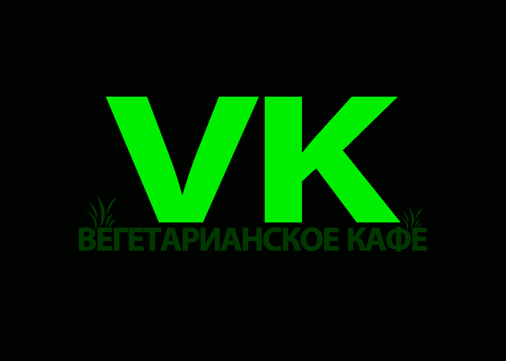
Speaking strictly on a visual basis and not whether or not it communicates what it’s supposed to, the difference in size between the initials and the smaller text is too large (imho) and those grassy graphics are going to be indecipherable at small sizes.
ВЕГЕТАРИАНСКОЕ КАФЕ = Vegetarian Coffee (or so Google translate says)
Isn’t all coffee vegetarian? Maybe there’s a problem with the translation.
I agree with what both RedKittieKat and VirgoNightingale said.
In addition, a bright luminous green doesn’t really say coffee, although it might communicate energy. A bright luminous green doesn’t say natural vegetation either — it suggests artificial and synthetic, which I don’t think is what you wanted.
The bright green won’t convert well to CMYK. On the left below is your original color. I’ve converted it to a CMYK gamut on the right. There’s a huge difference.

As for the darker text beneath the bright green VK, it looks a bit muddy, which lessens its impact and legibility.
Didn’t even think about how that green would print. B is right, it absolutely won’t print that bright unless you opt for spot colors, and even then… ![]()
There isn’t anything about this logo that says “coffee” to me or even has that vibe. I think it’s time to go back to the drawing board on this one. Sorry.
Honestly … when I saw the color, the old mind went to Mary Jane. It’s the same color green for everything Cannabis these days.
There was a smaller text?