deep breath My first post in The Crit Pit. This is just some personal work. What do you think? It’s obviously much bigger than this, an 18x24 poster.
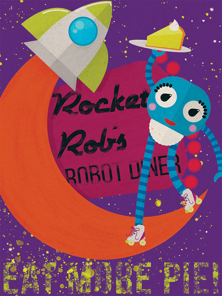
This is pretty nice. I like the colors and texture. Be careful, though, with the heavy hand applied to the texture/spatter especially in the bottom section… Remember that legibility is the most important factor, and I read “EAT MOBE PIE!” instead of the “EAT MORE PIE!” that I know this to say. (more so in the zoomed out version, but still in the larger as well.) (The obscured word “DINER” is also difficult to discern)
Overall, though…thumbs up!
It’s a fun illustration with a nice whimsical quality to it. I like it.
You said this is a personal project, so I understand that it’s more art than anything.
Even so, it’s still looks to be a poster advertising Rocket Rob’s Robot Diner. So with that in mind, I agree with JPretak, the typography saying what the poster is about needs to be a bit more legible.
Thanks guys! I was never all that comfortable with the text on the bottom, but wanted something to put more weight down there. If I were to redo it, I’d probably use the orange from the sign for that purpose.
Appreciate the feedback!
Love the aesthetic but as the others have mentioned, the text is a bit too obscured.
That pie looks delicious!
I agree with the others about the typography issues. I know this is a personal project, but if it was for an actual client you may want to include the address and contact information about the diner on the poster (assuming this poster would be used to advertise the diner.)
Or maybe this is just a poster that would go inside the diner and just used as propaganda to encourage others to eat pie. Either way, it’s good to think about the intended audience and purpose of the design even with personal projects; it will make your designs stronger.
I really like it. Although, I personally would change the “Rocket Rob’s Robot Diner” so there is less space at the line. When I first looked it, it wasn’t obvious that was the name of the place. Dropping the space would make it feel more like a name and a logo.
I also feel the colours for the rocket and the orange “tail” are a touch too dark. I feel that maybe they should be brighter.
The design you have is really cool, but needs some major contrast tweaks.
When you are working a design, especially one that is collage based, it is really important to add artificial depth to the piece by having a very wide value scale. Think B&W photography, Ansel Adams and the like. Don’t be afraid to use real whites and real rich blacks (sparingly). For instance, the drop shadow behind the moon seems like it’s about the same value as everything else.
Don’t be afraid to save a copy and flatten your art, then open in photoshop and create your white and black points (see short vid below). Then open it next to the original and see where you need to brighten and darken.
