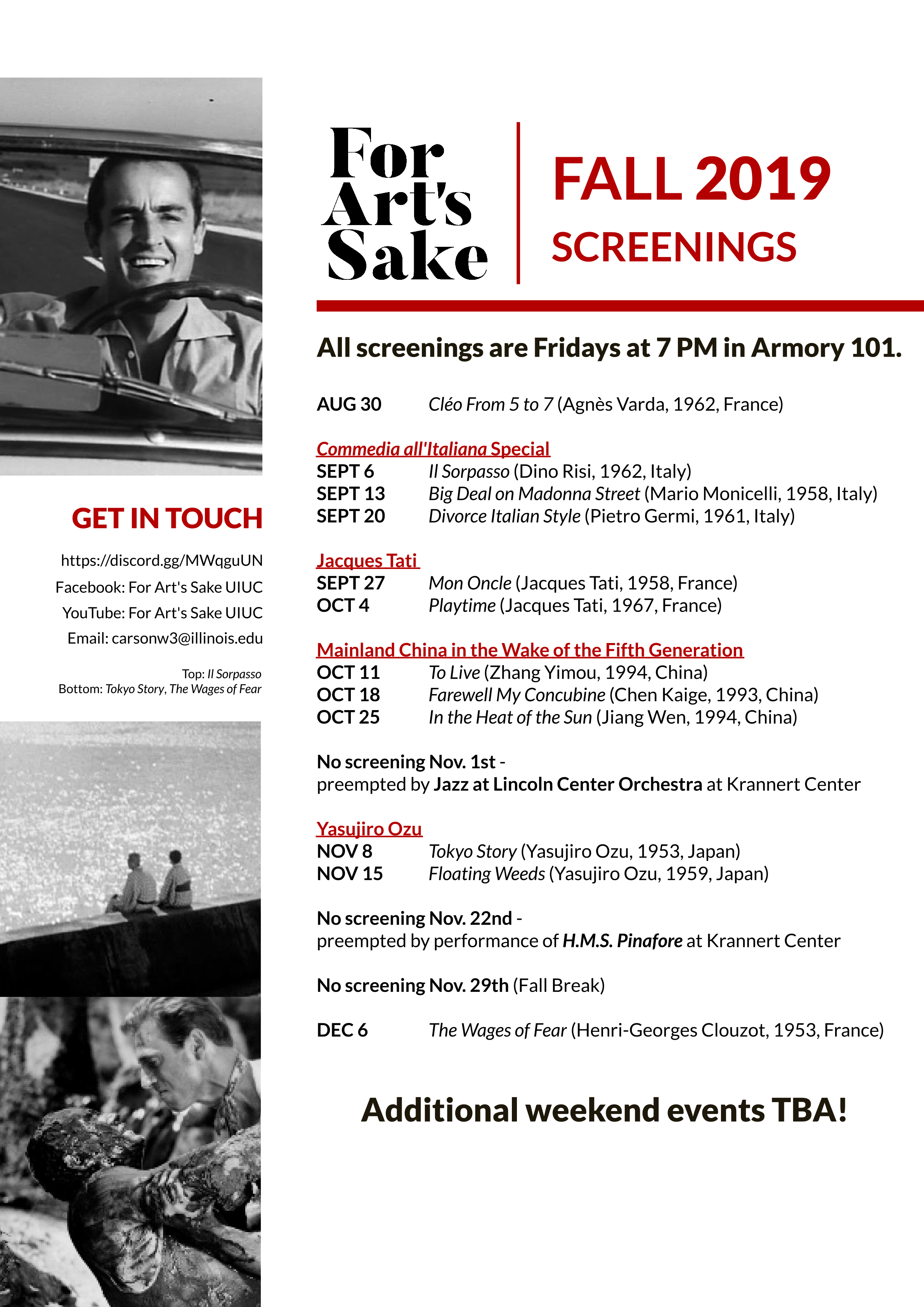
Fall – For what it is, I think it’s mostly fine. Nothing you’re going to put in a portfolio or submit to a design competition, but it communicates what it needs to. The one thing I’d say is that the type seems dense. You should add some leading to open it up a bit.
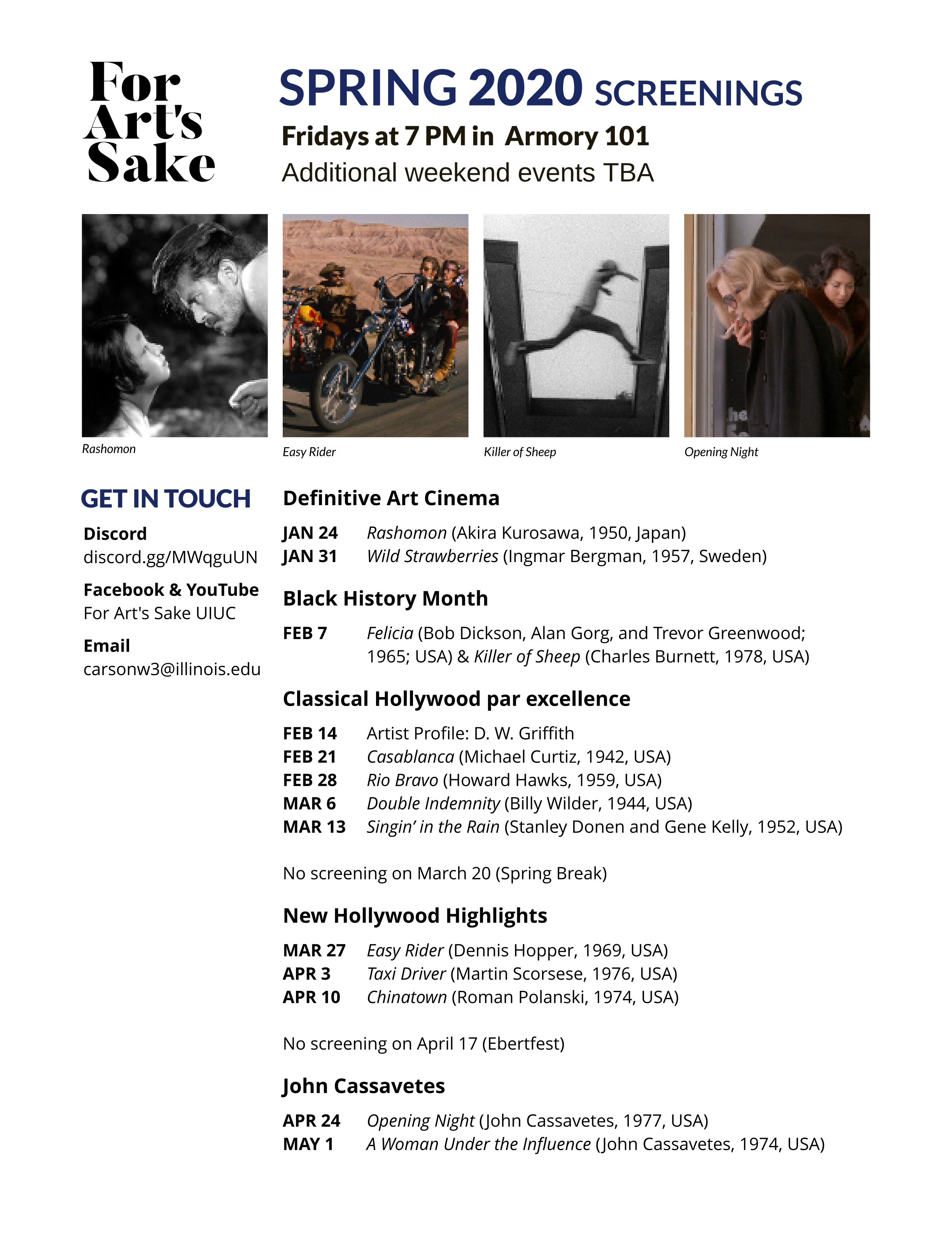
Spring – This one is a little flat or boring.
I get the goosebumps (and it’s not the good kind) every time I see underlines. Adjust leading a little bit.
Definitely get rid of the underlines unless they’re, possibly, hypertext links in a PDF. Other than that, underlines rarely serve a purpose other than to compromise the type.
If it were me, I’d make the spring layout a bit more like the fall layout. As Steve said, spring is a bit flat and dull by comparison.
Thanks for the comments, @Steve_O @Eriskay @Just-B. I agree about the underlines, I think they were originally included in a misguided attempt at making section headers still stand out in black and white. Two comments mentioned the layouts looking “flat,” and I’m wondering if you could help me speculate why that’s the case. I’m probably going to help make the schedule for the fall, so I may try having different regions in the design overlap so I can shake off that flat appearance.
I thought there was to much white space. I would have moved the pictures near the movie, like Machiko Ko next to Rashomon.
have a 40% grey photo of a movie somewhere would enhance the poster.
anything UI related need a logo or location, Is this event happening in Urban/Champlain?
I’m just a student, but I agree with several other posters in thinking that the underlines are distracting. I think you’ll still have good contrast with the color difference in the text. The alignment is really solid. The spring colors lack some contrast, could use something extra.