Hello! New member here. Not at all a graphic designer, but an experienced artist and writer. My partner and I have created a science fantasy universe out of which we’ve written three novels with a fourth mostly completed (self-published, of course). We’re undergoing a rebrand at the moment, so I’m using this time to try to make our covers (which I designed) more professional. This would be for an ebook (possibly self-print later, if it ever took off) meant for adult audiences who are fans of sci-fi or fantasy.
Apologies that I don’t know the correct terminology, so I’ll try to explain my thought process the best I can. While I did do a lot of research on what sci-fi and fantasy book covers tend to look like (and we’re both avid fans of both), we didn’t really want to follow those trends, since our universe and the stories we tell aren’t really typical to any mainstream genre excepting perhaps certain game franchises like D&D and Final Fantasy.
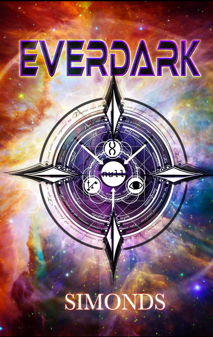
I decided on the ‘seal’ idea being central theme, with each book having a unique seal representing a different character or concept heavily represented in that specific book. So there’s a lot of symbolism meant to hearken back to the story in a more abstract way.
I know it’s messy – but I don’t really know how to un-messify it – and the typography definitely needs help across the board, so any feedback is appreciated! (I know things aren’t centered: I’m not really worried about stuff like that at this point since the overall design is still very much in need of help)
This part here is not blended well.
Overall - it’s pretty decent - nice cover - the image on the front is complex, I presume on purpose.
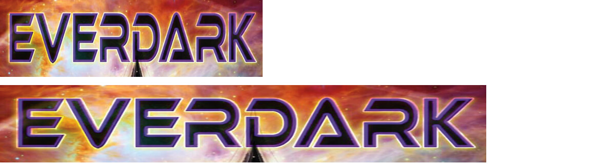
You’ve horizontally squished the type. This throws the width relationships between the horizontal and vertical elements out of balance by making the vertical strokes thinner while leaving the horizontal strokes the same thickness. If you need to condense the type to make it fit, you must also modify the type to restore the balance between horizontal and vertical.
The symbol strikes me as more occult than science fiction or fantasy. I haven’t read your book, so perhaps an occult look fits.
You’ve created considerable clutter with the three major elements — symbol, background nebulosity, and typography — competing for attention. In other words, the cover lacks hierarchy.
In general, good design has more to do with subtraction than addition. Less is usually more. Simplicity typically works better than complexity. Attempting to decorate one’s way out of a design problem rarely works.
Thank you for your detailed response!
I did have to rasterize the title for some reason (it’s been a while since I looked at the file so I don’t remember my thought process) so perhaps that’s why it’s doing that. I can’t even tell something is off with it, typography is not my strong suit. Maybe going back to the un-rasterized text would help that?
I don’t mind it coming off as occult, there are some occult elements in our stories ![]()
I think what I’m picking up by calling it ‘messy’ (being not a designer) is what you said about the clutter. I’m not sure how to un-clutter it, though. I’ve tried removing the background, reducing the seal down to a flat shape, and reducing the typography down to flat, and that all has made it look unfinished. If I keep tinkering with it with hierarchy in mind, though, perhaps that will give me better results.
This is what I’m referring to. Yours is on top. The bottom version is where I’ve stretched it back to where the ratio between horizontal and vertical elements is more natural and balanced.
There’s nothing wrong with condensed type, but good condensed typefaces were designed that way, not simply scaled horizontally.
To be honest, I don’t love it. There are quite a few things wrong with it. B has pointed out the main one. Alignment is out. The tension created where the symbol hits the D in the title is uncomfortable. The font – even when un-squashed – is pretty ugly. Very 80s cliché. In fact, overall I find the whole thing a bit too cliché. The contrast in the background image is too strong, so as to distract attention from both the type and main image.
I could go on, but I don’t want to sound as though I am just trying to rip it to pieces for the sake of it. Much as it sounds as though I am, my intention is not to be punitive and negative. However, your scenario is not uncommon. Fairly regularly people come along and say, ‘I’m not a designer, but…’. In and of itself, I have no problem with amateur designers, but not if they are doing it to achieve professional results then wondering why they aren’t achieving them. It’s a bit like saying, ‘I’m no accountant, but I’ve done my own accounts and can’t see why my tax bill is higher than it should be.’ What you need is a professional accountant.
My advice would be find a book designer who specialises in your area (though any good book designer should be able to communicate what you want to say).
We could go through all the issues, one by one, but even you said it yourself, you may well not see the issues even when pointed out to you. Why should you? It’s not your job to.
The book cover is too important to trust to chance. Book sales are won and lost on cover designs and I am afraid, the take-away on yours is, self-published, self-designed and amateur. People are going to assume that of the writing.
As I say, I am not trying to be destructive here, but my honest advice is, if you want to give yourself the best chance in a highly competitive market, it needs to look professional. That said, the book itself needs to be just as polished, ie, edited professionally and proof-read professionally. I am not implying anything here, but if you haven’t done those two things either, I’d suggest you do.
I have been designing books for around 30 years now and have worked with many publishers. Most of them have weekly cover meetings with editorial, sales and marketing people, so they all thrash out the effectiveness of covers from their perspective. It’s that important.
Hope this helps rather than destroys.
I understand what you’re saying and, trust me, I wish we could afford a professional designer. But we simply can’t. So, I’m attempting to do the best I can with what I have. The story of all self-published authors, eh? ![]() I did make some changes based on the feedback I’ve received here and in other places, though I’m not sure if I can/should post it or even if it’s any better.
I did make some changes based on the feedback I’ve received here and in other places, though I’m not sure if I can/should post it or even if it’s any better.
The self-publishing-cosm is full of a lot of … unpolished stories, for certain. I understand why a self-published author coming to this forum asking for advice would be advised to be cautious. At least, the writing has been through the wringer (I have a friend who is a professional editor and is working with us for a discounted monthly rate), so hopefully it’s better off than this cover!
Did you create the compass art? My brain keeps saying I’ve seen that somewhere before.
I did, yes, it’s an original design. Maybe you’ve seen our books, lol. We had released them before but we took them down to rebrand.
It doesn’t make me want to read it, and I’m a sci-fi fan.