Hello everyone! Our company is designing packagings for different types of products (domestic, beauty, pet supplies, etc.)
We face difficulty choosing the best looking packaging or product design.
Our products are sold in marketplaces like Etsy, Amazon, eBay, so it is really important for us to stand out against our competitors as well as match customers’ visual expectations.
We need help in selecting the best packaging and product design.
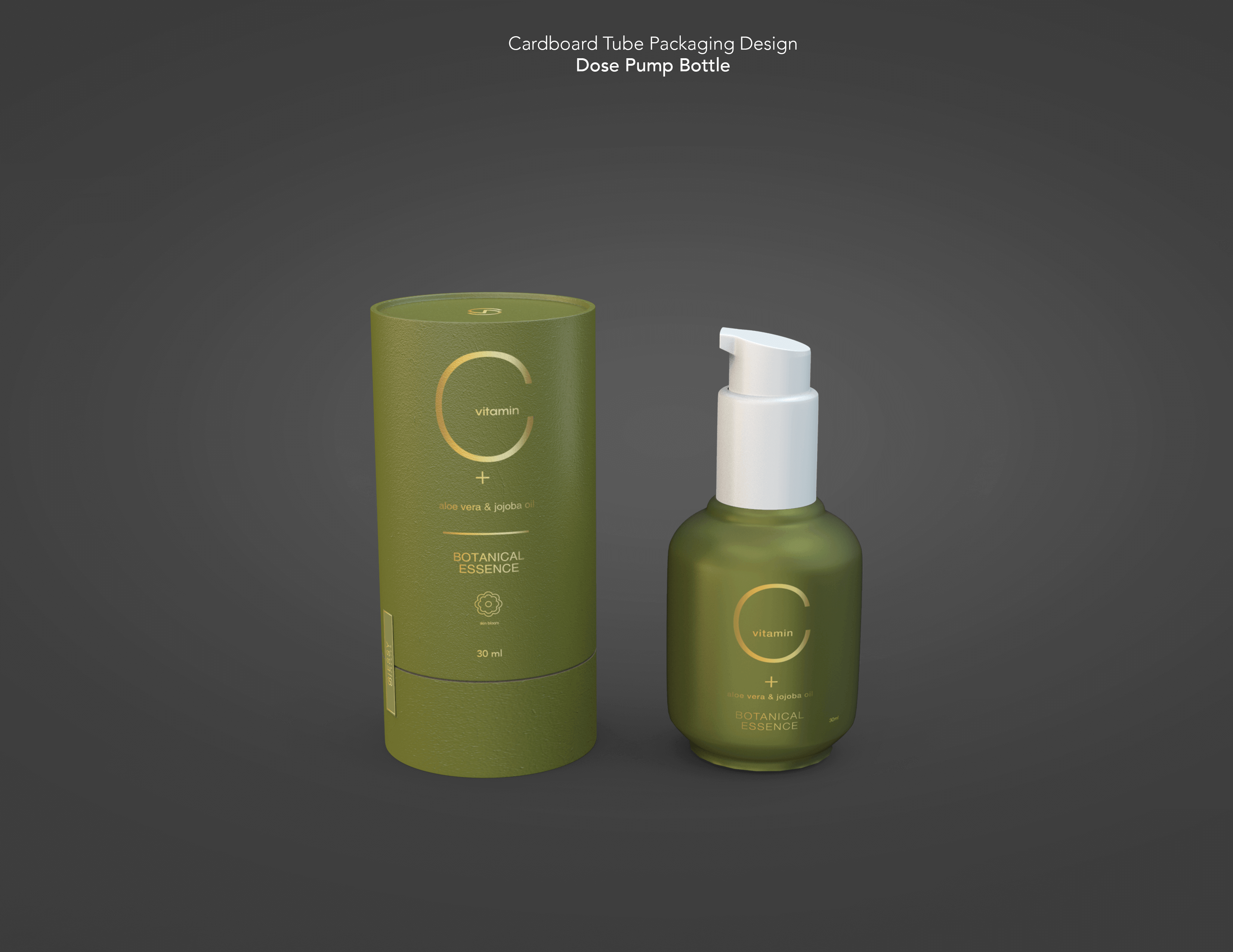
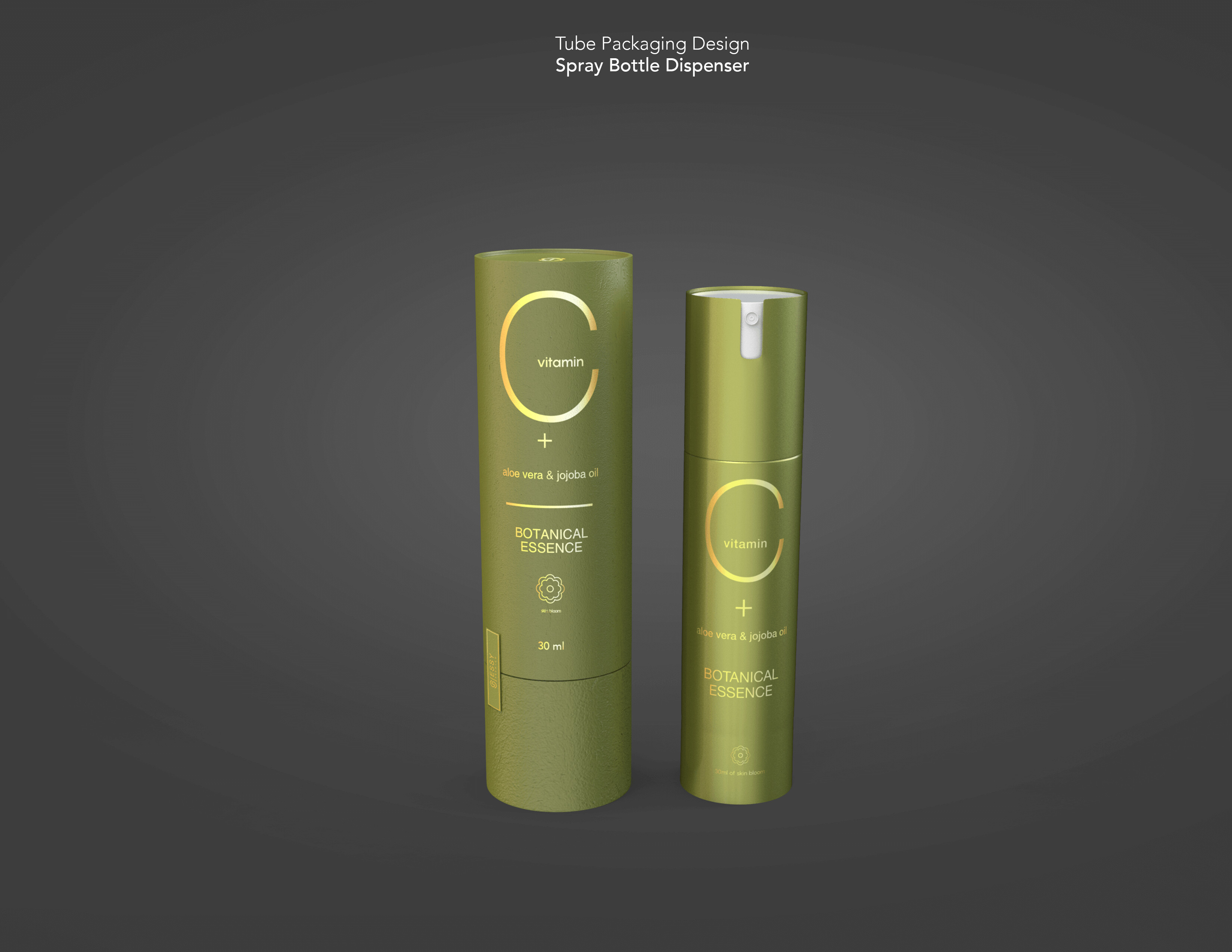
Product: Vitamin C serum
Criteria:
Product must stand out against our competitors
Product design must meet customers’ visual expectations. Example: customers are used seeing face serum with a dropper in rounded bottle shape. We plan to make it with a dispenser instead of a dropper! At this point, we are not sure if it is a good idea so all your comments would be appreciated.
I like the concept started so far! Clean packaging, only see a few minor things I would change. Also, don’t forget to put the name of the product on it (: Not seeing “serum” anywhere on the packaging itself.
I will note though that beauty “serums” are often extremely expensive. I’m working on packaging right now for some eye serum and its 2oz and retails for $200. That being said, it’s pretty important that you’re getting just a little bit of serum at a time and not being wasteful at all. Spray bottles or pump styles I don’t think will work because of that.
I like the general look and feel, but there are some issues. As @Smurf2 pointed out the placement of vitamin is moving around. There is some inconsistency in your alignment and spacing, too. Watch that + sign.
All of that said, the bigger issue is that the placement of vitamin makes the C look like a G at a quick glance, which is all you have in a retail space.