Seeking Critiques - Package Design (Beverages)

Hey everyone!

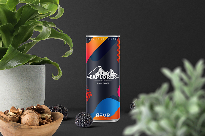
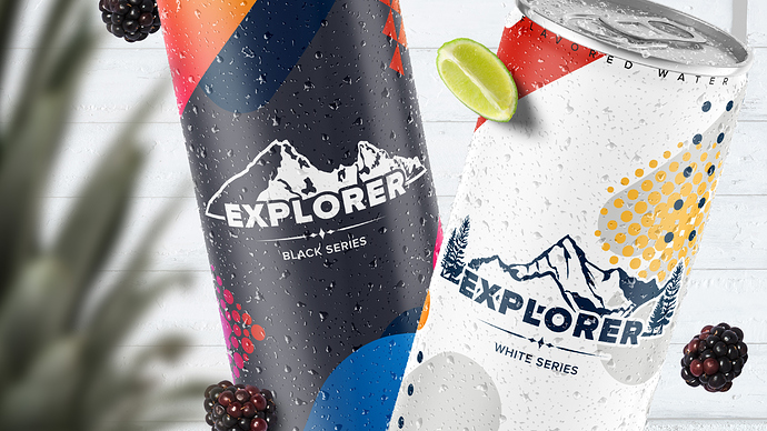
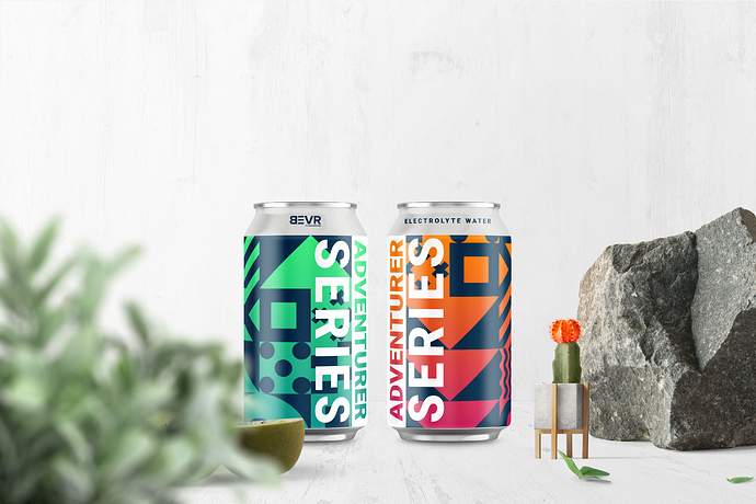
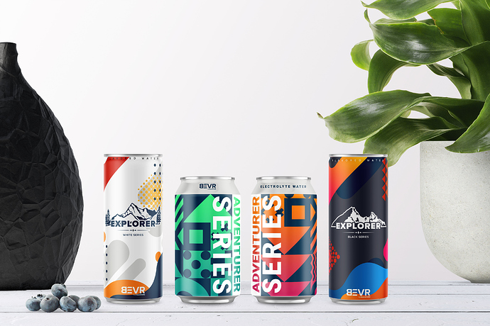
So despite my circumstances, I’ve been continuously working on new projects and designs and below are some samples from a new project I’m working on. Compared to other aspects, Packaging is one of my weakest fields and I would really appreciate it if everyone here can offer their feedback on the current designs.

A little bit of context:
Based in the sunny California, .travellista is a young company whose business focuses on building and providing extraordinary experiences for travelers and tourists. Young and energetic, .travellista has gathered much attention from travelers from all over the world. BEVR (abbreviated from the word “Beverage”) by .travellista is one of .travellista’s sub-brands. Most of BEVR’s products are non-carbonated drinks, energy drinks, canned beverages and refreshments for travelers and tourists of all ages and ethnics. With the rebranding of .travellista and the creation of the sub-brand’s new logo, BEVR seeks to have its old packaging system redesigned to fit both of the brands’ new images.

In this project, there are two requirements: First, the packaging system must make use of the defined color pallete (7 colors from the Pantone) and defined gradients. Second, the designed package must represent a youthful, energetic, and modern image (in accordance with the brand’s image).

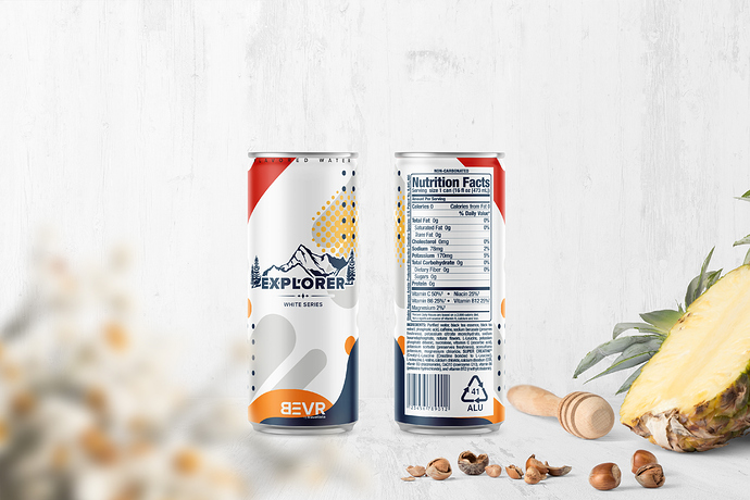
Below are the actual designs and some mockups.

Thank you in advance for your time and kind interest!
I’m very disappointed in this.

How would Coca Cola feel having their logo pushed to the bottom - and this ‘Explorer’ logo bang in the middle - it’s not even mentioned in your brief.

There’s a serious disconnect in the design styles even between the black and white series - and from a distance I thought it said ‘Black Berries’ but zooming in I saw series. I only thought it said berries because you used blackberries in the photo mockup - made it a bit confusing.

The designs are too slightly different on the black and white series - I wouldn’t put them in the same family at all.

You haven’t hit the brief on this at all! I would have thought the brand was Explorer not BEVR.

The adventure series is a bit better, clearly the same brand - but same again - I don’t connect it to BEVR - except for the tiny logo at the top.

I refer back to Coca-Cola - you see it emblazoned on their products. But they have sub products - like Sprite/Fanta that doesn’t even show the Coca-Cola logo - and that’s ok - as Coca-Cola is a black sparkling drink and everyone expects that - so you can’t have Coca-Cola on the outside of a Fanta product because that doesn’t make sense.

Does the end user know Fanta and Coca-Cola are the same company - probably not - or maybe they do - but they don’t care - because Fanta is orange, Sprite is clear - Coca-Cola is dark.

Tell me - will the user be buying the Explorer, the Adventurer - or are they buying BEVR.

That is a question that your packaging needs to answer.

Hope that makes sense.

Uhm, first of all, thanks for your feedback.
I guess it was my fault since the context wasn’t the full one (the full brief is very long as it’s a large-scale project).

Please allow me to clarify this:
.travellista is the parent company and the parent brand, under which, 3 sub-brands, namely BEVR, FASHIION, and DSCVR, are created. BEVR is .travellista’s sub-brand (it may be more accurate to call it a subsidiary company) which focuses on developing and releasing different types of beverages aimed at travelers and tourists. At the moment, BEVR releases 4 main product lines, the non-carbonated Explorer product line (available in Black and White series), the electrolyte water Adventurer product line (available for various purposes), the energy drink Trailer product line, and the general refreshment product line Curiosity.

So to use your example, yes, BEVR by.travellista is not a product line by itself. BEVR by.travellista is not what the end-user will be buying, it’s the Explorer, the Adventurer, the Trailer, and the Curiosity which they will be buying. Users do not buy the brand BEVR which is researching, producing, and distributing the products, users buy the products BEVR is developing. To make it easier to understand, you can think of Explorer, Adventurer, Trailer, and Curiosity by BEVR by.trallista similar to the OMEN by HP, Legion by Lenovo, and Alienware by DELL. I hope this makes sense. Again, BEVR is the developer, a part of .travellista (now a group corporation), not a product line.

I would like, however, to ask you to clarify a few points in your feedback if you may.

You are stating that there’s a serious disconnect in the design styles even between the black and white series. What do you mean by this point? You also stated that the designs are “too slightly different” on these two series. Since I’m not a native speaker, it seems I don’t really understand what “too slightly” means. Could you please clarify this point? To prevent misunderstanding, as stated above, the Black and White series are two different series belonging to one same product line Explorer. They are not two parts of one same series.

Sincerely yours,

Of course - and thanks for explaining it further.

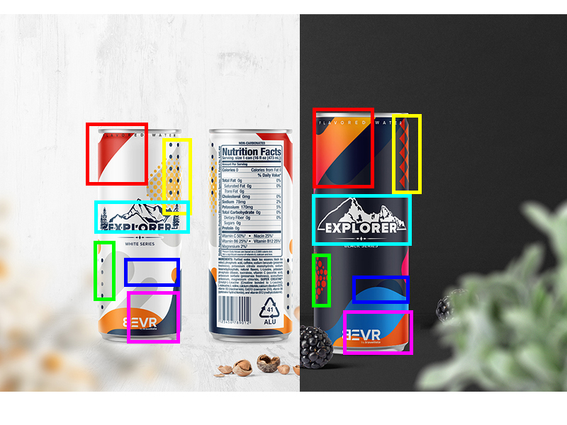
I’ve highlighted the inconsistent design areas - namely the Explorer image it’s a different mountain - not sure if it’s a big deal.

But there are all the highlighted inconsistent design elements.

Maybe I’m being over critical - but it’s my critique.

Thank you for taking the time to examine the two designs and to answer your question: yes, all of the elements used on the two designs are vastly different.

On the White series, all of the elements have a softer, more fluid feeling and they use only one single flat color. The illustration also has the light facing to the left and the shadow to the right. On the other hand, the Black series has a stronger, more bold feeling to it. Except for the illustration, all elements employ gradients with the lighter side on the right and the darker side on the left. This matches the illustration whose light source also stays on the right side. The only similarity between these two designs is the layout and direction of the elements as they still belong to one same product line: Explorer.
These changes are intentional and are all aimed to make the two designs distinguished from each other while complimenting the others at the same time (The way I represent the two designs is also intentional as I want to emphasize the differences). As I’ve stated before, the Black and White series are two separate series (not two flavors of the same series) from one same product line, each presenting a different flavor combination. Black with a stronger flavor combination using fruits and ingredients with a stronger taste, while white employs milder ingredients such as black tea leaves. Had the two series be actually from one same series, I wouldn’t have chosen to make such drastic changes and instead, would create elements to represent the flavors as can be seen from the designs of CocaCola’s various flavors (I wonder if other countries also get the vanilla, lime, strawberry, and peach flavor??).

What I hope to learn the most is whether the designs are appealing and represent the image of .travellista (as I’ve stated above) of being youthful, energetic, and modern.

Still, from your comments, I’ve learned how lacking I was when describing a brief to someone else who’s not directly involved in the project. This goes to show that somewhere out there, my understanding or my representation is still lacking and is something that I need to improve. For this, I sincerely thank you for your kind time and efforts and would love it if you could also provide me with your valuable feedback on future projects.

Sincerely yours,

Thanks for explaining it even further. It makes more sense now with your amended descriptions.

You have your reasons which you have convinced yourself is the right reasons - I’m not fully sold on those reasons.

I think it appeals more to people who are outdoor type, hikers, kayakers, campers etc.

It would be more appealing to those in an outdoor setting.

Youthful, energetic, modern - are not necessarily explorers, adventurers etc.

Youthful, energetic and modern? Umm, I’m not sure. The artsy look, as much as I might personally like it, might override the qualities you just mentioned. Are you sure you haven’t neglected some of the more practical and mundane aspects of the problem in favor of making them look cool?

That said, at first glance, I do like the look. It’s when I dive down below that initial reaction, that my reservations start to surface — some of which mirror Smurf2’s comments.

I kinda just see an energy drink.

I think the whole brand subbrand thing is more effective for another business.
Especially since this is a very tailored brief and custom to you. You have control over every aspect which is a rarity in design.

BEVR might be the parent company but if I was in a normal conversation:

“Hey, I’m picking up some Explore for our hike”
“Hey, I’m picking up some BEVR Adventure for our hike”

Doesn’t appear as clear as:

“I’m picking up some Dr. Pepper (insert any brand) for our Hike”

What about:

“I’m picking up some Roltite or Sparkling Rolyte?”

Thank you for your kind feedback.

The project I’m working on this time revolves a lot around these keywords. As much as I might like them, I find these keywords sometimes sound very vague as people might perceive them differently depending on the environment around them. Whenever I’m in doubt, I have the habit of going back to who the potential clients/customers of the brand are. In this case, the potential customers are not limited to any ages as the brand wants to focus on all travelers of all ages and genders who love to travel, be it casual traveling or extreme traveling. As such, the design I create must be able to convey the said images to users of all ages, all genders, all ethnicities, etc. which, for me, is a very challenging task.

I’ve referred to the design of many beverages brands, from famous brands like CocaCola, Pepsi, to other niche brands such as RedBull or Monster (I’m not really that well-informed when it comes to energy drinks). In most cases, I found their designs focus on one single clear image instead of trying to convey multiple keywords. For example, RedBull’s packaging employs bold typography with a high contrast between the drink’s logo and the background to create a strong image. In addition, the package’s design also uses abstract patterns with strong (sometimes sporty) illustration in between to create an energetic image. However, while younger customers could perceive these images easily, for users in the 40s or older, these images aren’t that well conveyed, and as such, I figured it’s not the most optimal choice to create a design that follows RedBull’s design. The same can also be said for Monster, CocaCola, etc. All of the designs are very beautiful, but it’s not a choice to try and create a design similar to them.

If possible, could you please give me some insights on how you think this problem could be tackled?

I can’t really have any say in the products names and choices as this is solely decided by the business’s owners (and stakeholders). If they tell me they want to create this product line with this name, that has this structure and hierarchy, then I’ll have to follow their instructions. They chose the name Explorer, Adventurer, Trailer, and Curiosity based on their reasoning (similar to the parent company’s name: .travellista) and this is something I can’t do anything about.

But I think the names are chosen as a way to play with words, or that’s what I’ve heard from the other teams working on FASHIION and DSCVR (though I’ll be working with them too). I believe what .travellista was trying to do is to make its name incorporated into people’s life instead of making the names standout from competitions. As such, they chose names that are very common nouns but are strongly related to the businesses.

Yes, I think you’re right. The word “EXPLORER” when combined with mountains, like you’ve done, conjures up images of backpackers, mountain climbers, and hunters/anglers, while the colorful abstract geometric shapes look anything but backwoodsy.

I can’t find it right now, but I thought I read something in your posts suggesting this is a crowdsourcing project. If so, there’s not a lot you can do other than try to interpret what the potential client wrote. With a more traditional client, instead of just a string of adjectives, I might ask the client to describe the typical customer — “Maybe a smart, savvy and style conscious 20- to 40-year-old who rarely sits still, loves to travel, loves art exhibits but doesn’t shy away from hiking boots either.” If I can get a client to paint that kind of mental images about the target audience, it helps me design something specifically for that person.

What? I must be missing something. Maybe I’m not understanding because I’m over 40, slipping into senility, and losing my ability to perceive whatever you’re referring to. :wink:

I think everyone has said pretty much everything I’d have said. I will caveat what I am about to say with the fact I quite like the aesthetics of them, but liking something vs. it’s functional relevance are two different things.

The brand, the product names all point to them being aimed at the more adventurous traveller, more than people on a family package to Spain.

To that end, in terms of the ‘story’ they are telling, the general sense I get from them is that they are ‘outdoors’, in the same way most modern 4x4s (SUVs) are ‘off-road vehicles’. They’ll likely never see, – or be capable of tackling – rugged terrain or muddy fields in their lives. They are sold to people who like to see themselves as rugged terrain people, as they drive the kids to school in the suburbs on slightly drizzly days.

If you want to actually go up a mountain you’d choose a Land Rover 90 or an older Jeep Cherokee, rather than the latest, sat-nav-, parking camera- loaded, luxury-branded, Lamborcedes Appalachian, with heated leather seats and vanity champagne fridge.

These appear to be aimed at people who like to think they could climb a mountain, but in reality are more likely to be atop a sand dune on a day out to the beach. My daughter actually does go up mountains and she would be very unlikely to pick one of these up to take with her.

Perhaps that kind of brand subterfuge is what Travelista are wanting to achieve anyway. Personally, I am not a fan of that kind aspirational demographic marketing. It feels like fakery, but evidently, it works.

Can I just add, as an aside, for a non- mother-tongue English speaker, your English is astoundingly good.

This is the rub - all these brands have perfected their packaging - yet you think you can do it better by doing something different…

That’s a bit class-less, there’s a reason why it’s done that way.

Anyway - I think I read somewhere this was a crowdsourcing project - in that case I am out of the conversation on this one.

Hate crowdsourcing.

@Smurf2 @Just-B
Thank you for your kind feedback. Please allow me to clarify this.
This project is not a crowdsourcing project. It’s a rebranding project with defined project scope, goals, and budgets which was taken on by a small agency in Saitama. However, because the project scope is too large, the leader (who I met at the last designer meetup in Tokyo) of the agency asked if I want to cooperate with them to push the project forward a bit faster. He also stated that it would be nice to have an additional pair of eyes and another brain to come up with new ideas.

As stated before, .travellista has 3 sub-brands, namely DSCVR, BEVR, and FASHIION, with each brand focusing on a different aspect of the traveling industry. DSCVR focuses on providing booking services similar to Booking.com, BEVR focuses on developing and distributing beverages and refreshments, and FASHIION focuses on designing apparel for, well, tourists and travelers (not the heavy professional gears). Since the three sub-brands’ rebrand must be completed at the same type, the agency divided its staff into three teams, each focuses on one single brand. Although so, we are still working under one same art director and under one same brand guidelines (this is why one of the requirements for the packages is the use of a defined color palette and gradients) to ensure that the rebranded three sub-brands fit .travellista’s image. I’m currently working with another designer and a photographer while being supervised by the said art director. Still, even though we are divided into teams working on different brands, we still maintain a level of communication between members to ensure that all of the designs are consistent. Also at the moment, the above designs have been approved by the client’s side, and we are proceeding with further additional designs.

You are mistaking what I’m trying to say through this sentence. As I’ve stated, each of these designs is very beautiful. However, they are designed to promote a defined image, or for a defined single purpose, and are different from the problems we are facing. We do not plan to mimic their design, we also do not plan to improve their designs. I’m just stating that while referring to these designs is useful, we still have to figure out how to solve the challenges we are facing in our own way.

Thank you for your feedback.

After confirming it with the project leader, it seems that it’s indeed the aspirational demographic which .travellista is aiming for. It’s not just BEVR, other sub-brands also received the same target customer and persona.

And thank you for your compliment on my English. In my country, English is a compulsory second language. As a result, students are taught English very soon, from the third year of elementary school at the latest. In addition, because of a special system implemented at my high school, for three years, all of our lessons are taught in French and English. As a result, I’m somewhat fluent in English (though not without faults). At the moment, I can speak three languages: Vietnamese (my mother tongue), English, and Japanese fluently, while my Chinese and French are both at the business level. This is, however, the very first time I’ve received compliments on my English and it really warms my heart. Thank you

Is this a real project you’ve been commissioned to work on for an actual company, a crowd sourcing entry, a school assignment or a project you conceived of yourself?