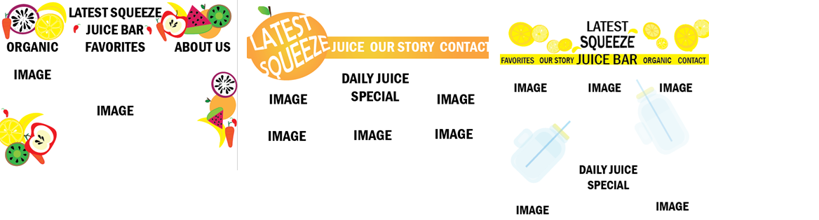
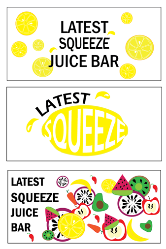
I’m a design student and my assesment is to create 3 Logo Concepts, 3 Business Card Concepts and 3 Website Layouts. I wish to seek your feedback on the designs!
For the time being, forget the business card and website. Concentrate on three solid logos and then look at the card and website.
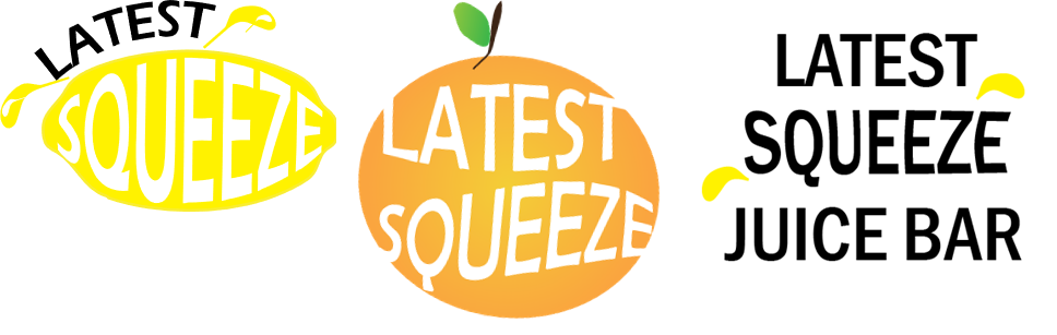
I see what you’re doing here – putting the words inside fruit for the first two and “squeezing” the “squeeze” with the last one. So good for you for at least putting some effort into a concept. That said, none of these are ready for prime time. They need a lot of refinement and polish. Keep pushing the ideas.
Some rough ideas:
With the lemon concept, everything looks tacked on. The Squeeze needs to be more legible. Darkening up the yellow would help. Why do you have the juice drops? Would juice be coming out of a lemon that wasn’t cut? Latest should be more integral to the design. This needs to have Juice Bar added in some way to clarify what’s going on.
With the orange, you kind of have a psychedelic feel with the warped type. That’s a big kind of. Search for psychedelic posters, Grateful Dead posters, psychedelic fonts for inspiration. As with the lemon, you need to integrate Juice Bar.
The third design needs the most work. The execution is pretty lazy on this one.
Out of curiosity, are you a high school student or is this a college level assignment?
Straight-up Y yellow does not have the contrast needed to be used on its own in a logo.
If that last one is a logo, how many color plates is that? Or silk screens? I’m seeing at least 6. Cha-ching!
The first logo with the lemon has potential. Like Steve_O said, it needs some refining. And yellow with white type is going to be a difficult read. You’re going to have to throw some Magenta in there, But I fear enough magenta to gain the required contrast will push you into a color not suitable for a lemon.
The designs with the fruit compilations seem very messy and jumbled. I would stick to perhaps one or two large fruit pieces.
Are those chili peppers? ![]()
To be honest, I am not really a fan of any of these. They just look too chaotic and unfocused.
Here are some suggestions to help:
Think about the message you want to create. Is Latest Squeeze supposed to be fun, healthy, stylish or something else? Pick one of these core values and then really try to communicate through use of colours, graphics and fonts.
For example, the font you have chosen is quite harsh looking, especially with the use of capital letters and the use of black. Normally I’d associate a juice bar with being healthy, so black capital letters go against that. I’d expect to see a more round looking font and in lower case to better reflect the concept of gentleness and nature.
Same with your colour choice. You have used very bright colours that contrast strongly with white. It just doesn’t suit the values I’d associate with a juice bar. Once you know what you want Latest Squeeze to be, Google for colour palettes that reflect your message. For example, if you think it should be a healthy place, then Google for health colour palettes.
I’d also avoid drawing vector fruits as it looks too much like clip art. If you are only allowed to use vector images, then maybe hint at the fruits. For example, if you look at this logo, it just hints at an apple. It’s not a detailed drawing of an apple and just looks so much stronger than what you have done.
Sorry if I sound too critical, but I hope these suggestions will help. I think once you’ve figured out what values you would like to communicate, it will be much easier to work on it. Also, do a Google search for things like Fruit Logo, Juice Bar Logo. There’s some really nice designs out there, although they also have some flaws. While you shouldn’t copy them, you might benefit from using them as a starting point to guide your designs. Pick a few of them and write down what values they convey and how they do it. What draws you to each logo and what is a turn of? I think doing this type of research will be a big help for you.
Do you have pencil and paper sketches before you got on the computer? If not, start there. Sketch out at least 50 or more ideas. Stuck? jot down ideas, put together mood boards, do something else and come back to it.
1 Like