Seeking feedback on my student magazine layout

Hello,

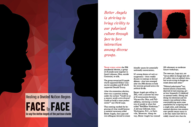
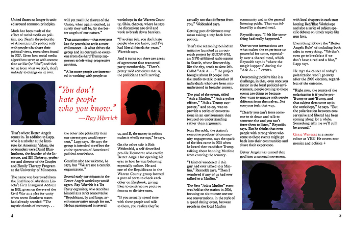
I am a new design student learning to use Illustrator and InDesign. Our most recent assignment tasked us with using content from Yes! magazine designated as Creative Commons and designing a magazine layout to go with the article. This is my valiant attempt!

I’d appreciate any feedback on how I can improve the article.

I designed the images in Illustrator, and I couldn’t figure out how to lighten my blue background to create a greater contrast between the background and silhouette images. I lowered the opacity, which helped, but it didn’t completely fix the problem.

Thanks in advance for any help you can offer!

I don’t mind the silhouettes and red/blue theme given the subject and that it’s a student assignment, and you’ve set up a grid which you mostly stick to; but I find the overall layout to be off. Take another stab and the 2/3 spread. The space on top of 3 looks very awkward to my eye. I think you could eliminate the smaller silhouettes on page 3 and do something more interesting with the article’s title.

1 Like

Begins With

Over the past few months, we’ve had several students specifically request feedback on magazine layout assignments. Interestingly, I’ve noticed that all seem to run into the same sorts of general problems.

You might want to search for those critiques since much of the advice in them is applicable to your design too. If you look up at the top right of the forum website page, you’ll see a magnifying glass, which is a link to the forum’s search feature. Search for magazine design.

1 Like

Steve_O Thanks so much for the helpful feedback. I agree the top of 3 is awkward. I was hoping to show a progression with the images that first face away, then look toward each other, and finally begin to understand each other.

I printed a sample spread and after seeing it I think my body text is a bit large. If I shrink it down, I’m wondering if I have room to make things more dynamic. If I drop the image on the top of 3 and shrink my font size, I could bring the lead in down to the bottom of the page and combine my body text into one column that takes the place of the current column 2 and 3. Do you think that would help? I’d have more white space on top that way. Maybe I could add a dividing rule between the lead and the body?

Just-B Thanks for the helpful direction! I read through many of the other critiques and several of them applied to my design. I guess it’s time to start revising!

Heading Putting a box on a darker background for the heading is not an attempt to solve the problem (let alone the heading block is not even centred inside the box). Choice of type style, size and colour afford you much more room for creativity. Also refer to PrintDriver’s comment.

Byline is missing.

First three words There is no reason for small caps. All caps will do.

Para spacing It does not seem consistent. For instance: On page three, column 1 has three para spaces but seems to have the same column height as column 3, which has two para spaces, whereas column 2 has the same number of para spaces as column 3 but column heights are different. For body text it’s best to do away para spaces altogether and use para indent instead. The first lines of all columns should line up.

Author’s descriptions Since there is no byline, there is no need for an author’s description.

End mark The end mark should be at the end of the article, not the end of the author’s description, which should not be present anyway.

Title page illustration May be a minor point, the the two characters do not seem to see eye to eye. Line them up.

Folios Page numbers 4 and 5 don’t seem to line up in respect to the body blocks. or vice versa.

My typing fingers hurt …

1 Like

Now that I have a little time, I’ll do more than refer the original poster to other posts on the same subjects, so…

1. Paragraphs: You’ve formatted your text like it’s for a website. Magazines, like most printed materials, use paragraph indents rather than leaving a blank space between the paragraphs. Spaces between the paragraphs result in a chopped up, uneven appearance to the text.

2. Inattention to detail: There is no room for sloppiness in a magazine (or any other kind) of layout. Your headline isn’t centered accurately inside the box in which it resides. The bottom left photo isn’t aligned with the text on the left side and is too close to the text above it. Your pull-out quote on page is badly organized and misaligned. Your pull-out quote on page two contains punctuation errors (face-to-face needs hyphens since its a compound modifier). The body copy has three blank lines at the end of the story. You need to fix these problems.

3. Entry point: It’s not entirely obvious where your story starts. Yes, you’ve used red small caps, but it’s anemic. A more typical, useful and better way to begin a story is with a large initial cap, a subheading, an authors byline, etc. Have you ever noticed that well-designed stores and buildings always have obvious front entry doors. This isn’t an accident — it’s a subliminal guide to people telling them how to get into the building. The same is true for magazine articles.

4. Bylines: I mentioned this in the previous paragraph, but it deserves another mention. Magazine articles typically have authors. A feature article, like yours, almost always has an author. The authors typically need their bylines on the page before the story starts. You’ve placed a little about-the-author blurb at the end of the story, which is a common thing to do, but this does not eliminate the need for a byline before the story starts.

5. Credits lines: Illustrations and photos almost always need credit lines, but you’ve left them out.

6. Page numbers: Yes, you have them, but you’ve treated them like an afterthought to just plug into the page rather than taking advantage of them as a design element. There are lots of little graphic elements that are common to magazine layouts that can be used as design elements — you’ve mostly ignored them (other than the pull-out quotes). Running heads, page numbers, rules & lines, drop caps, credit lines, inline section headings, cutlines (captions), etc., can be used as needed to provide visual interest to the layout and pull people into the story through various means.

7. Pull-out quotes: Good job on including them, but did you actually pull them out of the story? The quote on page 2 doesn’t even have quote marks or an attribution. Maybe it’s not a pull-out quote at all. Maybe it’s just a chunk of text to fill up space or an introductory subheading. If so, why have you formatted it like your pull-out quote? There’s no room for ambiguity in this kind of thing; subheads and pullout quotes are different animals and the distinction between the two is important.

8. Dullness: You’ve treated the layout as little more than an exercise to make the text fit alongside some illustrations. In other words, you’ve fulfilled the bare minimum of what’s in a typical magazine layout. Consequently, this story looks like it would be tedious to read, which is a major turn-off to readers. Integrating some of the devices listed previously would help enliven the page and help draw readers into a visually engaging layout.

All that said, you’re new at this and these are typical problems newbies run into. I ran into the exact same sorts of problems when I was starting out. You’ve done a good job on the concept you came up with regarding the faces. It’s a good concept to build a layout around, but you failed to build out that layout to much of anything other than a bare-bones layout.

Just a recommendation: head to your local bookstore and spend and hour or so carefully looking through the magazines to carefully analyze all the details and try to figure out why the designer did what she or he did and why it works or doesn’t work. Notice the differences in design across the different genres of magazines — some are clean, sparse and elegant, while others are cluttered, busy and chaotic. Almost none of these things are accidental.
3 Likes

I was not expecting so much helpful, detailed feedback! Thanks to each of you for sharing your experience and insight. It is one thing for me to look at my design and think, “this looks boring,” but quite another to have the mechanical specifics pointed out that could help. There is so much to magazine design that I have previously enjoyed but never stopped to analyze. @Just-B, in addition to working on your suggestions for my design, I will also be taking your advice to go peruse some magazines in person.

Thanks again!

1 Like

The majority of time feedbacks are based on what’s at hand. It’s never personal – well, sometimes it may seem harsh, but I’m sure it’s not intentional. Having said that, every now and again you might come across some snide remarks which you should disregard.

Still, I’m impressed by how you took the feedbacks with such grace and maturity. This is the spirit of this forum.