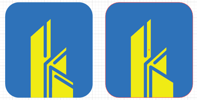
Snap reaction: The white outlines of the k abutting the yellow background induce an uncomfortable visual modulation. I’d want to do experiments to eliminate that white.
I’m liking the choice of colour, I think the blue is very professional and the yellow is approachable. However there are few things that feel a bit off to me.
Firstly I struggled to read the name “kANTHARIA” - what was the reason behind the lowercase “k” and removing the cross stroke from the “A’s”? Because I think these things significantly affect the legibility of this text.
I get the impression you’re trying to do too many things at once, I would just let your mark be the hero and make sure the brand name is legible.
Regarding the mark, it feels very busy and like @HotButton mentioned, there are issues of contrast using the white and yellow so closely together. I would try to simplify this a bit.
I like the concept of combining two things to create something new – like a k and buildings – but I get the feeling that this is the first solution you came up with and stopped working on it. So I’ll commend your thought process, but I have to say this isn’t the best solution. Also, I’m not crazy about the typography. Keep pushing and working on this. Good luck.
I liked the concept of K being the building but the white over line is somewhat uncomfortable to the eyes. I think you should either check with different color or reduce the white border size.
Once again I thank you all for your time to feedback my logo design. I have taken into account all of your points and tried to implement in my best possible manner.
If possible please let me know your views on these.