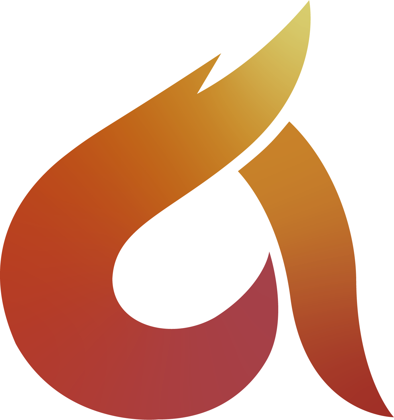
I’m going into my second year of Uni and a work placement is apart of our second semester. I’m looking at getting into concept art when I leave Uni as I’m mainly interested in detailed illustrations and I’ve been getting into 3D over summer. This self branded logo will be used digitally for the profile of my Instagram and for my website, CV, etc. I went with the word Avidity as it describes my passion towards the craft, and to symbolise that I made the letter “A” a flame. So far the feedback from my peers has been to improve the logo structurally but I don’t really know where to start with applying that that critique. I’m posting here because I’ve seen some in depth criticism which points out things that i wouldn’t have otherwise noticed.
Logo making isn’t my strongest subject so I’m sure there will be a lot to say about it, so I hope none of you go easy on the logo.
The gradient isn’t working. Frist of all, it’s a gradient in a logo. A technical no no.
Also,
It’s coming across as washed out. The red at the base is not really a red, and as you can see here, the banding is a serious issue even at this relatively small scale. I know you said this was going to be used digitally, but you might want to focus more on doing a logo that is appropriate for any media it might be used on.
I can see what you mean about the colours, a flame is supposed to look bold and powerful; whereas this currently has a pastel appeal to it. I’ll try a more vector based approach to make it easier to print on business cards and other mediums
Cheers for the feedback
I’ve said this here before, but morphing a letter into a fish, a bird, a house or whatever (including a flame) usually ends up producing something that is neither and sort of akin to a Frankenstein creation.
Every now and again, a really good example of this approach works out well, but it’s very difficult to pull off consistently. For some reason, though, it seems to be lots of people’s go-to solution despite it making the problem harder to solve without any inherent benefits other than being an easy starting point.
You’ve chosen the name Avidity, which is great. It means avid or enthusiastic. So an obvious direction is coming up with a symbol that suggests enthusiasm or avidity, which is difficult but totally doable and what we get paid for.
In your case, you decided a flame might do the trick, which is a good option. Personally, I would have chosen something abstract that suggested avidity or enthusiasm, but that’s just me. A flame could work too.
But it’s the next step that got you into trouble and made the problem more intractable. Instead of just creating a nice stylized flame that would sit to the side of a word mark spelling out Avidity, you decided to restrict your good options even further by morphing the flame into a lowercase “a” for no reason other than the first letter of avidity being an a.
The result is an awkward hybridized a that doesn’t really look like an a and a flame that doesn’t really look like a flame. Would Nike’s logo have worked as well if they’d forced an n into the swoosh? Would Apple’s logo have worked if they had put a couple of serifs on their logo to make it look like an a? There are famous exceptions, of course. McDonald’s golden arches make an okay M logo.
I guess what I’m saying is that sometimes it works and sometimes it doesn’t. Sometimes beginning designers (you mentioned being a 2nd-year university student) focus in on making an initially promising idea work when it just doesn’t want to. This kind of time-consuming stubbornness really makes solving the problem hard. It’s a whole lot better to drop the idea that resists panning out and spend that time exploring other options. Keeping thought processes fluid while avoiding the tendency to get mentally locked into an idea can save a ton of time and frustration.
@Just-B is absolutely correct. There is no golden rule that says one must be literal in a logo concept. If one can, that’s great, but the odds are not always good.
That’s brilliant advice for someone like me, I normally end up dis-forming the letter forms whenever I make a logo and I end up spending weeks trying to make it work. I didn’t think of doing something as simple as a flame, ill have to give that a try. You also mentioned how you would have went more abstract with the symbol, so just for reference could you suggest any logos that could be good influence? I’m glad I posted this early in the design phase as this will probably go in a whole other direction now.
Thanks a lot for the advice, much appreciated
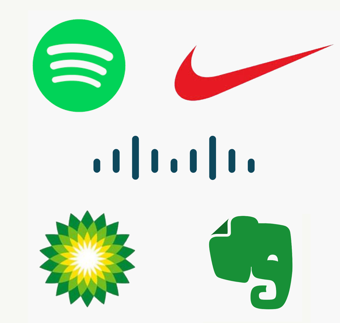
I’m not saying these are great logos, but they are well-known, successful and based around abstract concepts that relate to the nature of their parent companies. I’ve removed the usual accompanying text from each to more clearly show the logos.
Spotify — It needs to work as an app icon, which it does. It’s also a circle or a spot, which plays off the name. It also has sound waves seemingly emanating from a speaker or headphones, which suggests music.
Nike — I already mentioned Nike, but it’s a perfect example. They didn’t make a stylized N or a symbolic shoe. Instead, they wanted to visually represent speed. The wind suggests speed, but better still is the sound of the wind made by something moving by quickly — a swoosh.
Cisco — They make the hardware that keeps the Internet working. The vertical lines represent the electronic pulses of a signal traveling across the internet, but they also depict the Golden Gate Bridge in San Francisco — Cisco’s home.
BP (British Petroleum) — One of the biggest oil companies in the world has been plagued by environmental disasters, so they countered this with a sun and green rays or leaves. This simultaneously suggests energy, green leaves, the environment and dynamism. It might not be accurate for a company built around extracting fossil fuels, but it depicts the abstract concept BP wants the world to believe they epitomize.
Evernote — An elephant isn’t abstract, but the concept it represents plays on the abstract aphorism that an elephant never forgets. This seems appropriate for an app made to keep track of things. There’s also the nice little detail of the ear turned over like the corner of a note. Place something into Evernote and it will never be forgotten.
Like I mentioned, there’s nothing wrong with making a logo out of initials (monograms) or making those initials represent something else. For that matter, it can be quite attractive and clever when it works. The trouble is that cleverly warping the initials into something with an additional meaning seems an easy and logical starting point, but successfully getting to the finish line can be difficult.