Hi everyone, I need some feedback/ critiquing on a logo I have designed for my startup company. My background is in product design however I have limited experience in designing a graphic design logo.
The brand is called Mindscape. We plan to offer lifestyle products for the Self-development industry that focuses on personal development not only for personal success, but also for creating a larger positive impact.
As to align with our brands values we want to create a logo that is visually unique and interesting as well as something that looks simple and that compliments our brands simplistic styling.
The logo is also required to work well in both print and digital formats, plus work at both small and large sizes.
The thought process behind this logo was that it needed to be relatable to the self-development industry, however the logo was designed to communicate this in a visually less obvious way.
Questions
On first impressions, what do you think this logo looks like?
Do you think this logo is aligned with our value of simplicity?
Do you think the logo look aesthetically good looking?
Do you think the logo is right for a personal development lifestyle brand?
What do you think of the chosen typography (Typography is called Averta)?
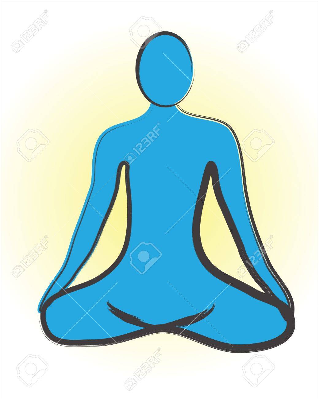
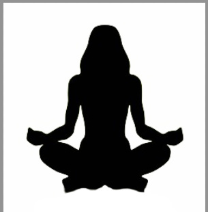
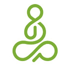
Ok lol, thanks for the reply, its really appreciated. it was designed to look like an abstract person/ Meditating Person sitting down with crossed legs. Something like this image i found on google.
Like Steve O mentioned, the typeface you chose is nice. I like it. I also like the name.
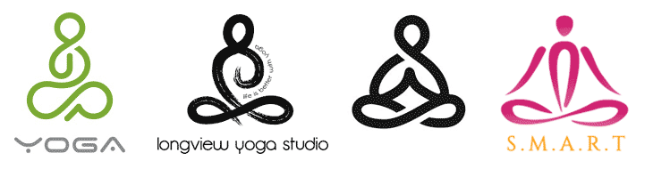
As for the general concept, half the yoga studios in North America have beaten you to it — at least to variations of lotus flower and/or lotus position images.
I do think, however, that your objectives of simplicity, abstraction, simplicity are good. I might also add to that list subliminal suggestions of mindfulness, growth, clarity, focus, insight, wellness, etc.
Unfortunately, a soft-serve ice cream cone or, worse still, a pile of poo do not communicate these things. If it were me, I’d move away from the obvious solutions and concentrate on more imaginative imagery that is suggestive of the emotional qualities associated with those terms I just mentioned.
Think a gentle breeze, a warm spring day, ripples on a still pond. You might also play off the name itself and focus the logo on the mind or the intellect. Or you could develop something suggestive of strength, stamina, wellbeing and achievement. It really just depends on the emotional qualities that reflect your brand and its appeal to your target audience.
I can see it now. It took me some time. I had to go away, surf some other threads and then come back to this one. But now I can see the outilne of a person sitting in padmasana.
The problem, however, is that one has to look very hard to be able to see it, whereas with the others that B’s posted, no such effort is required. You get it in a split second. And that is all the time one gets to grab someone’s attention, isn’t it?
So, if you’re attached to this idea, I’d suggest working with the image a bit more to make it easily identifiable.
Hi everyone, once again thank you for all the comments and it’s very interesting to hear all your opinions on the logo.
I can understand that the logo might have the form of a dog poo lol, or maybe look like Ice cream or a coat hanger. Honestly all people see thing differently so i don’t have a huge problem with some people seeing the logo as ice cream or a coat hanger. However if people see the logo as dog poo this could be problematic.
Just B thanks for the great advice, i have been discussing your thoughts with others and i will now possibly consider just using a type based logo only. I will try out a few alternative maybe and could post a few later on the forum to get people’s view on them.
To try make the Logo look more like a meditative pose. I have created three small revisions of the original logo, If everyone can leave comments it’s really appreciated.
Do you think the logos looks more or less like a meditative pose?
Do the logos look less like dog poo, ice cream or a coat hanger?
Which logo do you prefer the most?
The main differences between the newly revised logos and the original logo:
Bottom of the logo has been reduced in width to make the logo look less like a dog poo emoji shape.
Top of the logo is now circular to make the logo look less like a hanger.
Since it seems you really want to go in this direction, yes, the more recent ones look less like those things it shouldn’t look like. Even so, there’s room for improvement.
One thing I’ll suggest is making the meditating figure a bit larger.
It would also better match the typography if you made the weight of the line in the figure more or less the same weight or thickness as the typography. In other words, this would make them look more like they were designed together as a matching pair rather than two separate things that were conceived separately, then cobbled together without quite matching each other.
I’d also work on the proportions of the seated figure by making the relationship of all the parts a bit more uniform. I think you’ve done that best in the middle logo where the negative spaces are more or less uniform and the visual weight of the figure more or less even throughout.
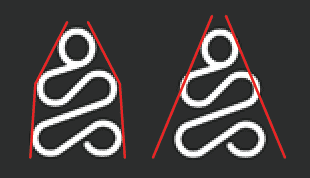
This one’s a little more difficult to explain and needs the drawing below. There are invisible lines that extend from the sides of the head past the arms and curving back slightly to edge of the legs. Those invisible lines or edges are awkward in the sense that they introduce an unattractive box-like complexity into the shape that isn’t needed and creates unwanted tension.
What I’ll suggest doing is redrawing the figure to better fit a pyramid, so that those invisible lines (drawn in red below) are straight and open up in an expansive way to the wordmark beneath it. Similarly, this would also better situate the head at the apex of the pyramid, which seems appropriate for something called Mindscape.
Here’s a slightly modified and somewhat more detailed version. Because I favor images that clearly communicate the message, even if a little less elegant.
Thanks for all the great advise Just-B, i will definably work on the the improvements you suggested.
Regarding this last comment. Do you think by following the red lined pyramid shape, this could make the logo resemble a dog poo emoji again? or was the round head added to the top enough of change by itself to not make this a problem.
“What I’ll suggest doing is redrawing the figure to better fit a pyramid, so that those invisible lines (drawn in red below) are straight and open up in an expansive way to the wordmark beneath it. Similarly, this would also better situate the head at the apex of the pyramid, which seems appropriate for something called Mindscape.”
It very well might look like that or, maybe an ice cream sundae with a cherry on top.
I think it will depend on how you draw it, which might mean giving up on your particular squiggle of shapes and doing it a bit differently.
I’m not suggesting that you copy the one below, but it does demonstrate an alternate way of drawing the same subject that few would mistake for anything other than what it is. I’m guessing there are other different ways to draw this kind of cross-legged seated figure using a single line that are equally suitable. It’s just a matter of finding them.